Project Overview
Project Name: T.O. Night (Toronto Nightlife App) UX Design
Duration: 3 months
Role: UX Researcher, Wireframe Designer, UI/Visual Designer (Support)
Tools Used: Figma, Adobe Illustrator, Adobe Photoshop
Course: Introduction to UX Design - Brainstation
Introduction
As part of the 'Introduction to UX Design' course at Brainstation, our final project required us to create a working prototype for a mobile app. In a team of three, we were tasked with addressing a problem within the nightlife sector.
We identified the challenge of planning and navigating nightlife activities and decided to develop an app concept that offered real-time information, personalized recommendations, and easy access to venues and events.
Over three months, we applied our newly acquired UX design skills using Figma to create a cohesive user interface and a clickable prototype. This prototype demonstrated the app's potential functionality and user experience, simulating real-world interactions.
The project provided valuable hands-on experience, replicating a real-world scenario where we collaborated to solve a specific user problem and deliver a viable product concept.
Value Proposition
Our primary value proposition for this project focuses on simplicity, convenience, and the ambition to be the ultimate one-stop destination for all nightlife enthusiasts. With T.O. Night, we’re committed to crafting a user-friendly and intuitive platform that ensures effortless navigation and event discovery.
We understand the frustration of juggling multiple apps and browsers when planning a night out. That’s why we aim to streamline the process by consolidating event discovery, ticket purchases, reservations, and even ride-sharing services into a single app.
Our vision is to empower individuals to seamlessly browse, plan, and enjoy their nightlife adventures within an all-encompassing app, ultimately redefining how people experience nightlife by making it more accessible, enjoyable, and stress-free.
Highlights of the App
• Comprehensive Access: Provides information on a wide array of live events, local restaurants, clubs, bars, and more—expanding beyond just sports events and concerts.
• One-Stop Dining and Event Solution: Offers real-time information and reviews, along with booking, reservations, and ride-sharing services, all within the platform.
• Efficiency: Saves users time by consolidating planning tasks into a single app, eliminating the need to switch between multiple platforms.
• Personalized Recommendations: Suggest events and venues based on users' interests.
• Safety Features: Includes information about the venue and surrounding area to ensure safety.
• Seamless Planning: With an account, users can manage their entire nightlife plan with a single click.
Research
We conducted interviews with friends, coworkers, and family members aged 19 to mid-30s, focusing on individuals who are active in Toronto’s nightlife or have used event booking apps before. Each group member conducted 3-5 interviews, with a total of 20 interview questions asked each time.
User Interviews - Insights
• Toronto nightlife varies significantly for different people based on their lifestyles.
• A platform that offers both event planning and discovery of activities is highly convenient.
• Providing detailed information on pricing, location, and other event details before attending helps avoid surprises and sets accurate expectations.
• Offering personalized recommendations encourages users to explore and attend events they might not have known about, broadening their experiences.
Design Process
User Personas:
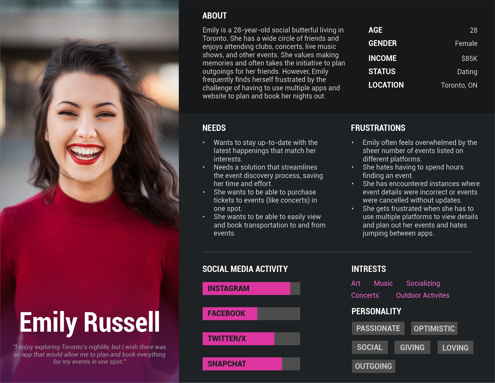
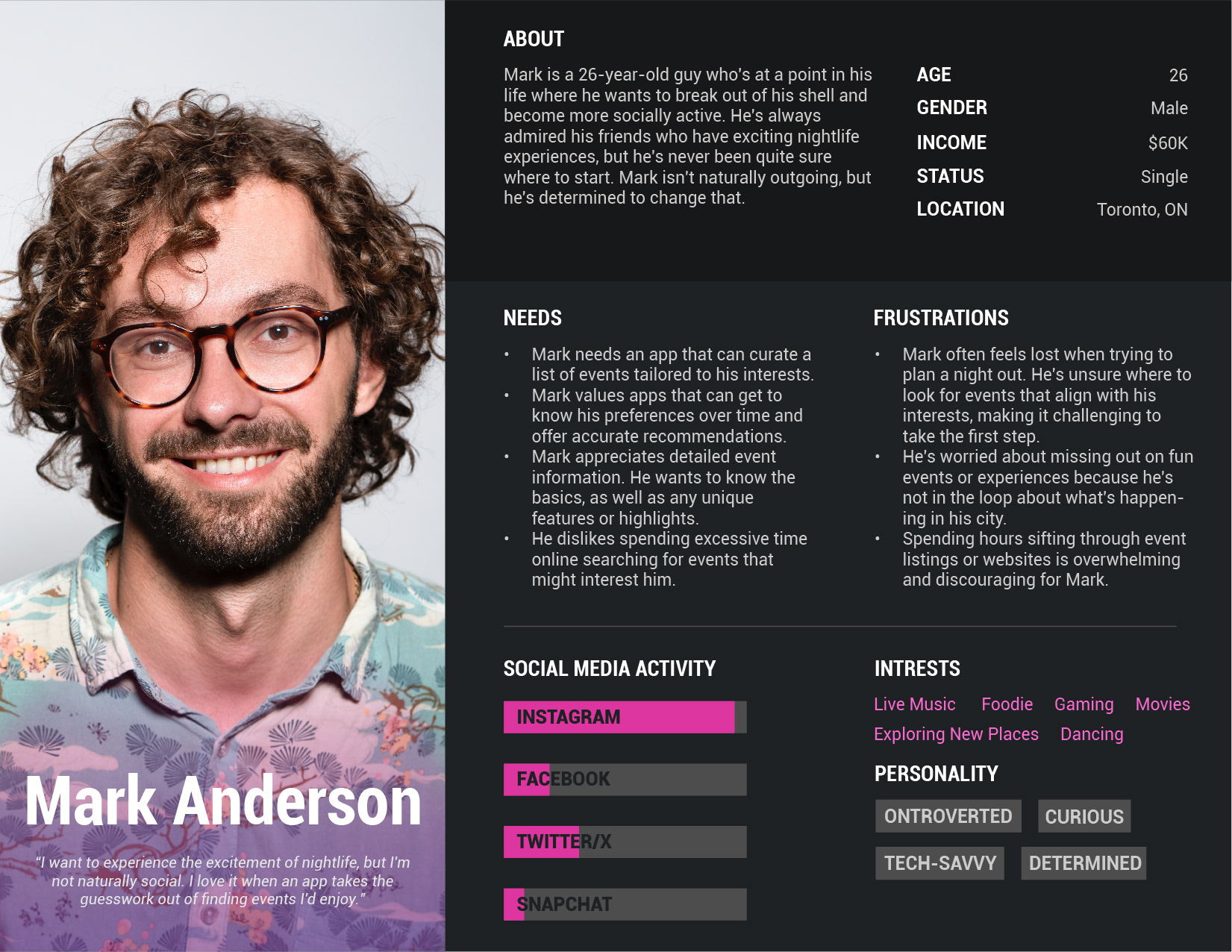
Based on our interviews, we created two user personas to better identify and understand our target audience.
Information Architecture:
As a group, we discussed and outlined the main pages and settings we wanted to include in the app. We created the Information Architecture (IA) to showcase the app's structure and how everything would flow together.
User Flows:
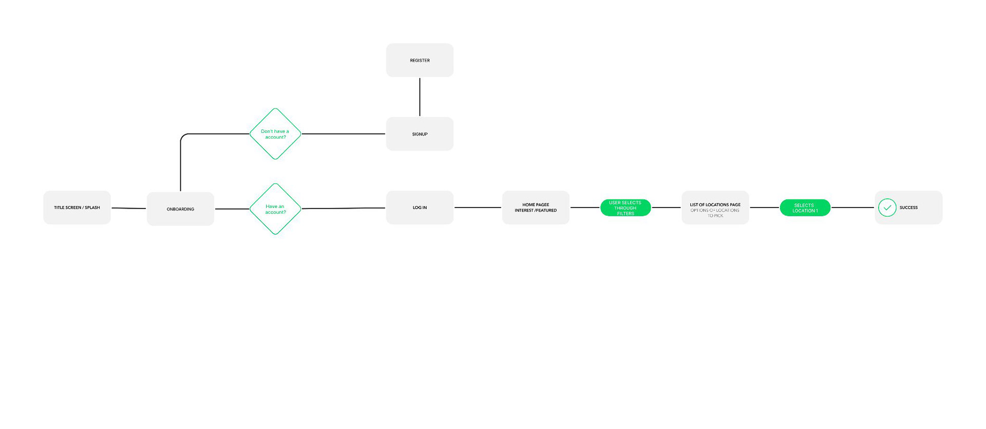
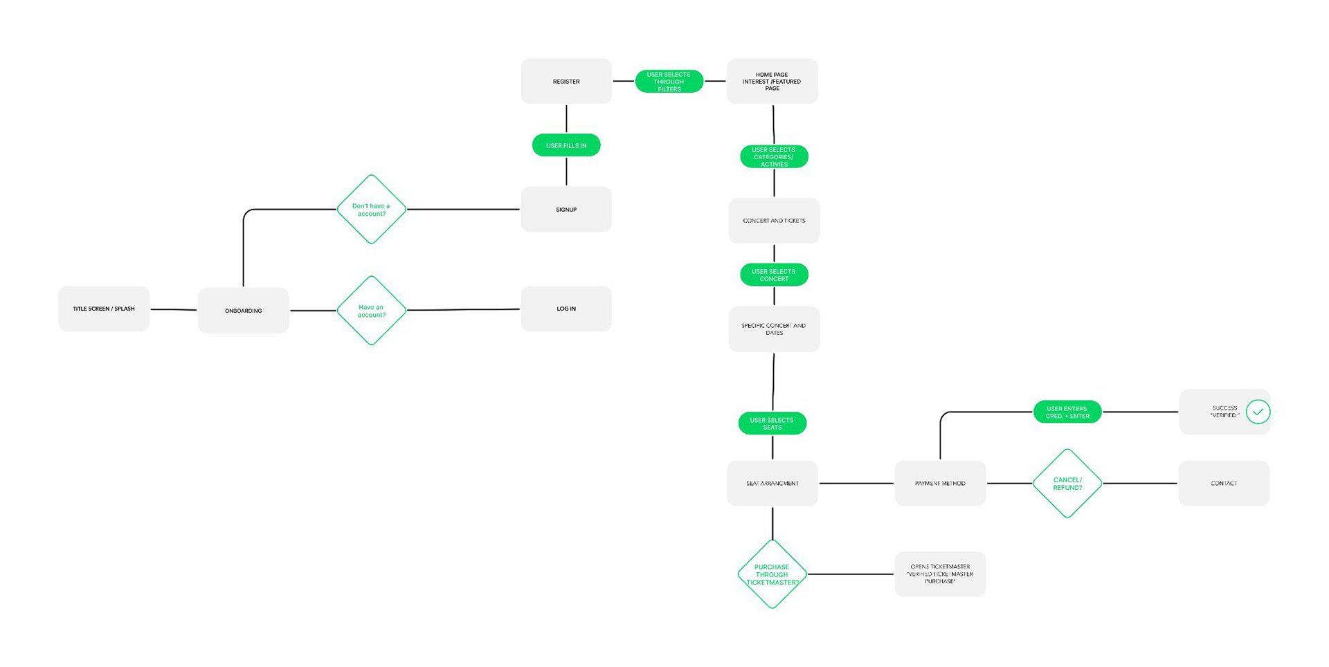
As we refined our ideas and the app's structure, we developed two separate user flows. These flows helped us visualize the big picture and understand how users would navigate through the app. The first user flow is for login and location selection. The second flow is for signing up.
Sketches:
We began by sketching out our ideas for the app’s design. Using the information we had gathered, we created basic sketches of a potential UI (User Interface) to begin visualizing the app's look and feel.
Wireframes:
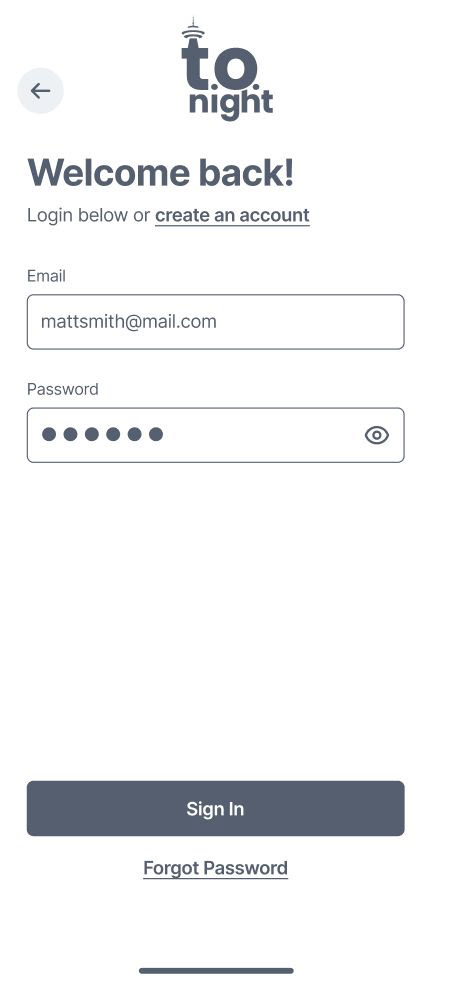
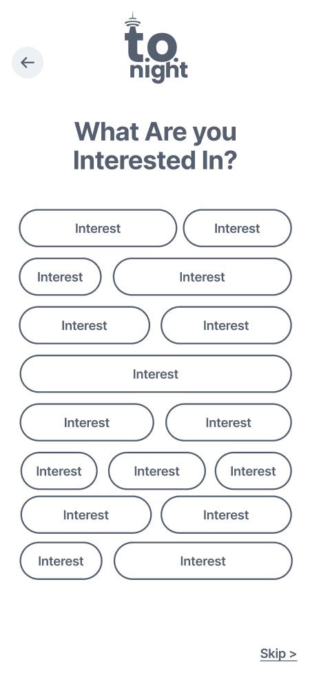
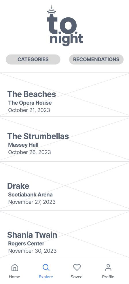
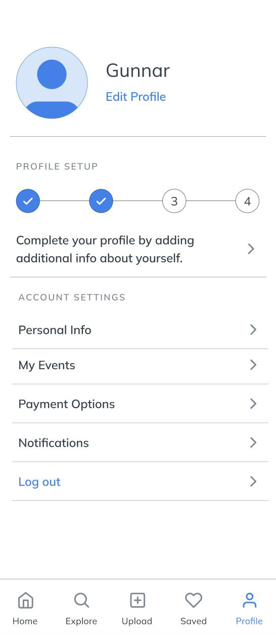
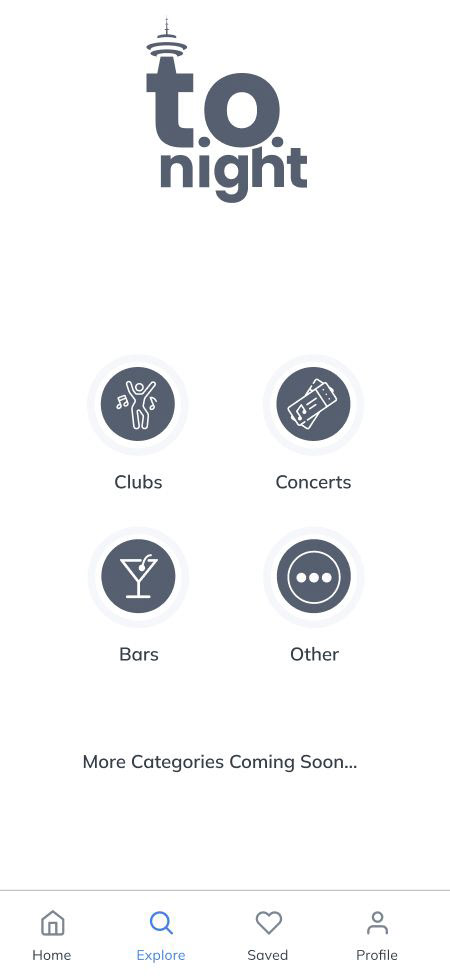
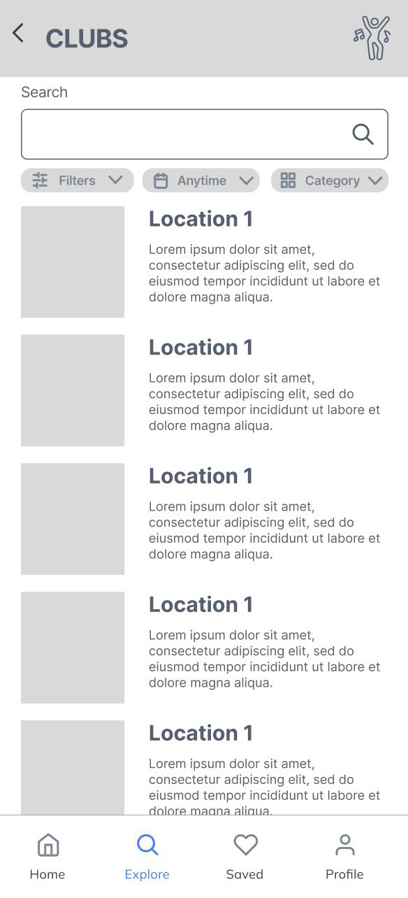
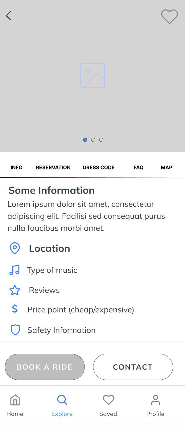
We developed both low-fidelity (low-fi) and high-fidelity (hi-fi) wireframes for several app pages. These wireframes were instrumental in showcasing our vision for the app's design. While minor tweaks and adjustments were made for the final design/prototype, the hi-fi wireframes effectively represented the core user experience of the app.
Final Design & Solution:
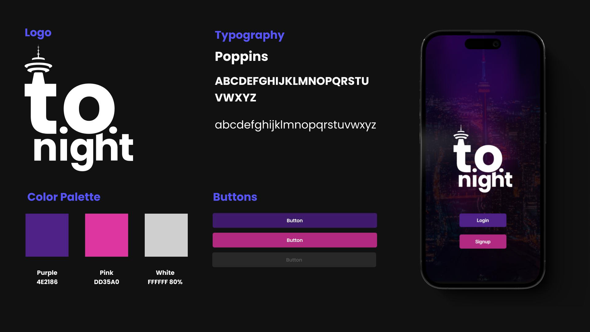
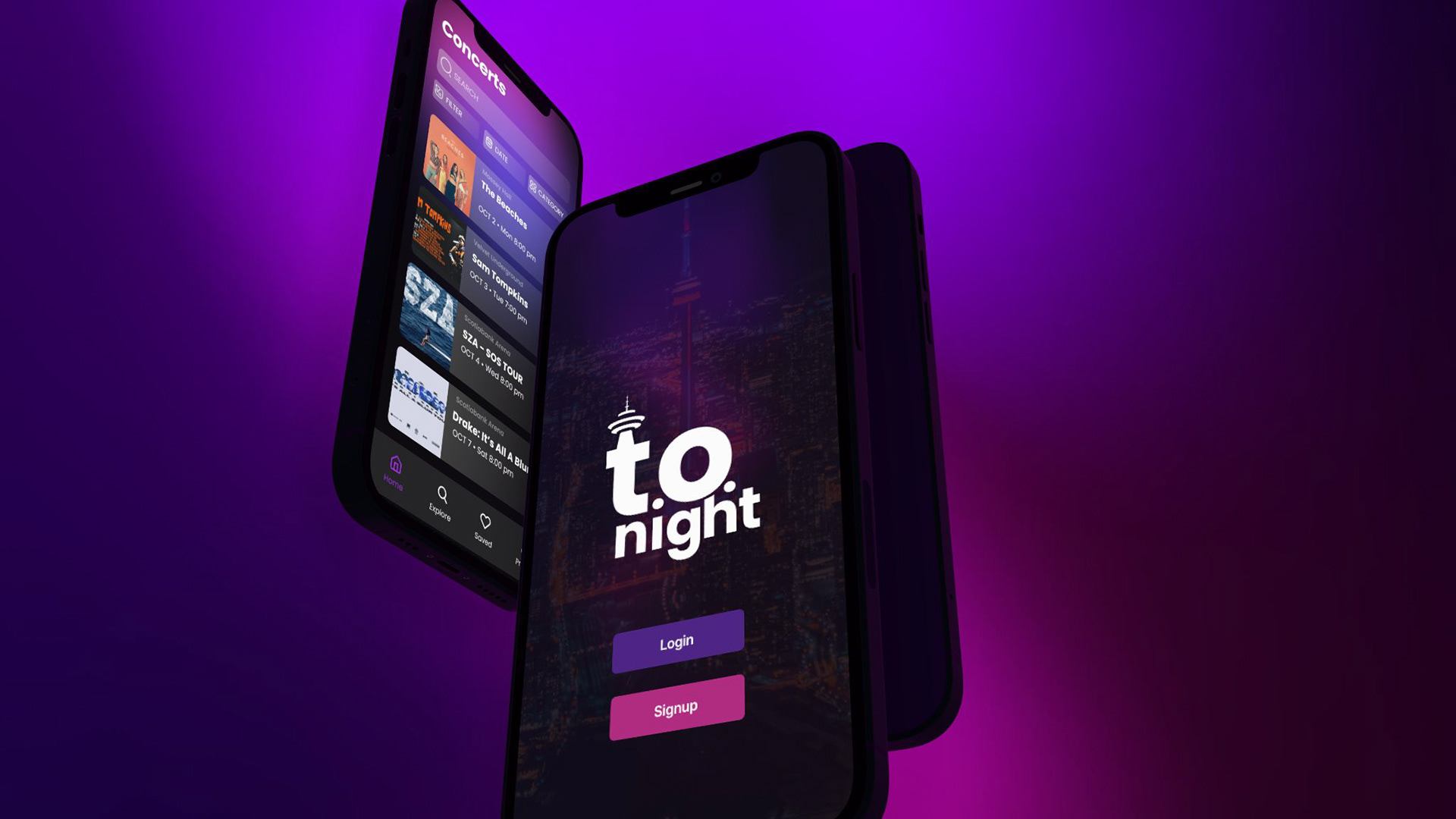
Below, you can find the style guide and a link to the clickable prototype for the app. The most notable design choices are the style and colour scheme, which reflect the app's nighttime focus.
We intentionally chose to keep the app in "dark mode" to ensure a comfortable experience for users in low-light environments, like nightclubs. The colours convey a neon-like theme, creating a vibrant and engaging mood, while the typography was selected to reflect a fun and playful style. We prioritized clear images, concise wording, and simple filtering options to make navigation as easy as possible. Our goal was to create an app where users could quickly complete their tasks without unnecessary steps.
**I apologize, as the prototype link is currently not working, but should be resolved soon.
Impact & Results
Feedback:
Our group presented the app to our entire class and received overwhelmingly positive feedback, particularly on the idea and implementation. The UI received additional praise, though some accessibility issues were pointed out, specifically with the button colours. While we didn’t conduct a full accessibility test, these issues would be addressed in future iterations. Due to time constraints, we didn’t perform formal user testing on the final prototype. However, we conducted informal user testing leading up to the final presentation and received valuable feedback.
Learning Outcomes:
As we conclude our journey with the T.O. Night project, we’ve not only developed a solution to enhance the nightlife experience but also gained significant insights and skills. We’ve come to appreciate the importance of a user-centered approach, the value of personalized recommendations, and the critical role of effective communication. This project has deepened our understanding of technology’s potential to enrich social lives. We look forward to applying these lessons in future endeavours, always aiming to create solutions that bring meaningful enhancements to people’s lives.
To advance our T.O. Night app idea effectively, we plan to implement several key strategies using the available resources. We intend to strengthen social features, encouraging users to connect and share experiences within the app. Additionally, we are considering monetization through membership tiers, offering enhanced features and settings.
Our core objective remains to provide a one-stop shop for nightlife, which will require partnerships with brands like Uber and Ticketmaster for seamless event experiences and planning. Continuous user feedback and iteration will drive improvements, while strategic marketing and community-building efforts will expand our user base and engagement.
Ultimately, our goal is to create a comprehensive, community-driven, and revenue-generating platform that enhances nightlife experiences and fosters a vibrant nightlife community.
