Overview
Client: Purple Oak Health
Industry: Healthcare
Project Duration: January 2023 - February 2023
Services Provided: Logo Design, Branding, Website Creation
Industry: Healthcare
Project Duration: January 2023 - February 2023
Services Provided: Logo Design, Branding, Website Creation
Background
Client Description:
Purple Oak Health is a holistic health and wellness center in Toronto, Canada, offering adaptable programs focused on preventative care and mental health, including individual therapy sessions and nutritional counselling, provided by a team of experienced local practitioners.
Project Objectives:
• Logo Design: Develop a unique and memorable logo.
• Visual Identity: Establish a strong and consistent visual identity.
• Branding: Create cohesive brand elements and guidelines.
• Website Creation: Design and develop an easy-to-navigate website.
Research and Discovery:
The initial meeting for the logo design was straightforward. Based on my discussions with the client, we noticed that most mental health clinic logos typically feature a face, head, or brain symbol. However, the client wanted to steer clear of these elements, as they didn't want the logo to imply anything negative about their patients' minds or suggest a sole focus on mental illness.
Instead, they preferred a minimal and abstract design that still connected to the business as a whole. This clear direction helped narrow our focus, allowing me to start the design process with a well-defined vision.
Design Process
Concept Development:
My design process has evolved over time. Initially, I would generate some general ideas and present 5-8 different logo concepts to the client to help them choose a direction. This approach provided the client with options and helped me understand their style preferences.
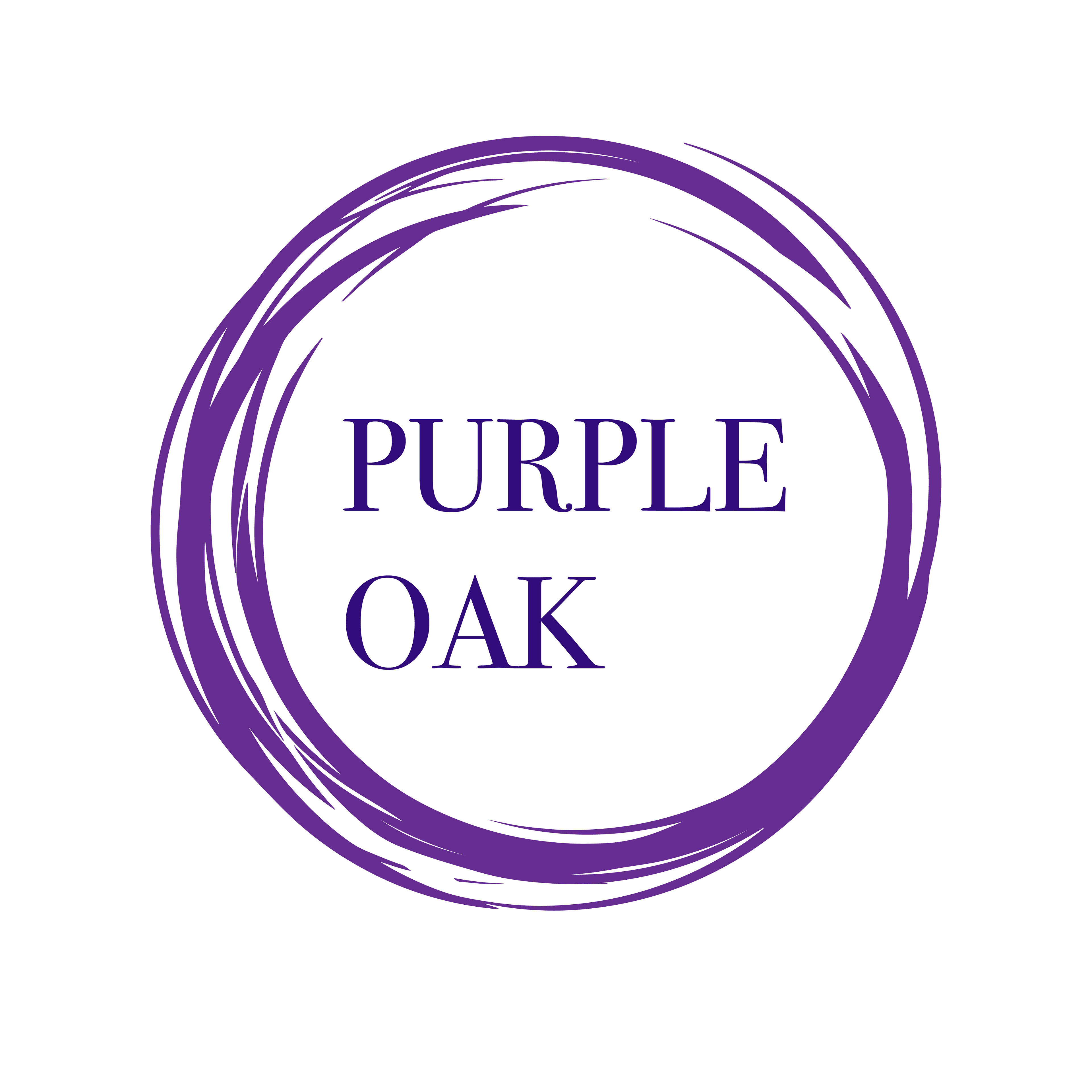
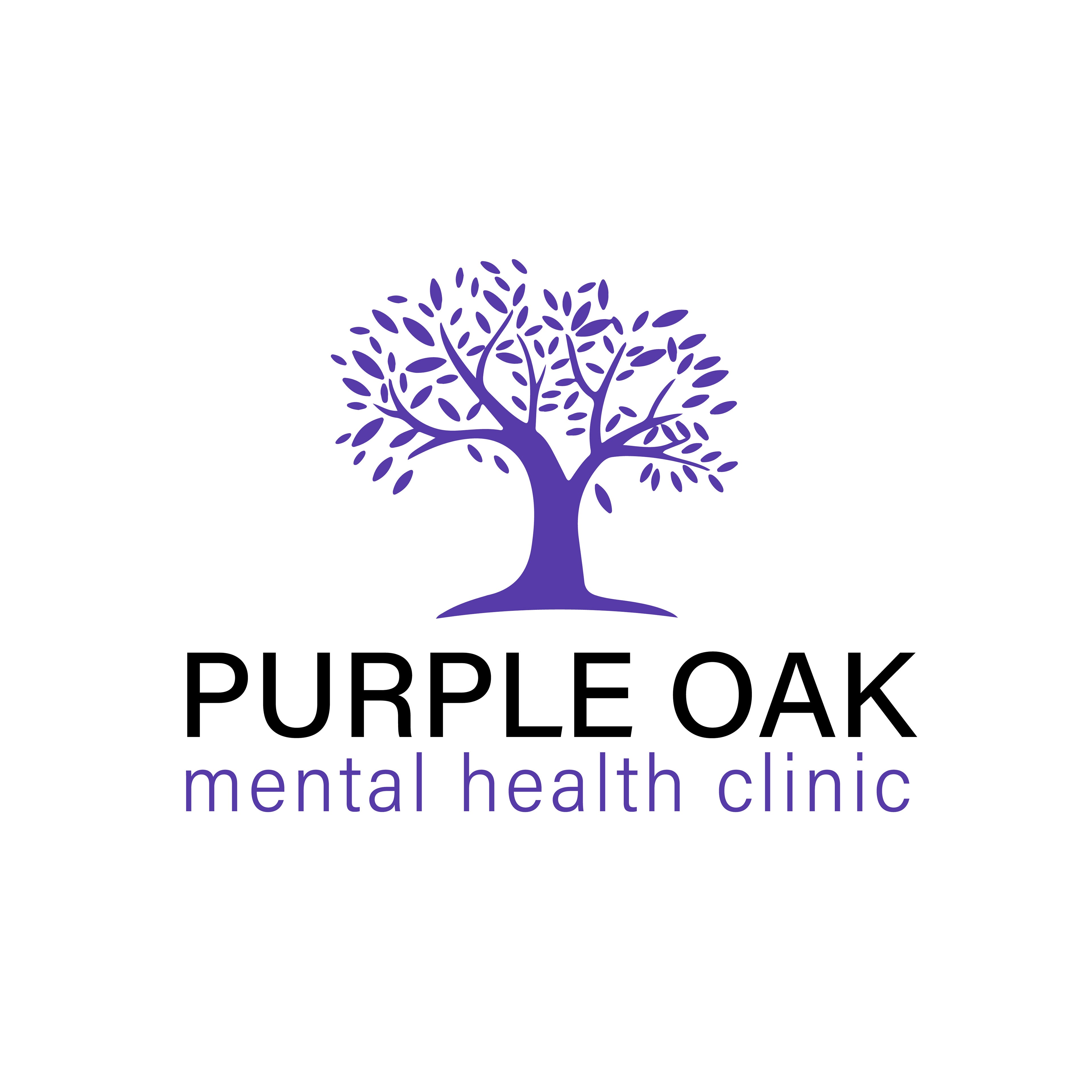
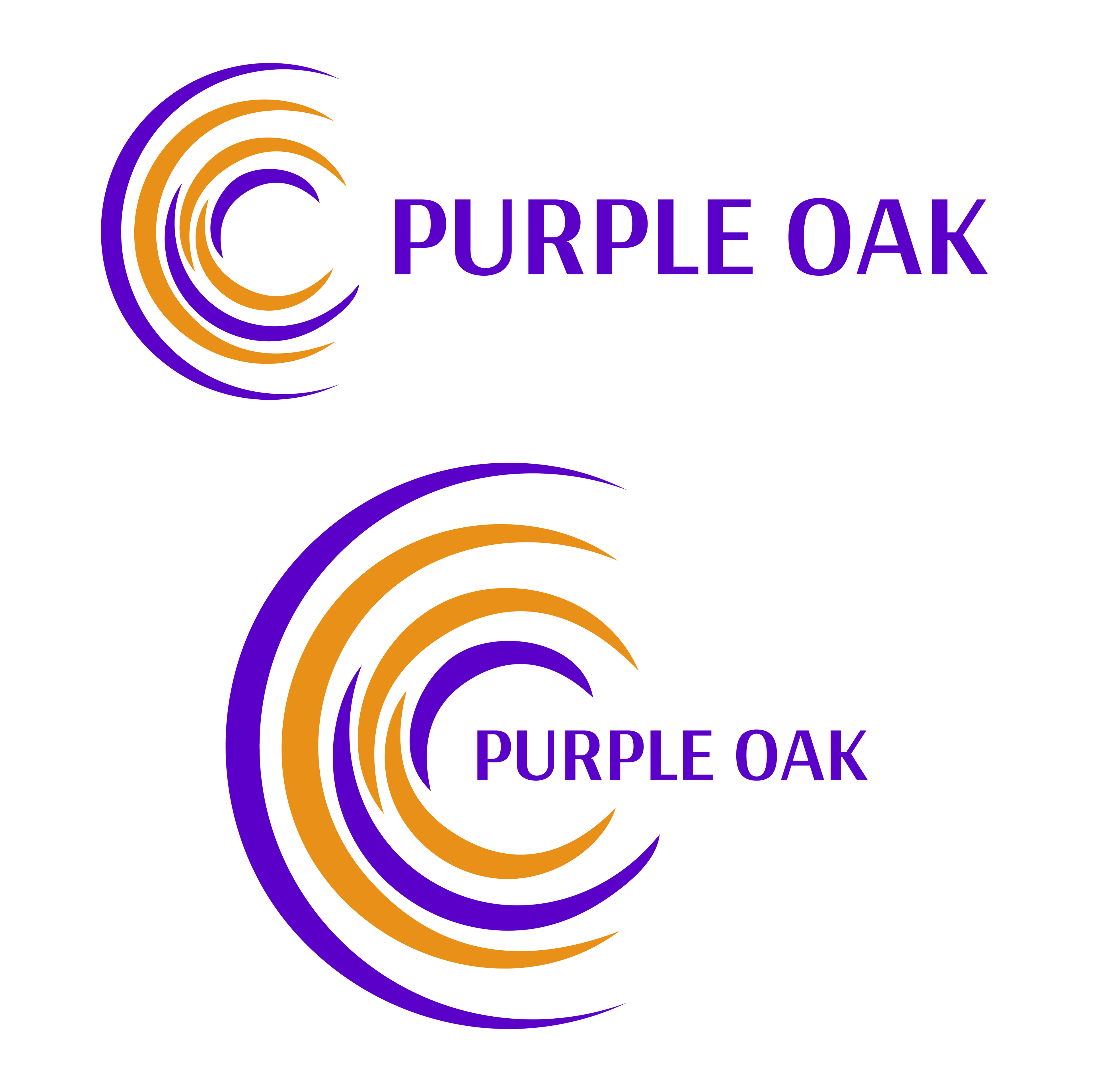
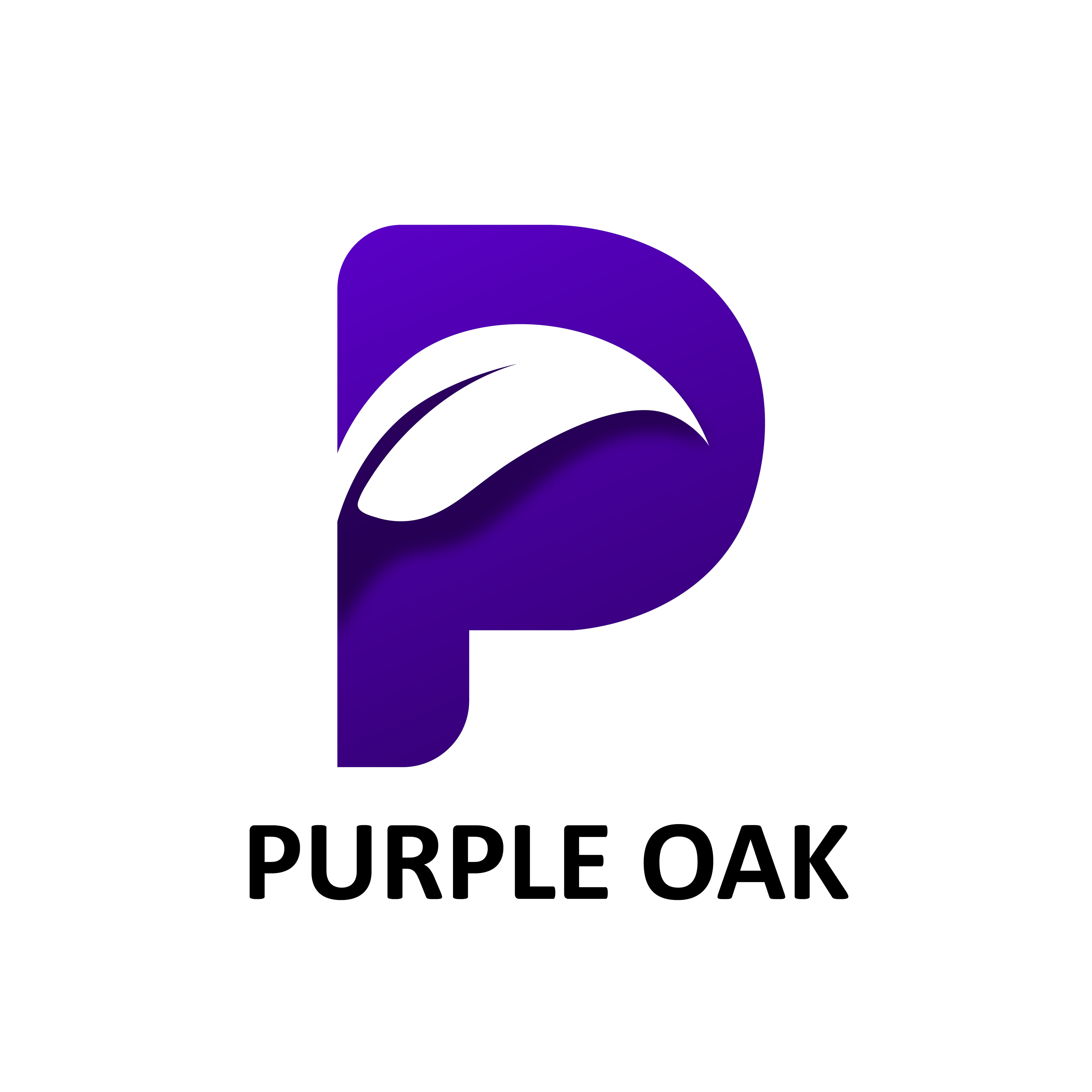
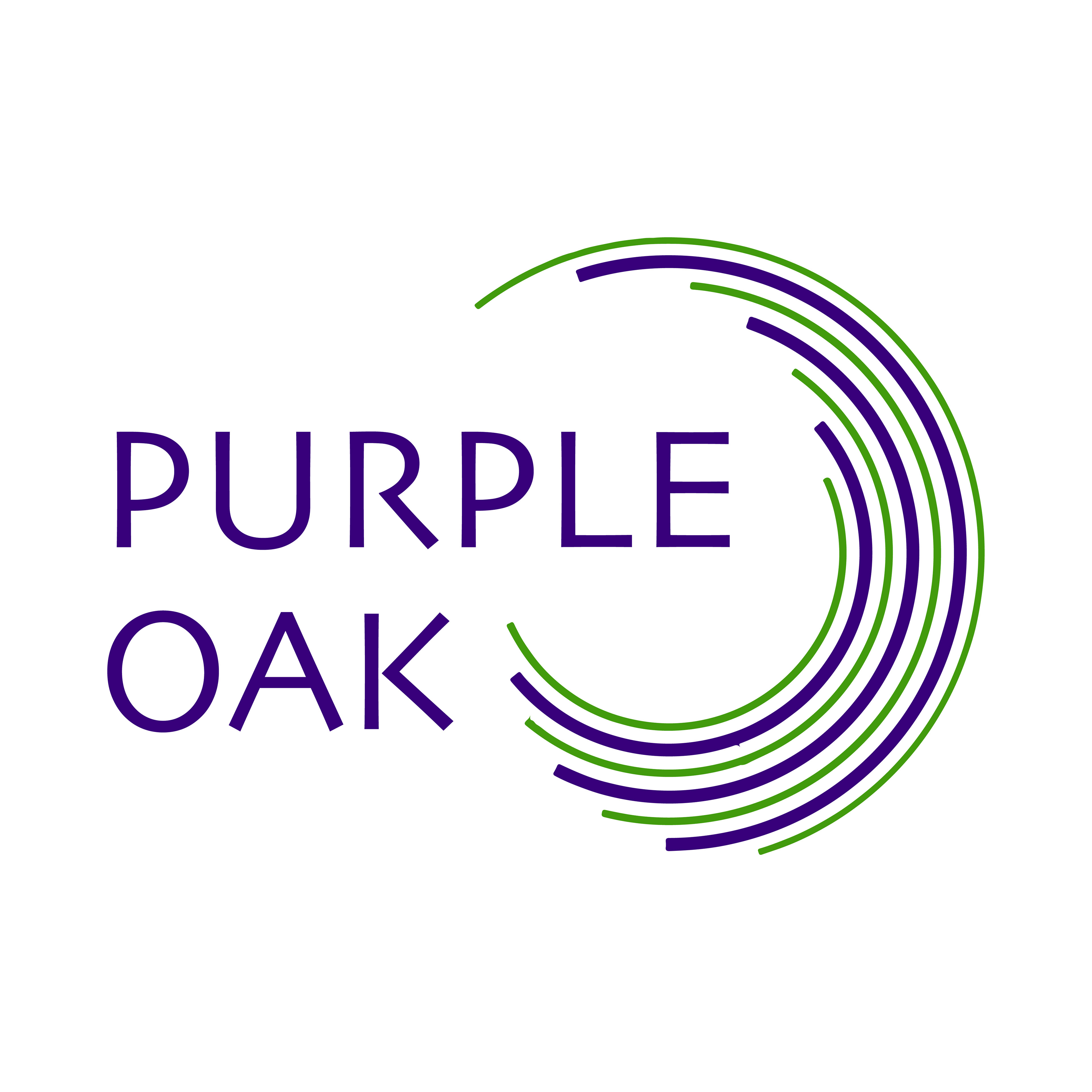
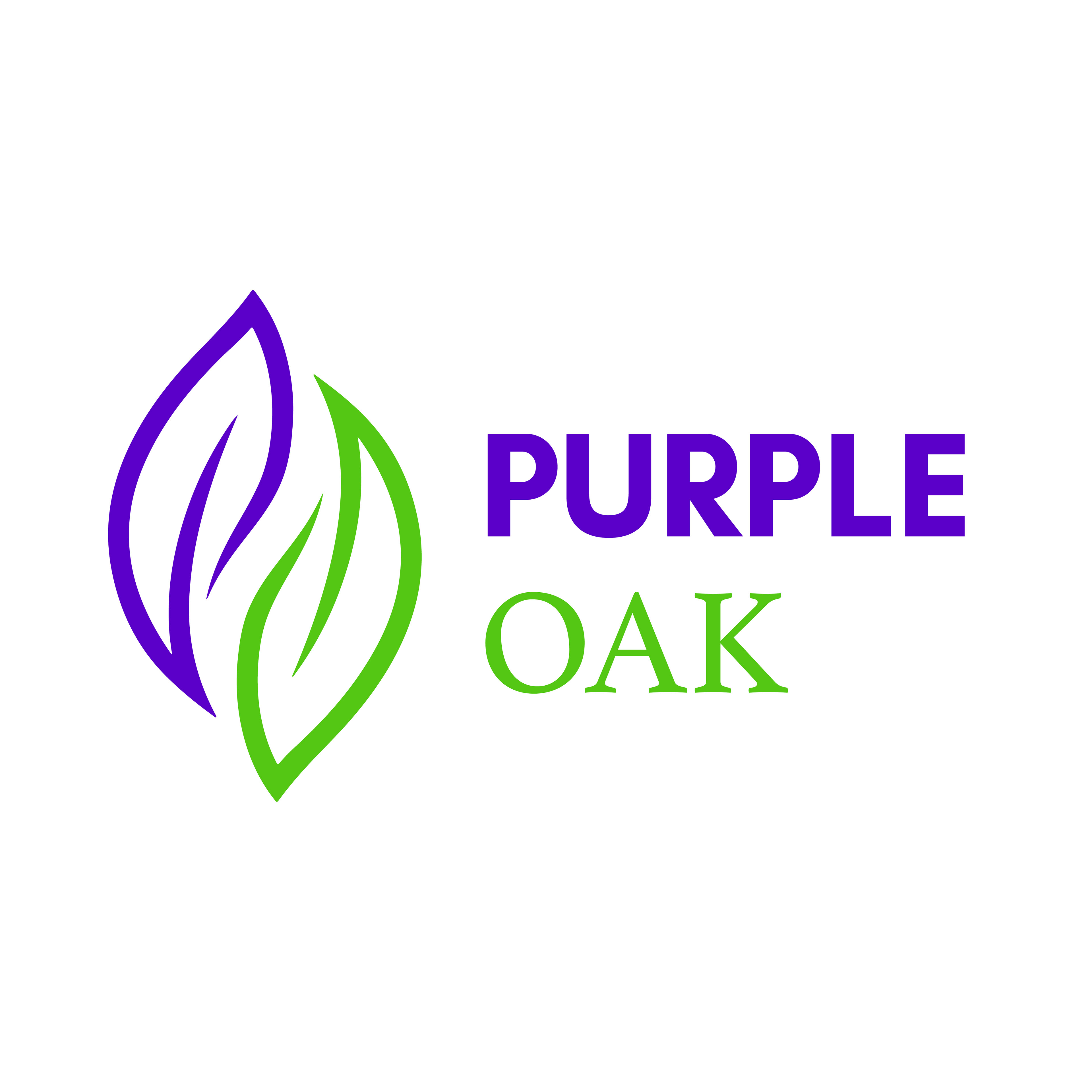
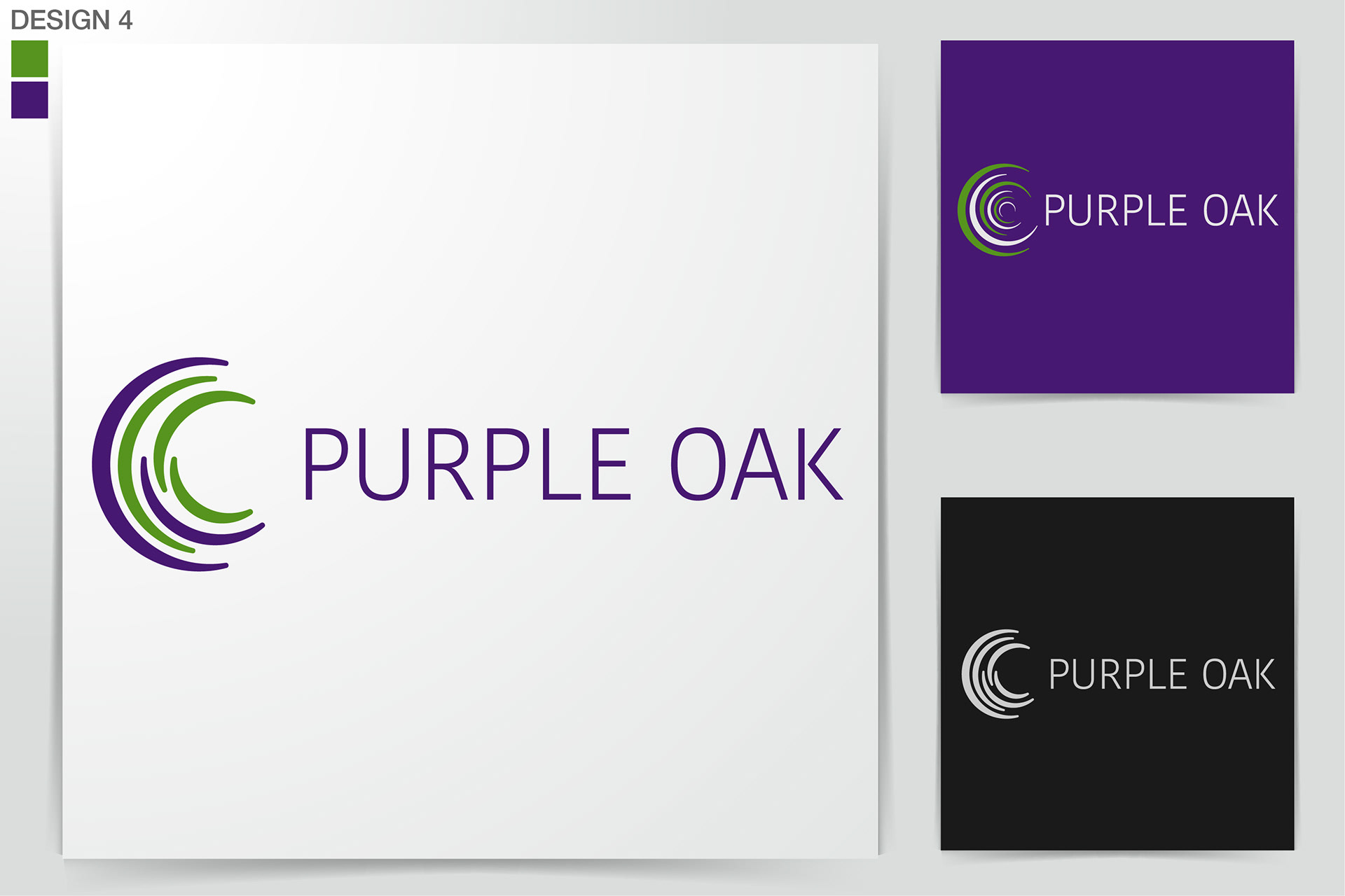
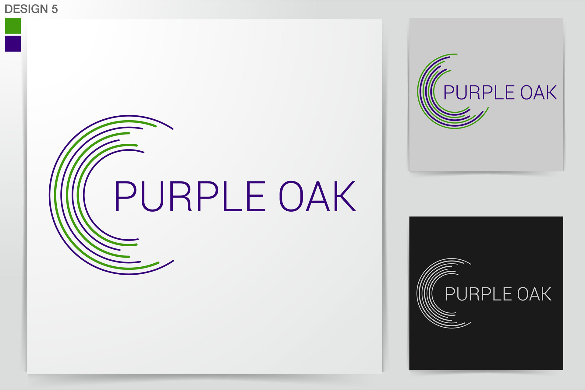
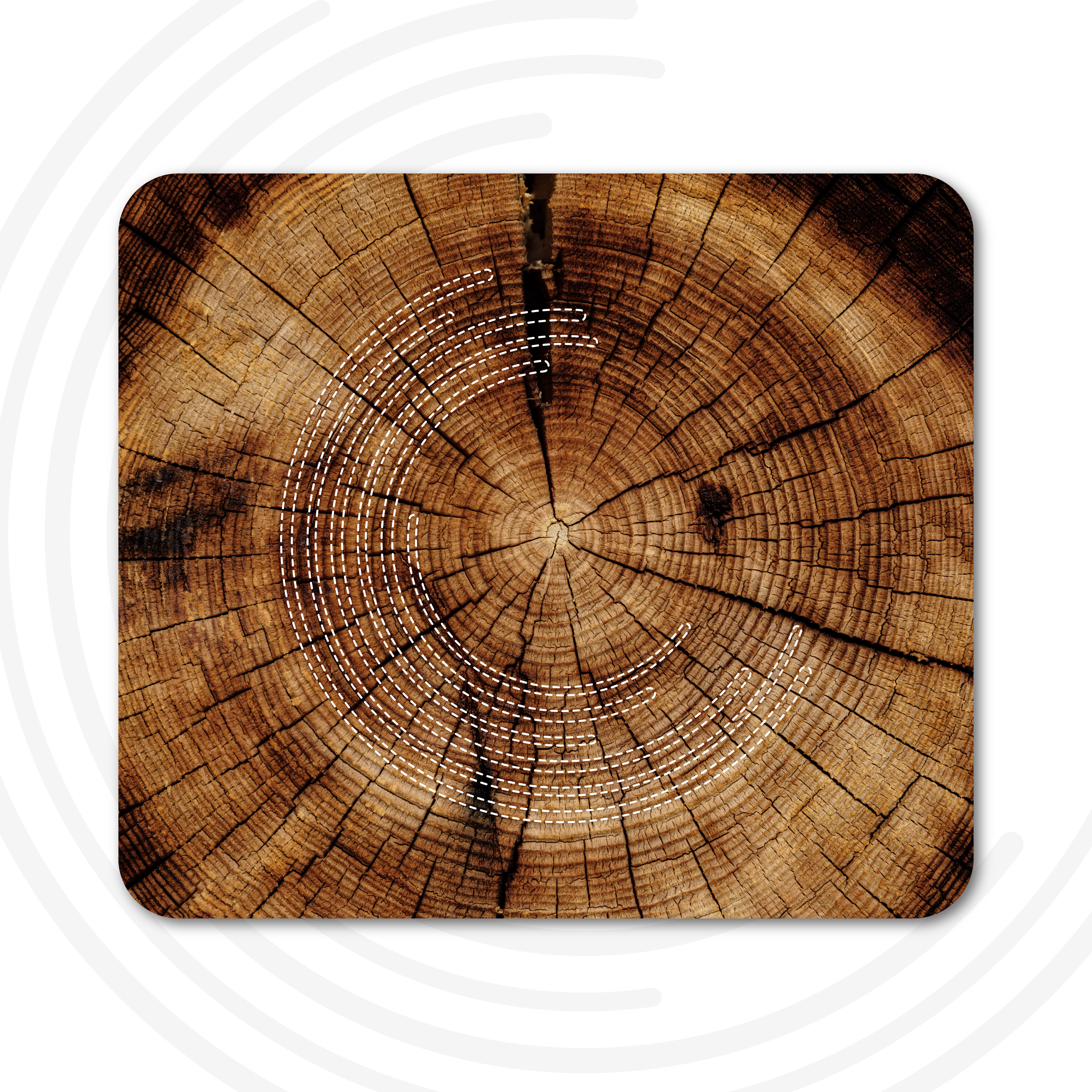
For this project, after several discussions and exchanges, the client selected a concept featuring circles and rings. We decided that these rings could represent an oak tree, which aligned perfectly with the brand's identity. You can see some of the early concepts and iterations of the logo below.
Design Iterations:
With the direction set, we explored various ways to represent the circles and rings in the logo. Numerous iterations were created, each tweaking elements like the thickness of the rings, their orientation, and the number of rings. This process was crucial in refining the logo to meet both aesthetic and symbolic goals.




Final Design:
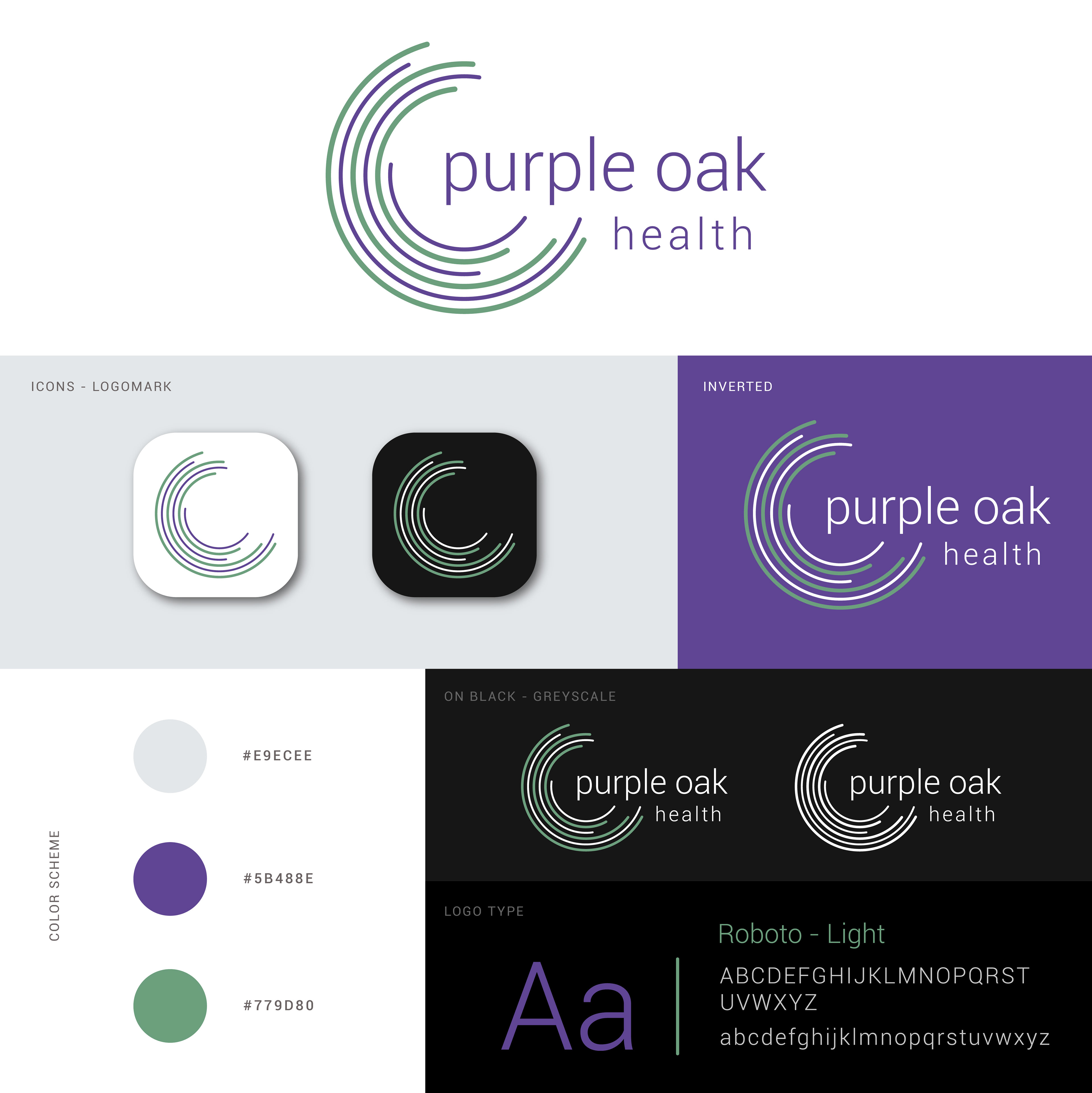
After extensive refinement, we finalized a design that was unique, minimal, and modern, yet effectively conveyed the brand's message and meaning. The final steps involved perfecting the design, including adjustments to typography and subtle modifications to the ring elements. The result was a logo that not only met but exceeded our expectations, fully embodying the essence of the brand and business.
Purple is associated with qualities such as wisdom, warmth, creativity, and healing. It symbolizes a sense of balance and health. The “Oak” tree symbolizes inner strength, endurance, resilience, and growth.
Combining these two symbols suggests a place where individuals and communities can find compassion, expansion, strength, and balance in their health and wellness journey.
Brand Guidelines and Implementation
For the first few months following the business launch, I assisted with the creation and launch of their social media presence and designed and developed the business website.
My goal was to ensure a consistent look and feel across all media, platforms, and content related to Purple Oak Health. This included maintaining uniformity in typography, colours (both main and complementary), and the placement, size, and orientation of the logo.
To uphold the brand identity, we kept a white background across all platforms and content. We adhered to a minimal design aesthetic, utilizing negative space to allow the content to breathe.
The primary colours used were purple and green, complemented by a few lighter and darker shades where necessary. This cohesive approach ensured all visual elements remained consistent and aligned with the brand's identity.
Logo Applications
Here are some examples of where the logo has been implemented:
• Website: Homepage, navigation bar, and footer (www.purpleoakhealth.com)
• Social Media: Profile pictures, cover photos, and post graphics
• Signs: Exterior and interior signage for the clinic
• Business Cards: Clean and professional design with the logo prominently displayed
• Banners: Event and promotional banners featuring the logo and brand colours
• Merchandise: Branded pens, mugs, and other promotional items
• Stationery: Letterheads, envelopes, and brochures
Client Feedback
“Amin is a true visionary when it comes to his field of expertise. He captured the essence of our brand perfectly and provided valuable insights throughout the process. His creativity and expertise are evident in the final product, which truly represents the nature of our business and stands out in our industry. The final logo is modern, professional, and conveys our message clearly. We've received numerous compliments on our new logo and couldn't be happier with the results."
— Mehdi Attarha, Director of Operations, Purple Oak Health
— Mehdi Attarha, Director of Operations, Purple Oak Health
Conclusion
This was a project I am very proud of. I worked with the client from the initial concept stages through to the launch and beyond. Seeing the logo used in physical forms, such as signs inside and outside the clinic, has been incredibly rewarding. The goal was to create a minimal and unique logo that conveyed a message and represented the brand well, and I feel I accomplished this.
The use of rings in an asymmetric orientation and pattern gave it a unique touch and feel. This is one of the proudest projects I've worked on, and I’m grateful for the opportunity and trust given to me by the folks at Purple Oak Health.
