Project Overview
Project Name: Academy Awards Best Picture Poster Series
Duration: Annual project, ongoing for 5 years
Category: Passion Project / Personal Work
Main Passions: Design, Movies
Purpose: To create a cohesive series of posters for the films nominated for Best Picture at the Oscars each year, shared on social media leading up to the Oscars ceremony.
Introduction
The Academy Awards Best Picture Poster Series is an annual project that I started five years ago out of my love for movies and design. Each year, I create a set of posters for the films nominated for Best Picture at the Oscars. This project allows me to combine my two main passions and contribute to the movie poster art community.
Top Gun: Maverick
Maestro
Joker

CODA
Design Process
Research & Conceptualization:
• Follow the Oscars buzz and identify the nominated films.
• Research each film to understand its themes, visual style, and key elements.
• Develop a unifying concept or theme that will tie all the posters together for that year.
Sketching & Drafting:
• Create initial sketches and drafts for each poster, focusing on the unifying theme.
• Experiment with different styles and layouts to find the most compelling designs.
Design & Development:
• Finalize the design for each poster, ensuring consistency in the theme, colour palette, and typography.
• Use various design software and tools to bring the posters to life.
Review & Refinement:
• Review each poster for cohesion and impact.
• Make necessary adjustments and refinements to ensure each poster stands out while still being part of the series.

1917
Sound of Metal

Oppenheimer

Elvis
Project Highlights
Consistency: Each year, the series has a specific style or theme that makes the posters easily identifiable as part of a set.
Community Engagement: Sharing the posters on social media has helped connect with other artists and movie lovers, fostering a sense of community.
Growth: Over the years, my skills have evolved, and the complexity and creativity of the posters have increased.
Challenges & Solutions
Time Management: Balancing this passion project with other professional work can be challenging. I set aside dedicated time each week leading up to the Oscars to work on the posters.
Creative Blocks: Sometimes, finding a unifying theme or unique design approach can be difficult. I overcome this by immersing myself in the films, seeking inspiration from different art forms, and brainstorming with peers.
Conclusion
The Academy Awards Best Picture Poster Series is more than just a design project for me; it's a celebration of my love for movies and art. Through this project, I've been able to push my creative boundaries, connect with a community of like-minded individuals, and produce a body of work that I'm incredibly proud of. Each year presents new challenges and opportunities, and I look forward to continuing this tradition for years to come.
2020 - The Start of the Journey
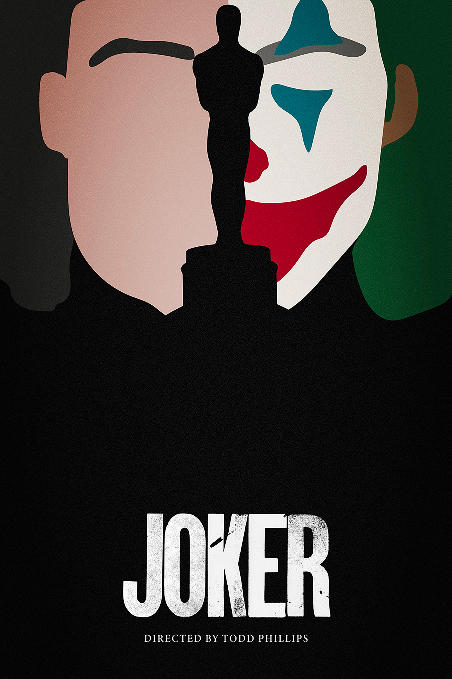
This was my first Oscar series, where I experimented with incorporating the Oscar statue into each poster. The statue is subtly or prominently featured in every poster, depending on the scene. My goal was to use scenes and icons to convey a brief story about each film while integrating the official logos (title cards) for added authenticity.
While the posters worked well with the style I was aiming for and gave the series a somewhat "official" look, they didn’t quite achieve the cohesive feel I was hoping for. However, this was my first attempt, and I was still proud of the results.

Joker
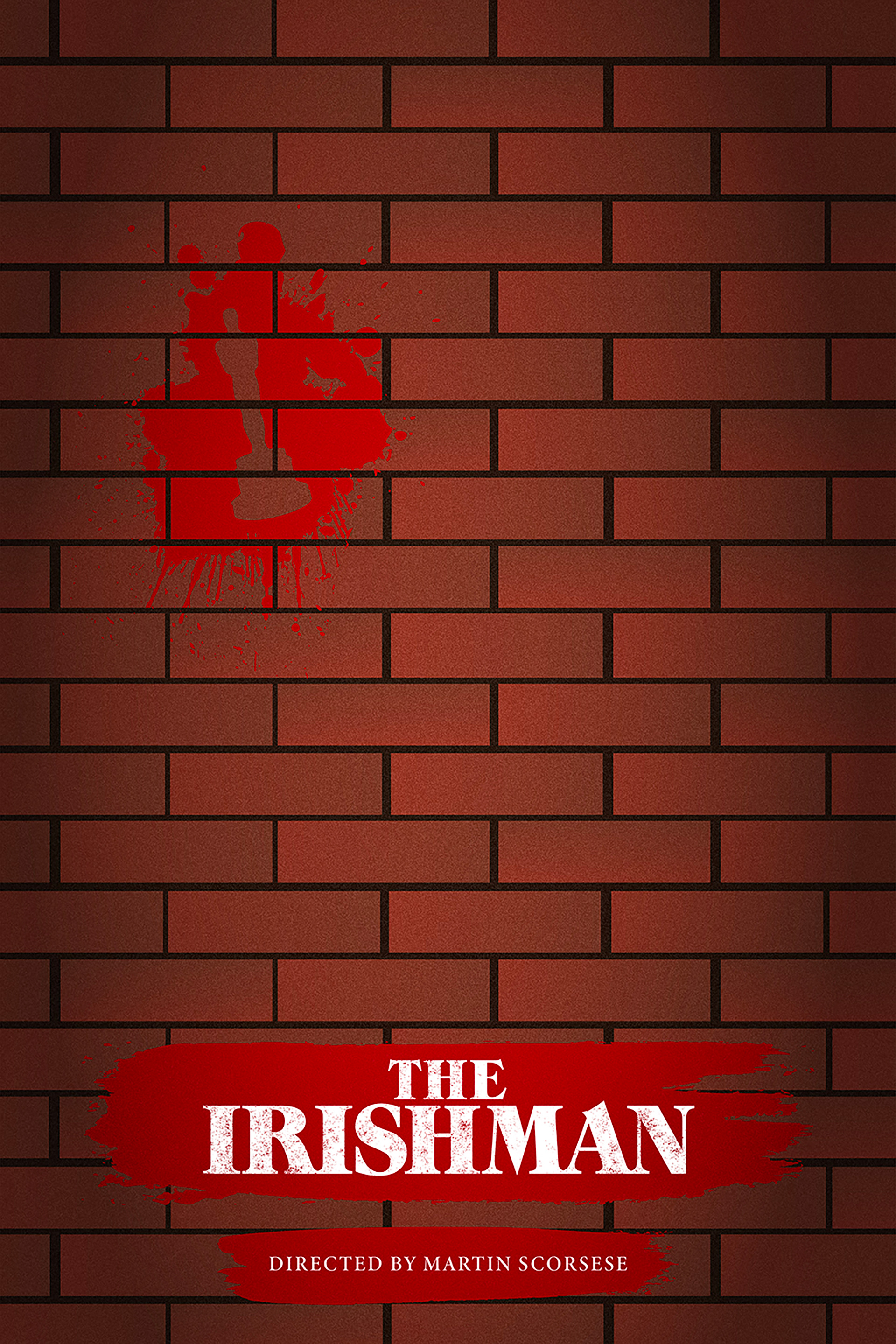
The Irishman
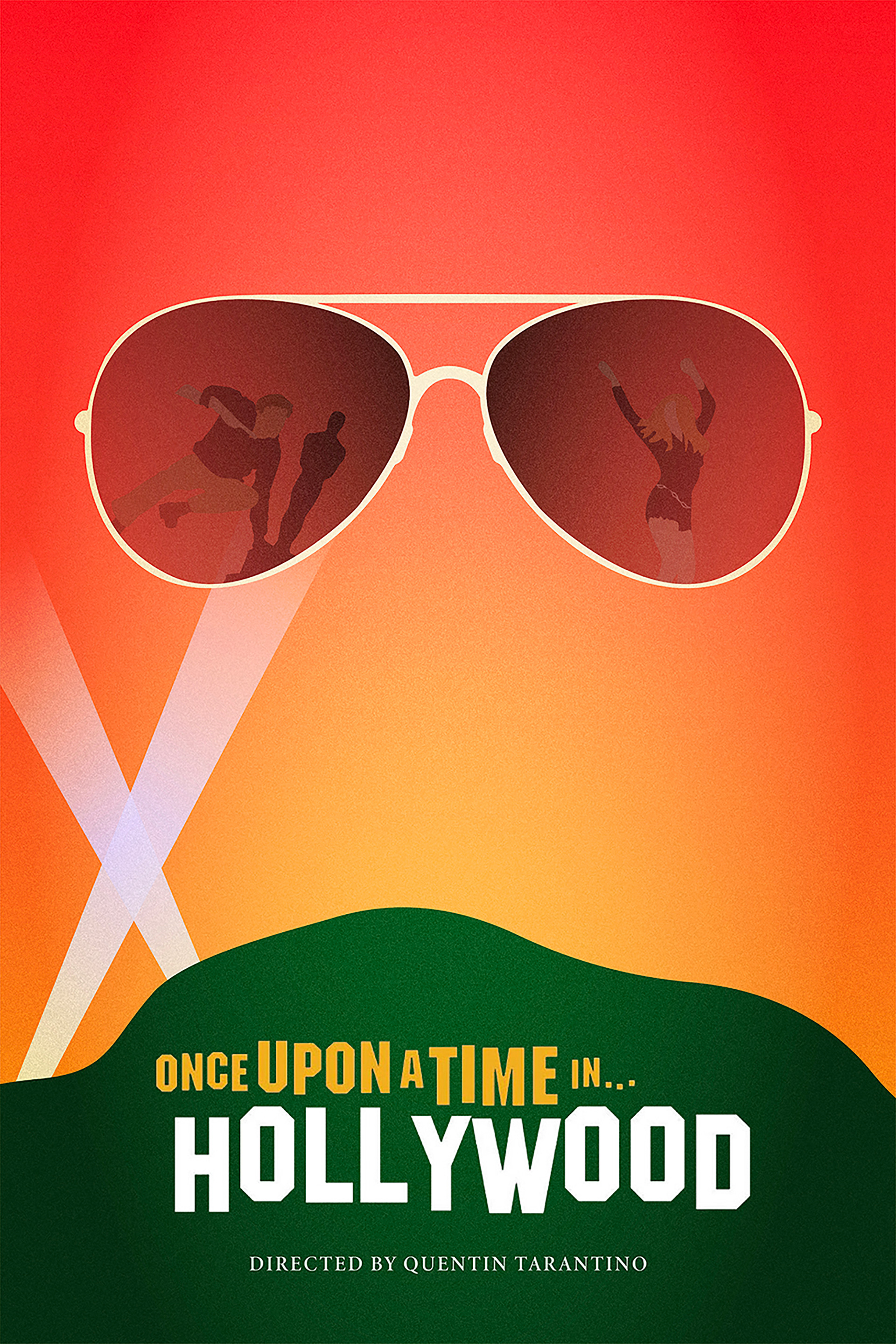
Once Upon a Time in... Hollywood
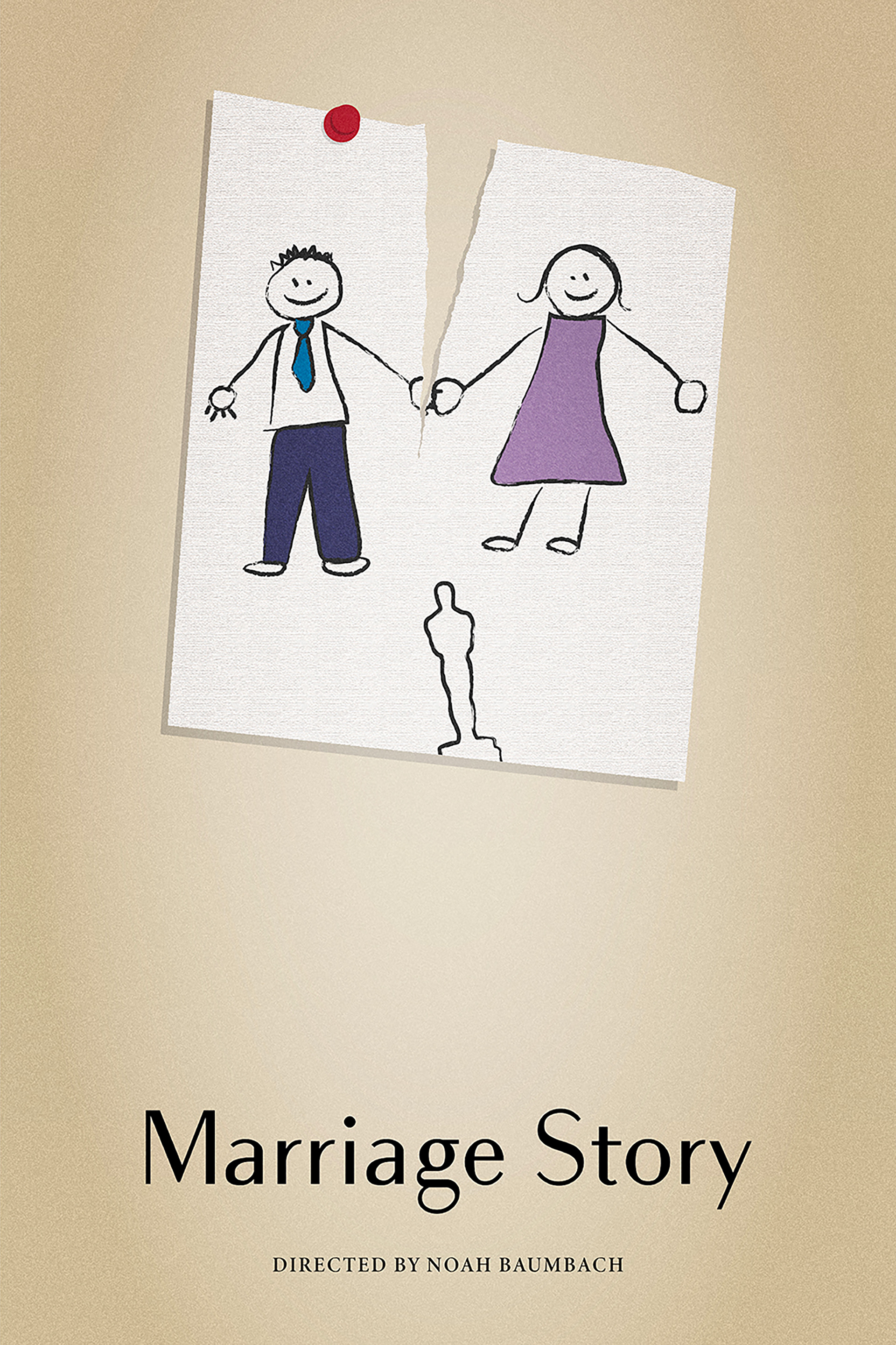
Marriage Story
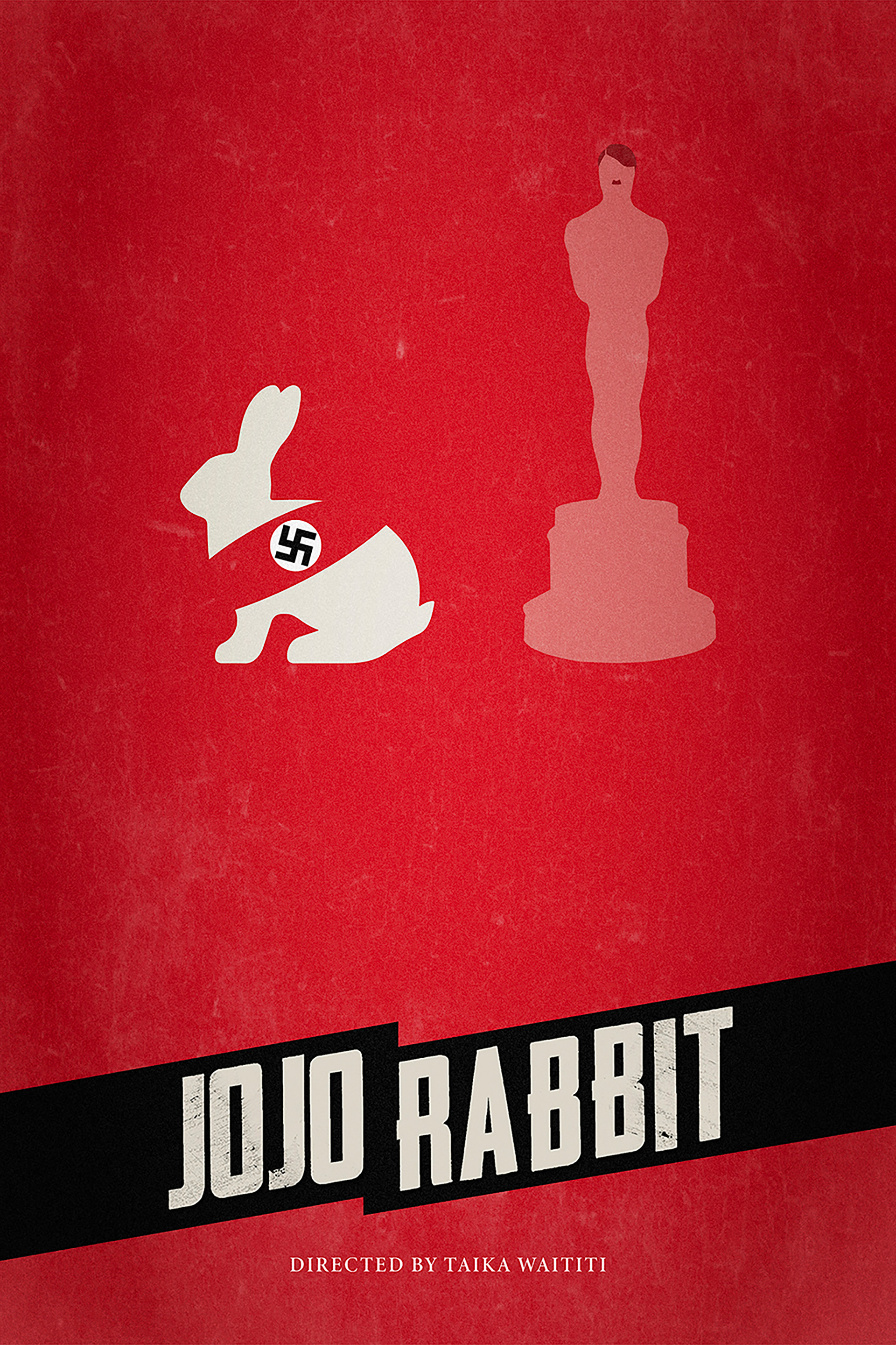
Jojo Rabbit
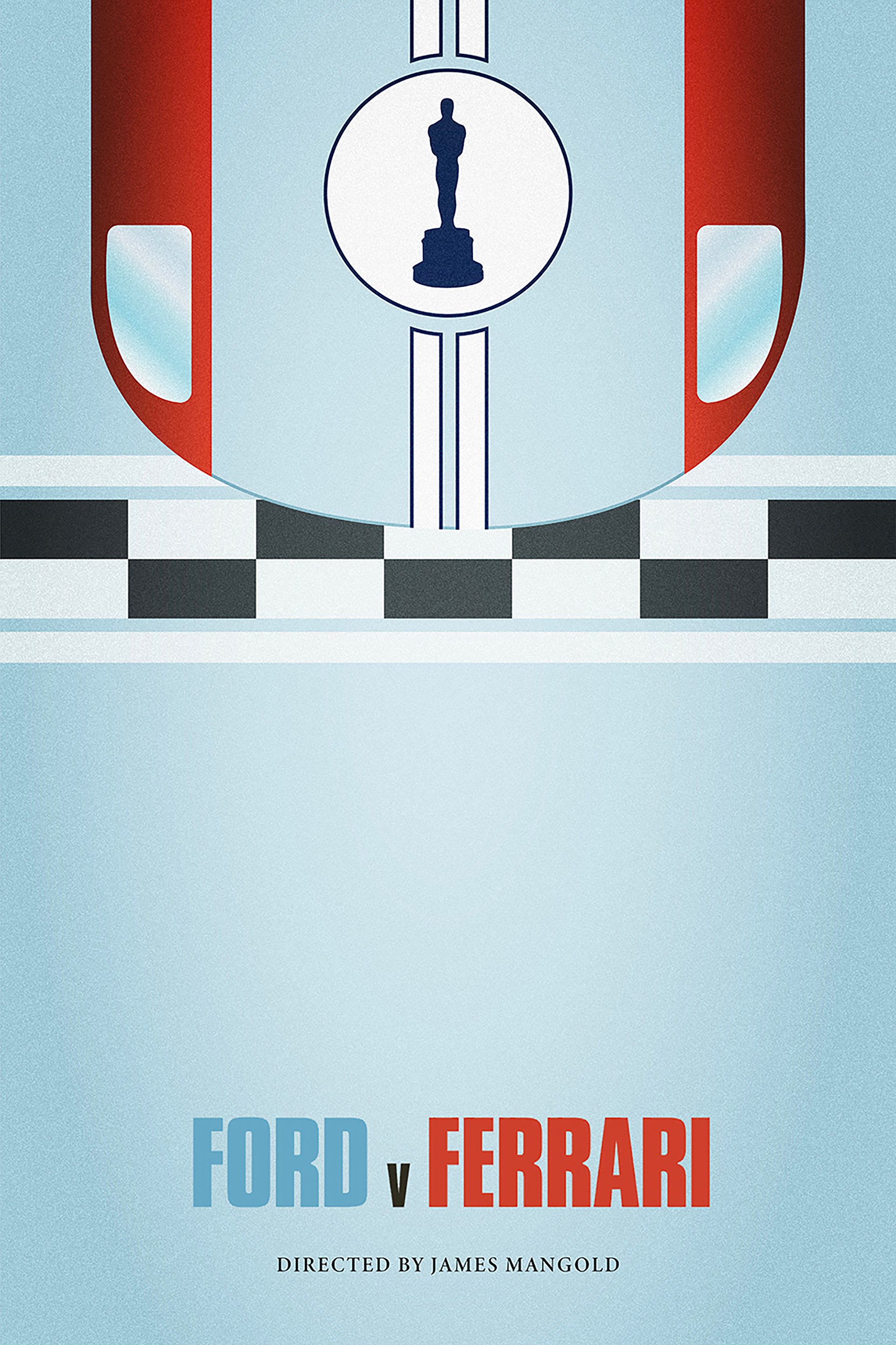
Ford v Ferrari
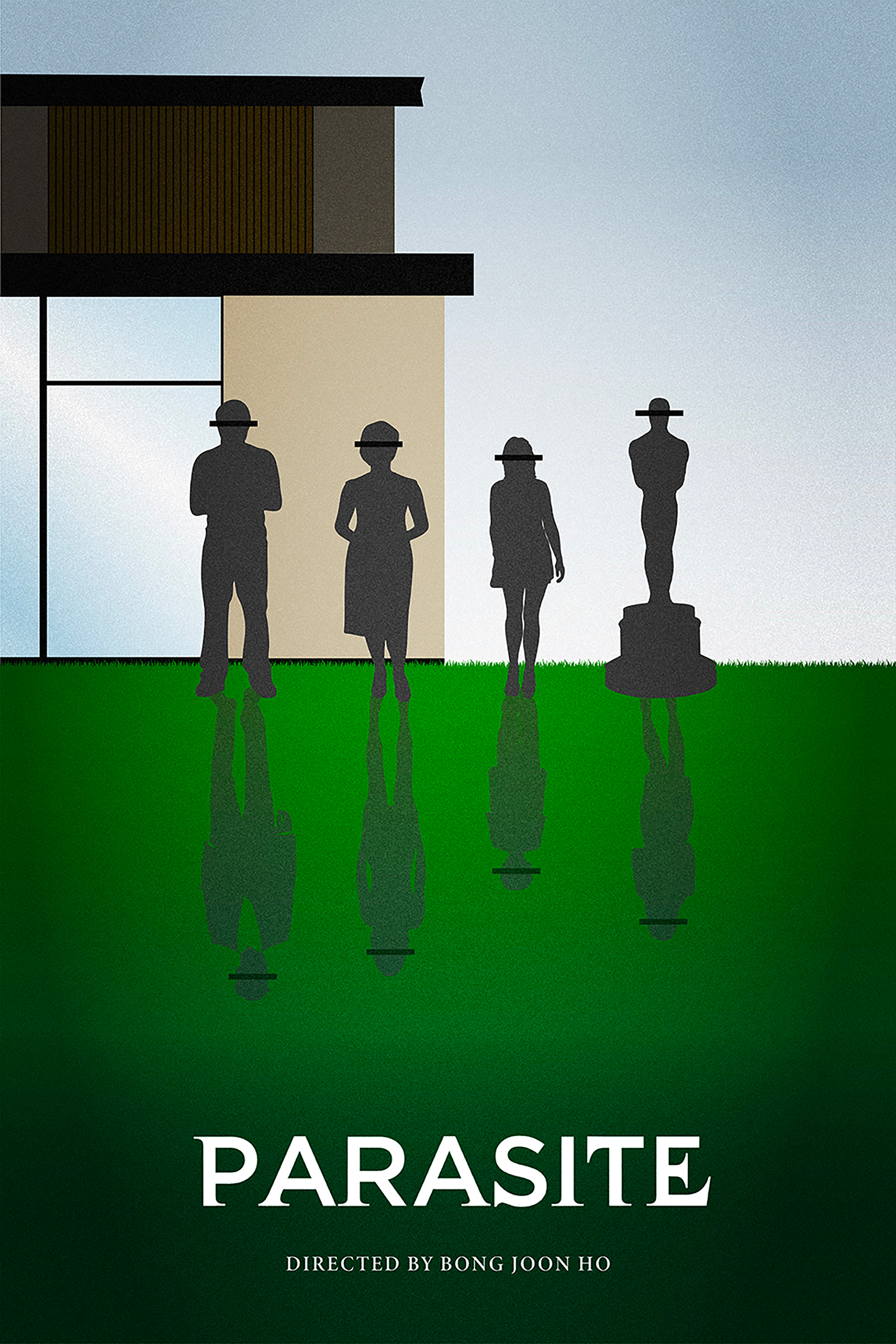
Parasite
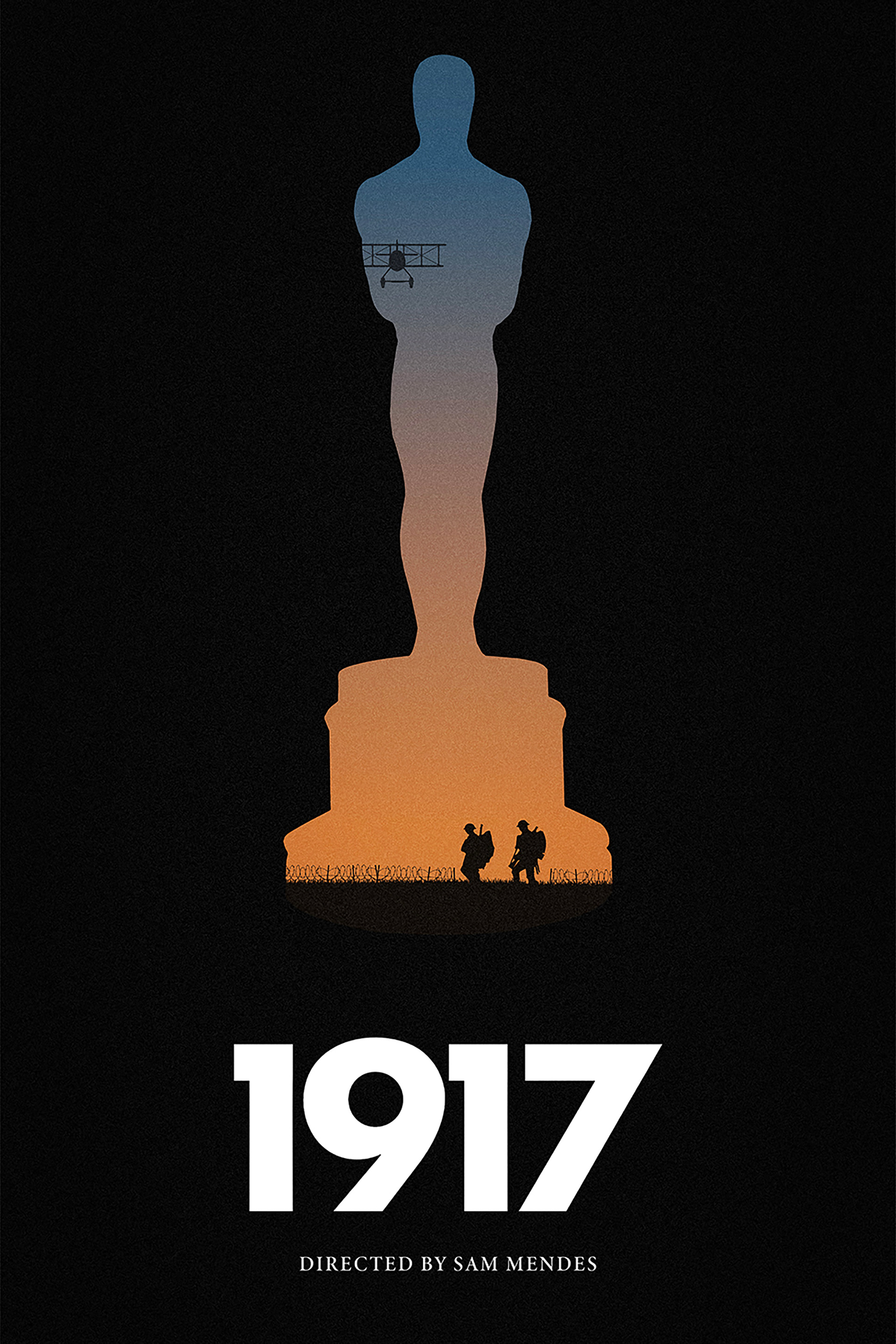
1917
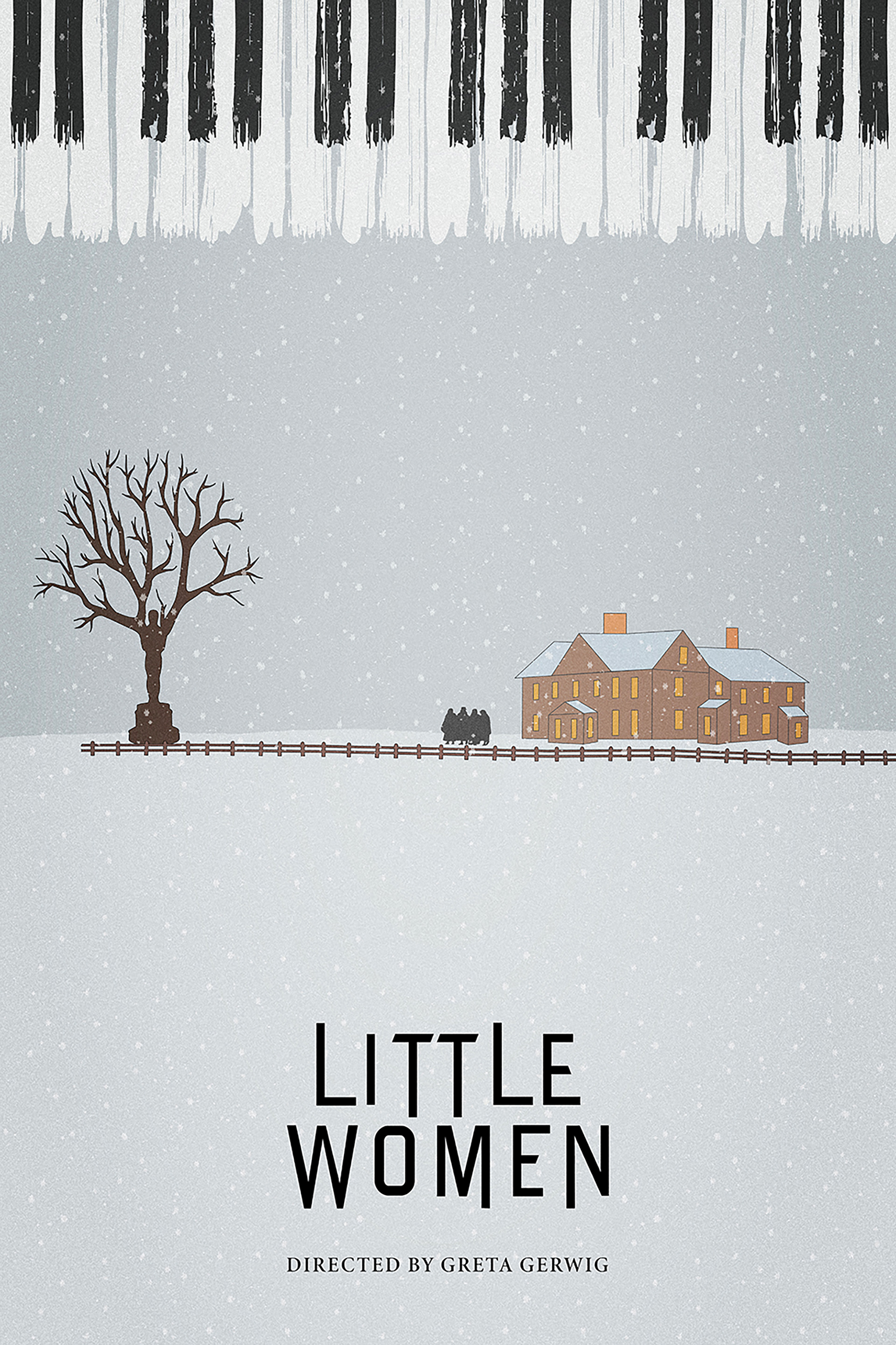
Little Women
2021 - Challenges of the Times
2021 was an unusual year for the Oscars due to the pandemic. Many films were delayed, and fewer were released that year. The awards ceremony itself was also quite different. Leading up to creating these posters, I had only seen three of the nominated films. Usually, I make a point to watch all the films before designing the posters, but most just didn’t catch my interest this year. I had to rely on trailers, marketing, and synopses for the others.
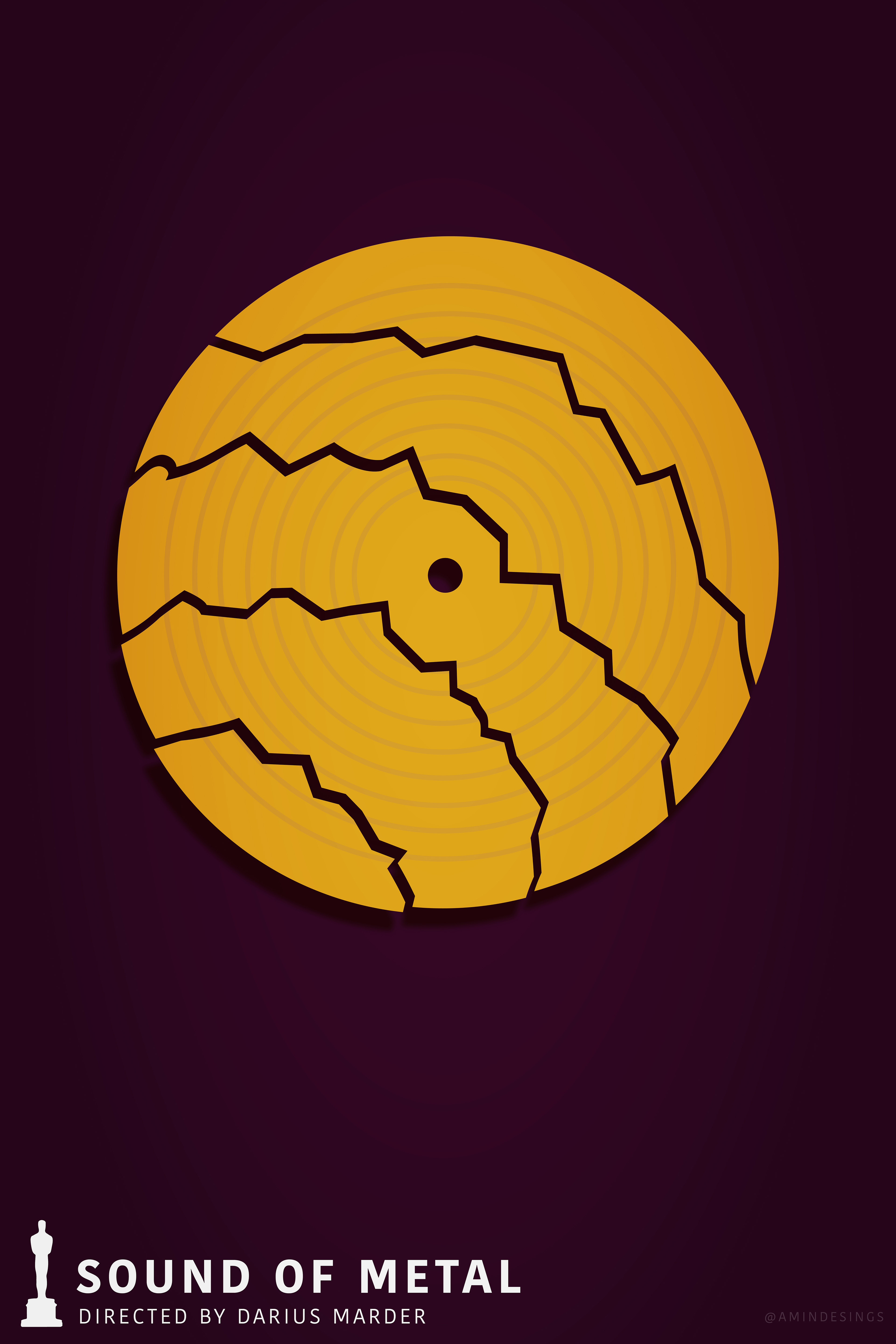
For this series, I chose to stick to a specific colour palette: gold, purple, and a neutral beige. Gold was an obvious choice for its association with the prestige of the Oscars. I designed each poster around a single icon that represented the film, some more abstract than others. Although there were challenges, I was really pleased with how it all turned out, especially the colour palette. *One exception was the mostly grey poster for "Mank," which was a black-and-white film.

Sound of Metal
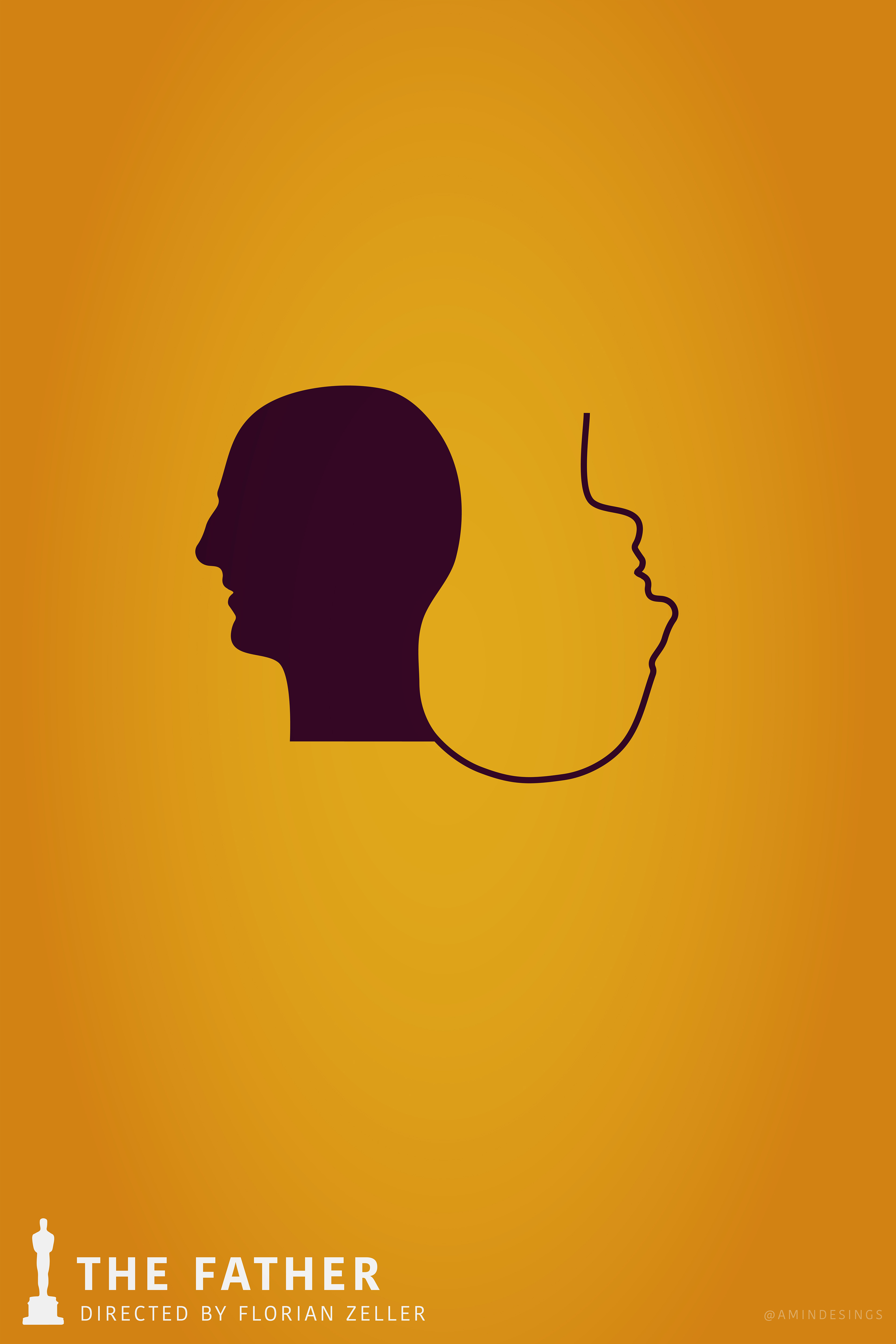
The Father
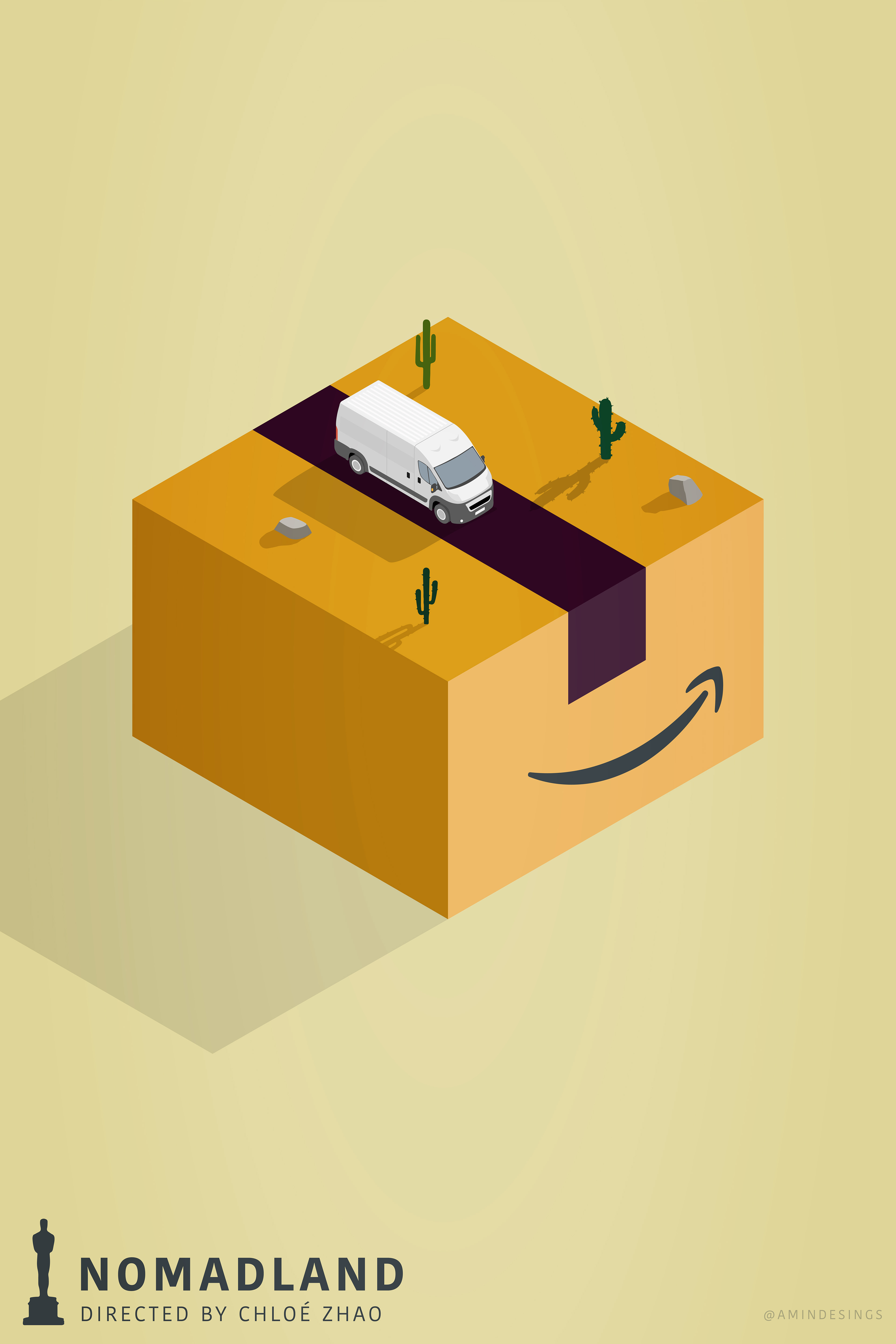
Nomadland
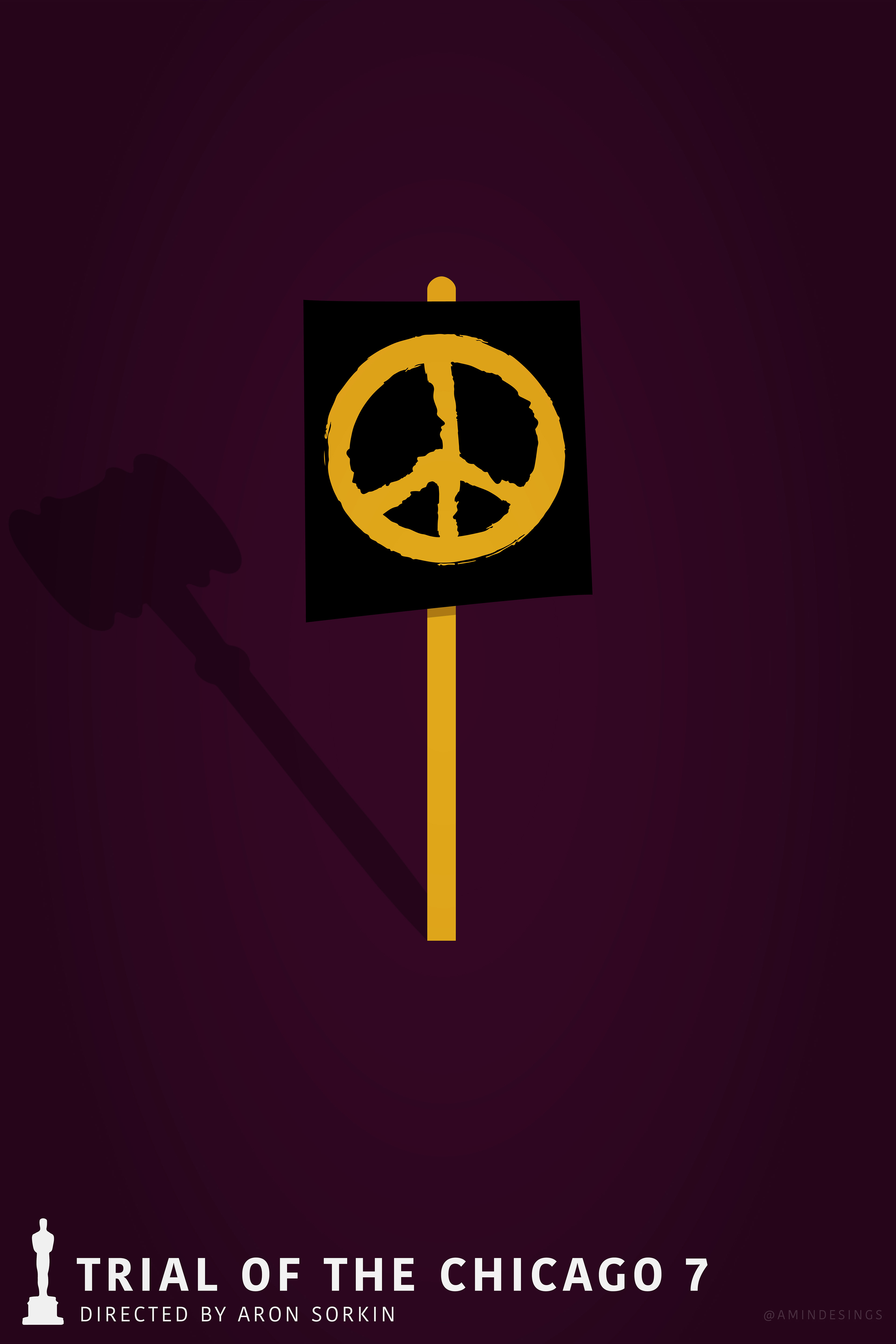
Trial of the Chicago 7
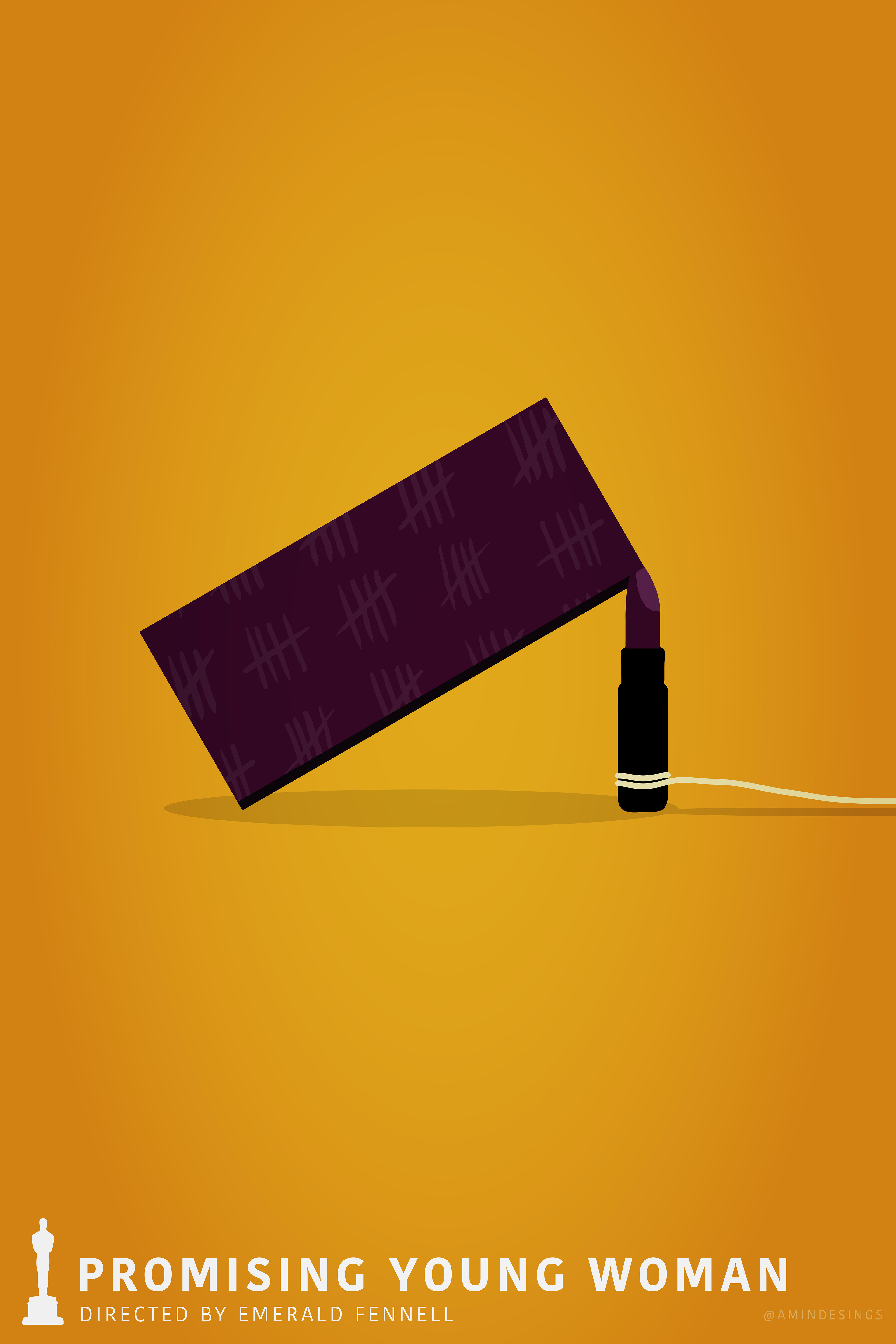
Promising Young Woman
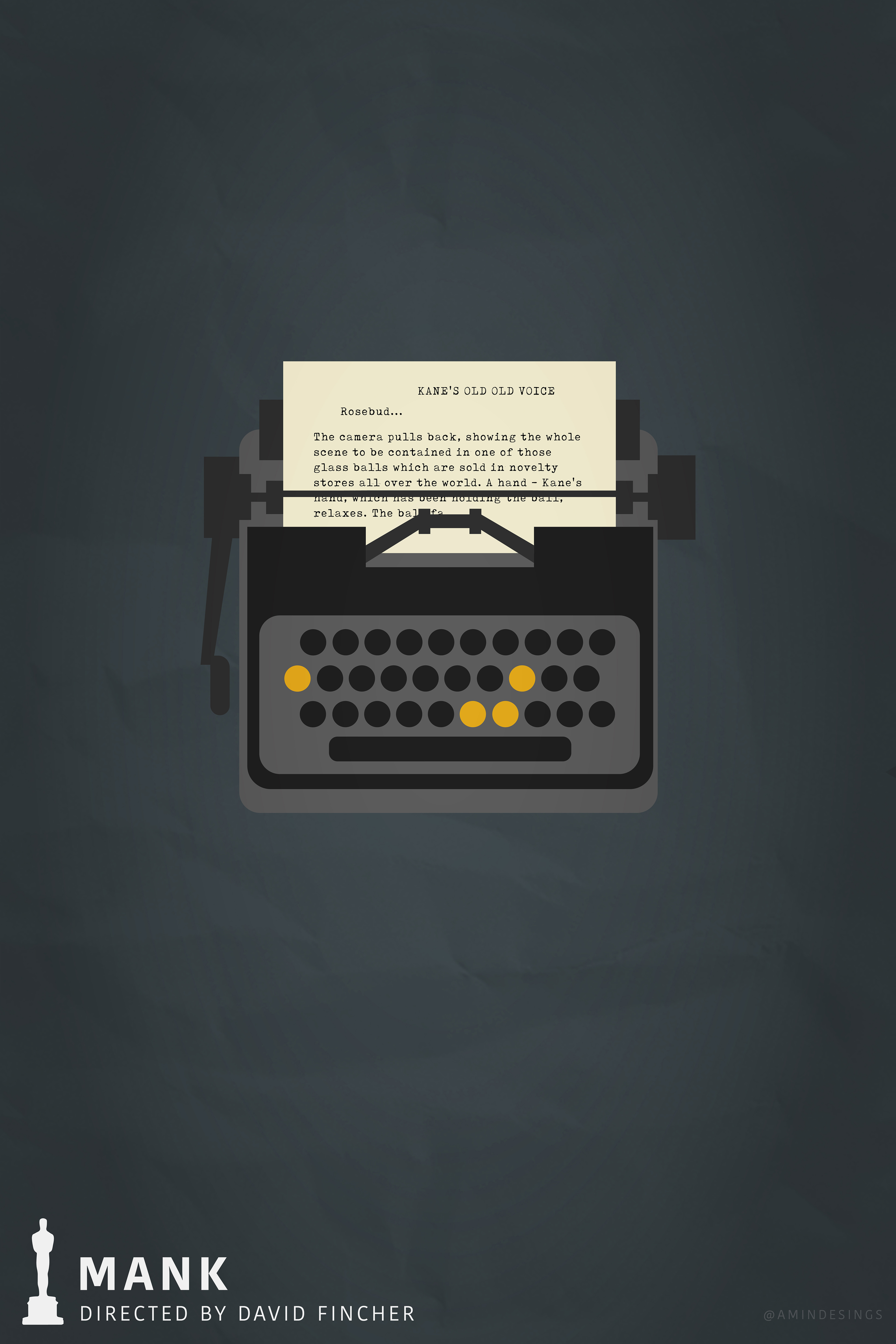
Mank
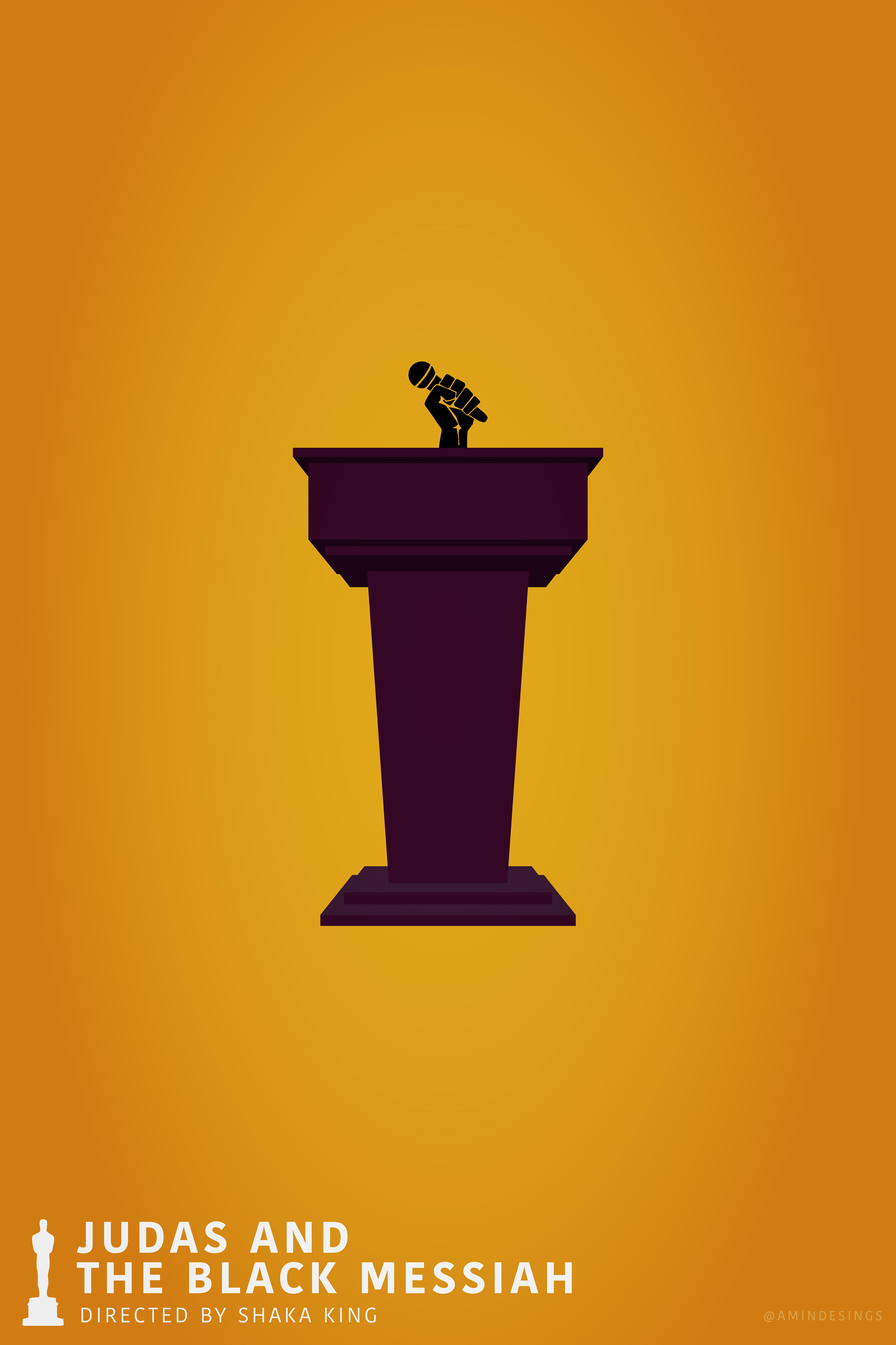
Judas and the Black Messiah
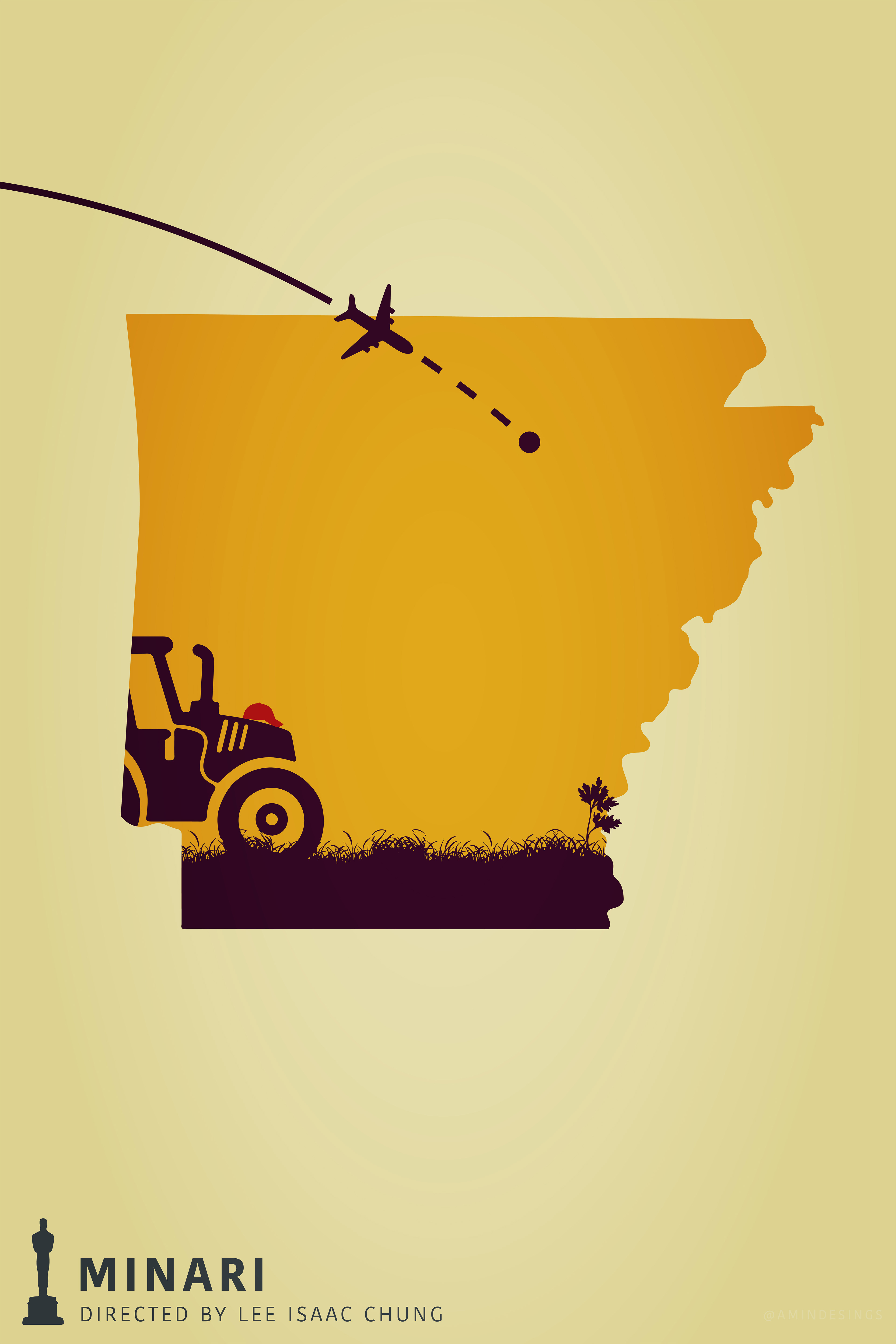
Minari
2022: Exploring New Ideas
This year, I took a completely different approach. I wanted to experiment with Photoshop more, moving away from the vector-based work of previous years. I centred each poster around a significant quote from the film, combined with an image of the main character(s). My goal was to make the characters pop out of the text, creating a layered effect.
I also chose stock photos for the backgrounds that related directly to the films, like a desert for Dune or sheet music for CODA. The typography was kept bold and simple to allow the image behind it to come through. I’m glad I tried something new, and while some posters like Drive My Car and CODA turned out really well, I felt there was more I could have done to refine the series. Nevertheless, it was a strong concept, and I learned a lot from this experiment.
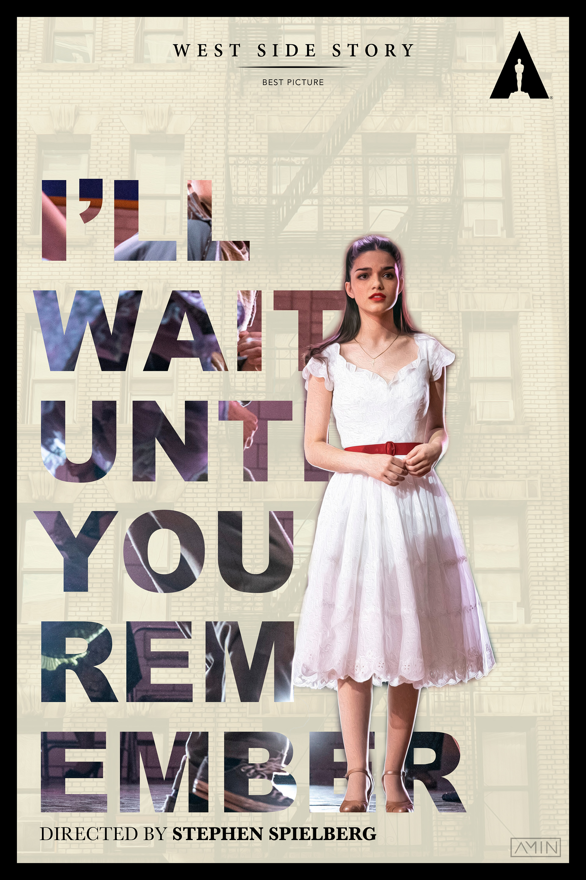
West Side Story
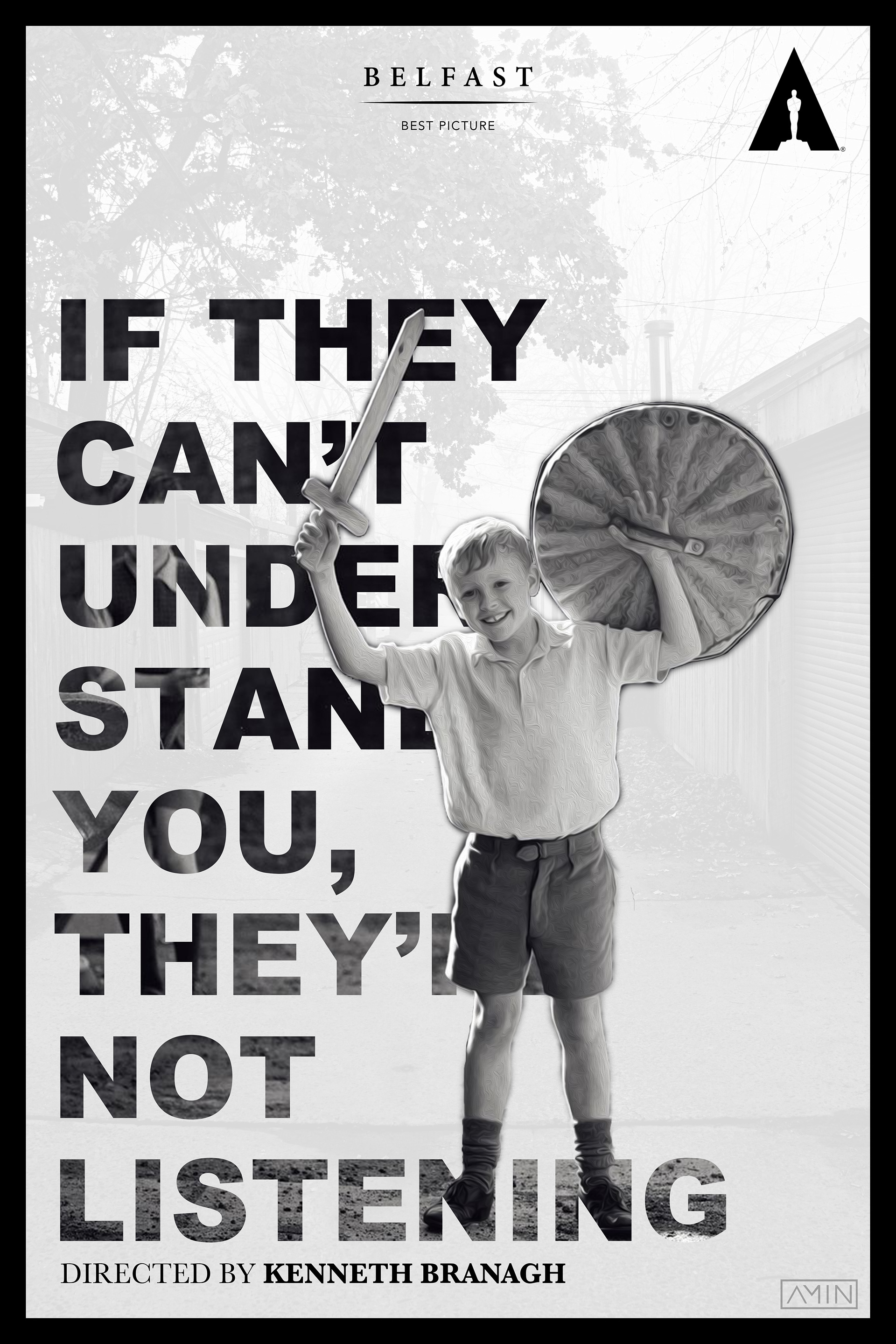
Belfast
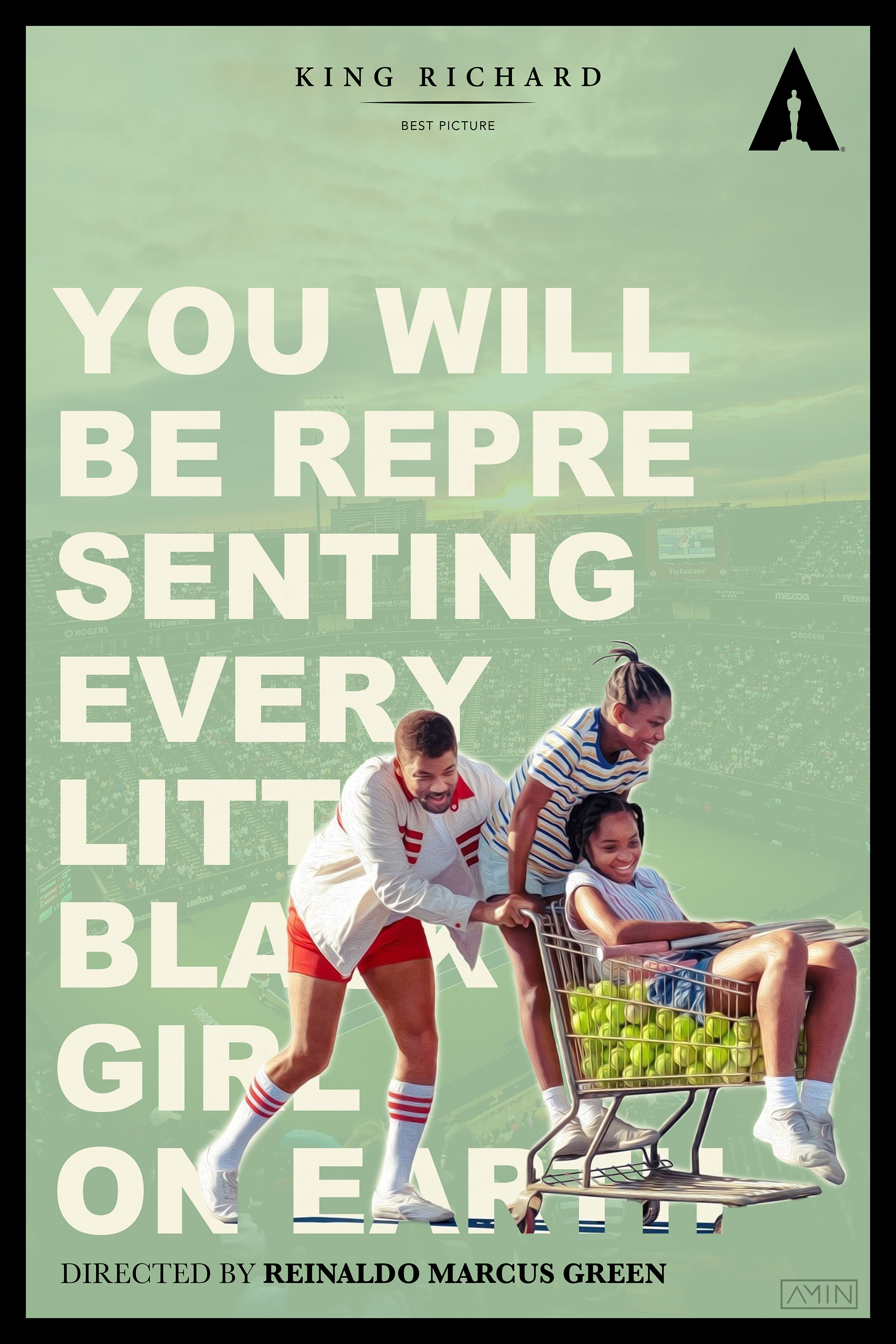
King Richard
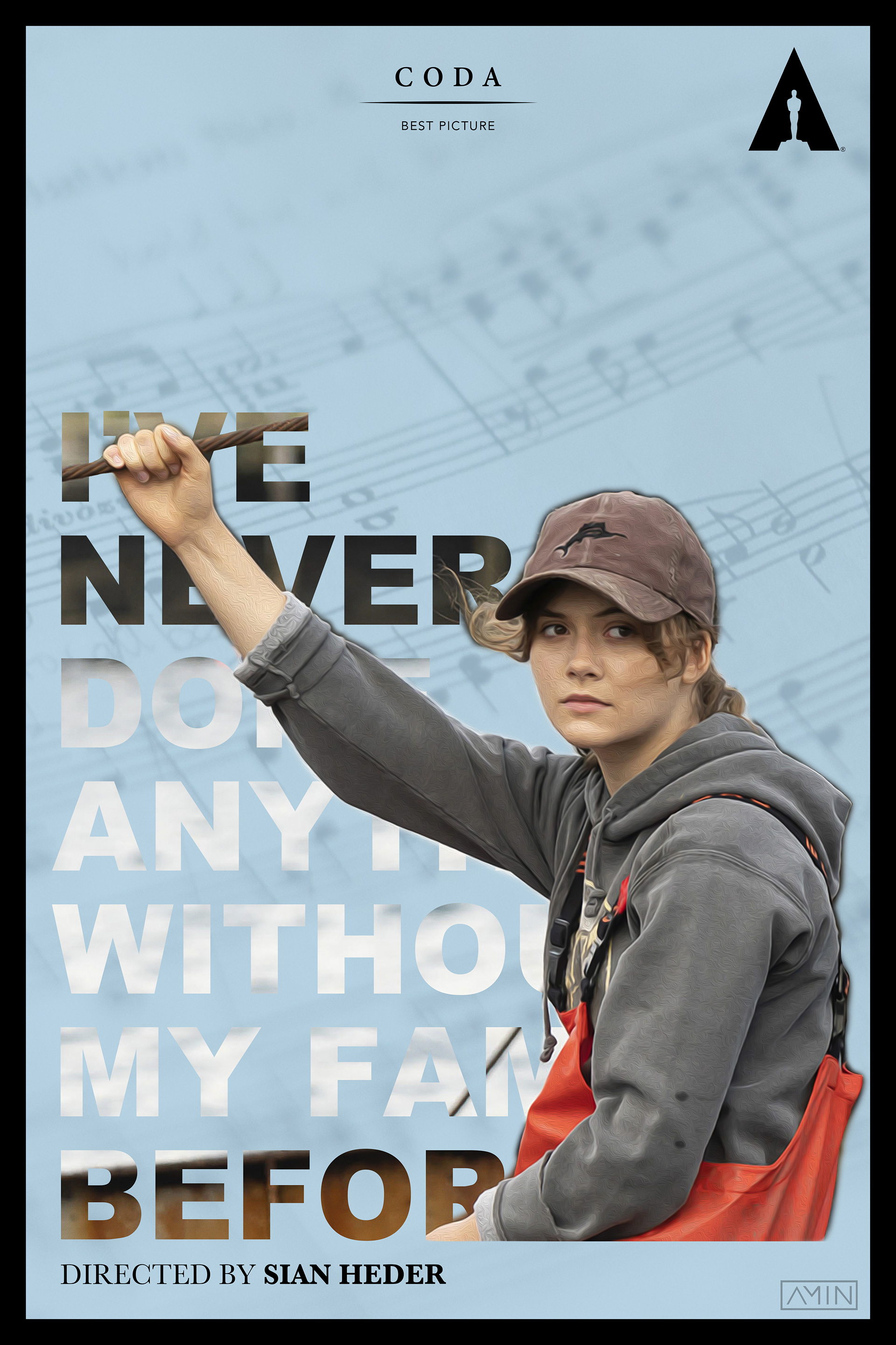
Coda
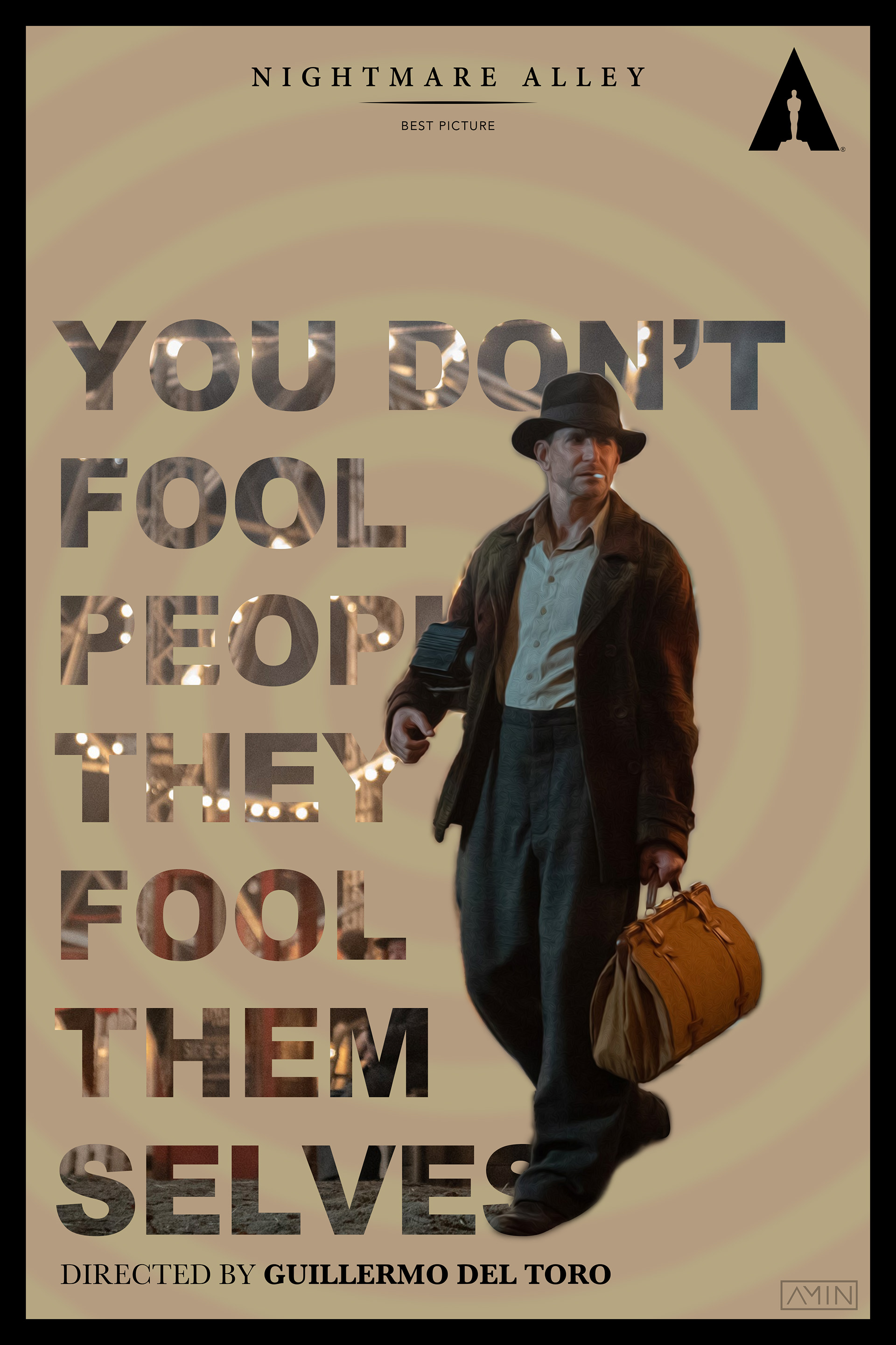
Nightmare Alley
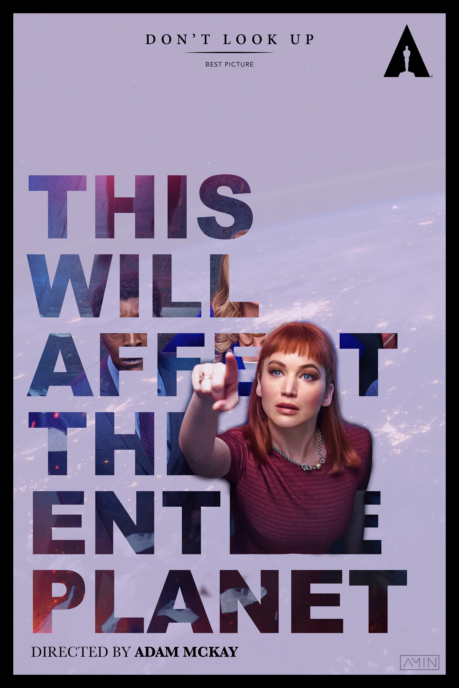
Don't Look Up
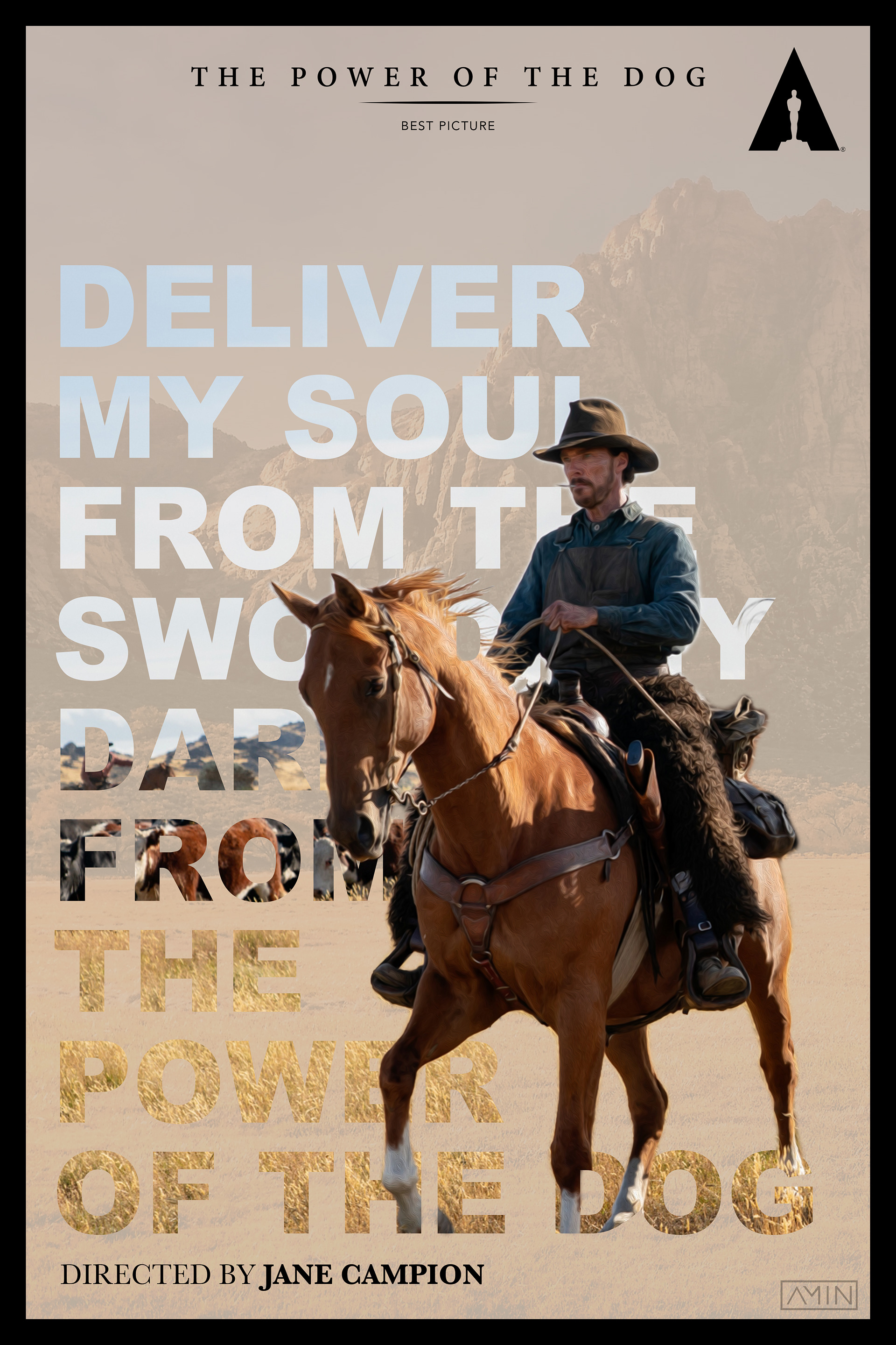
The Power of the Dog
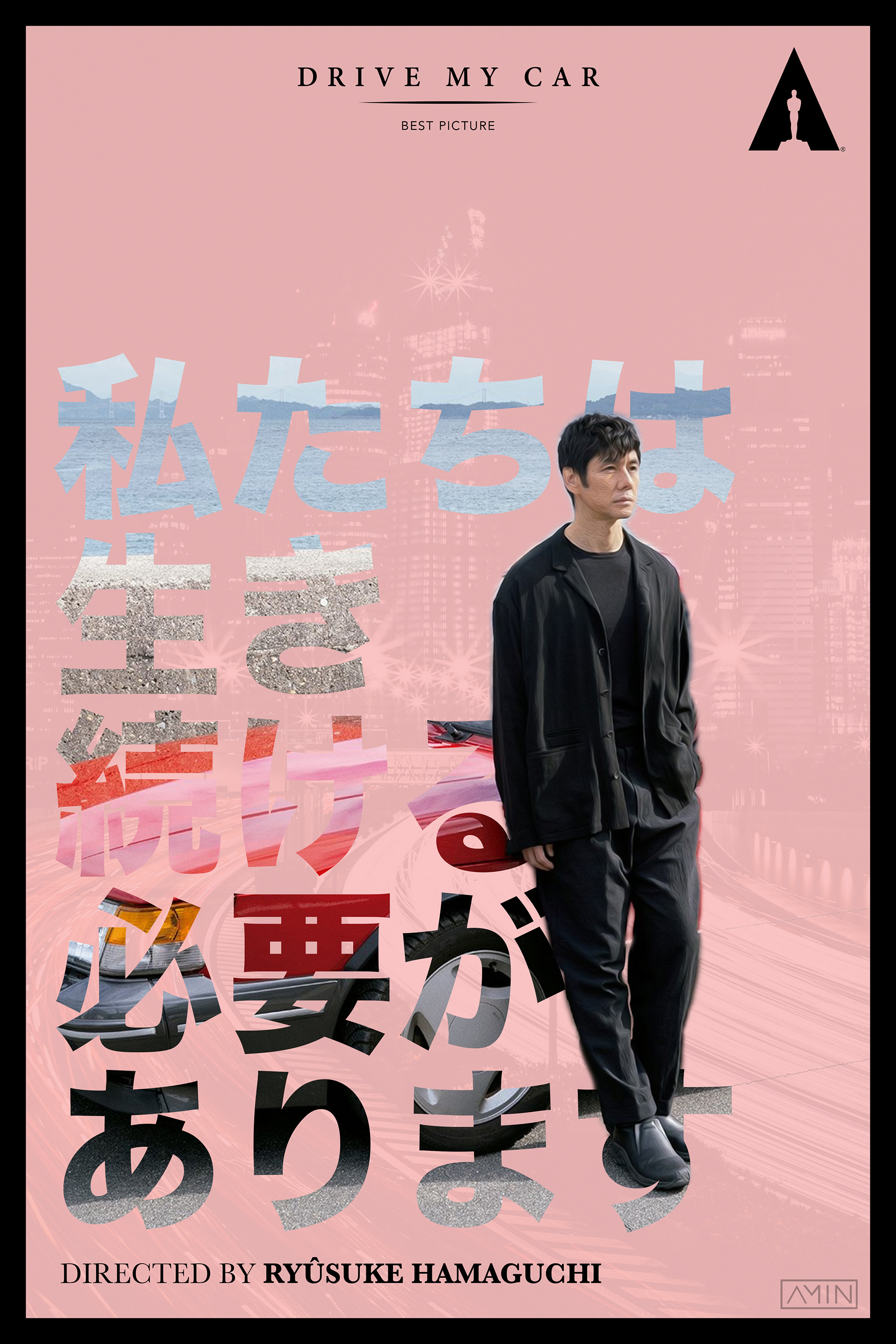
Drive My Car
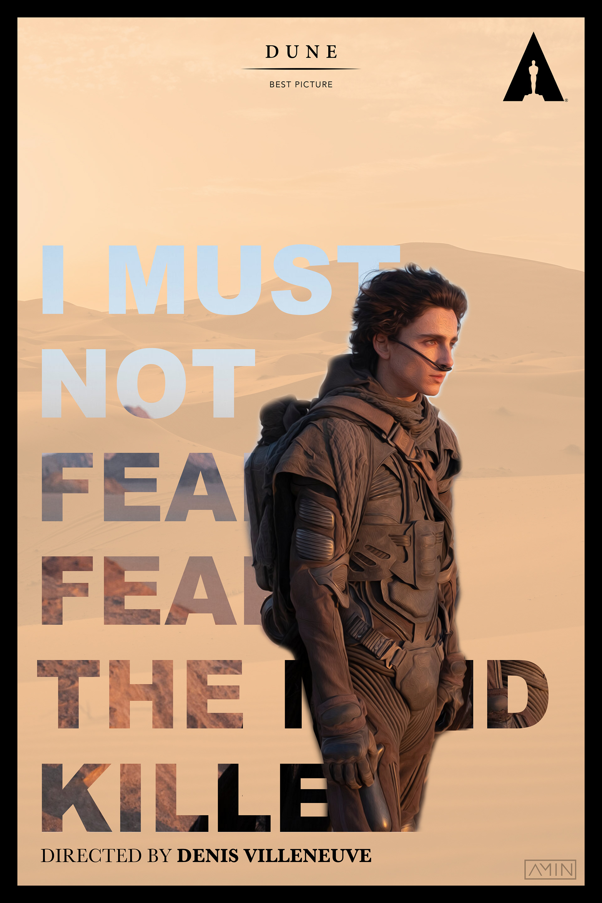
Dune
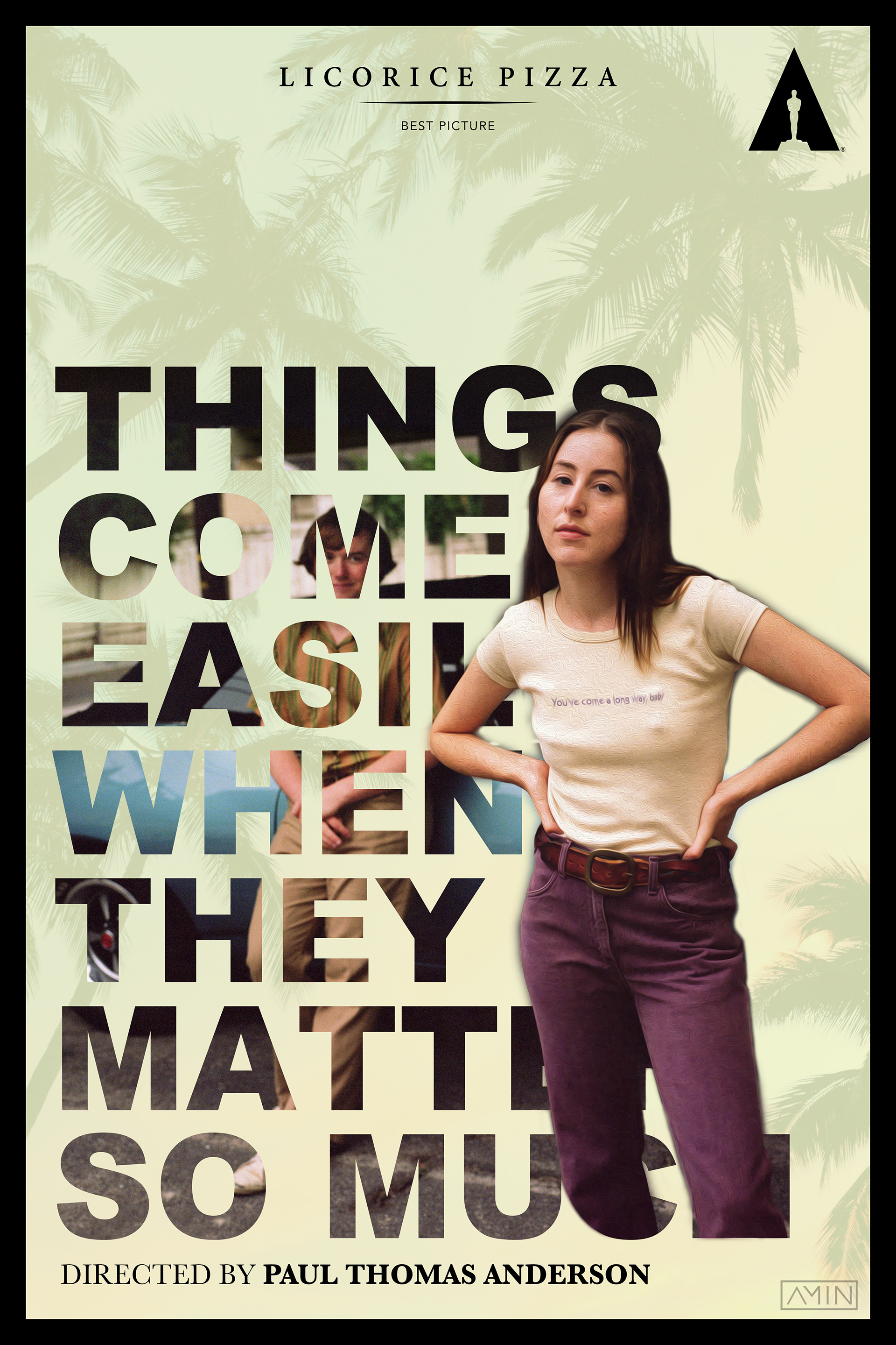
Licorice Pizza
2023 - A Return to Form
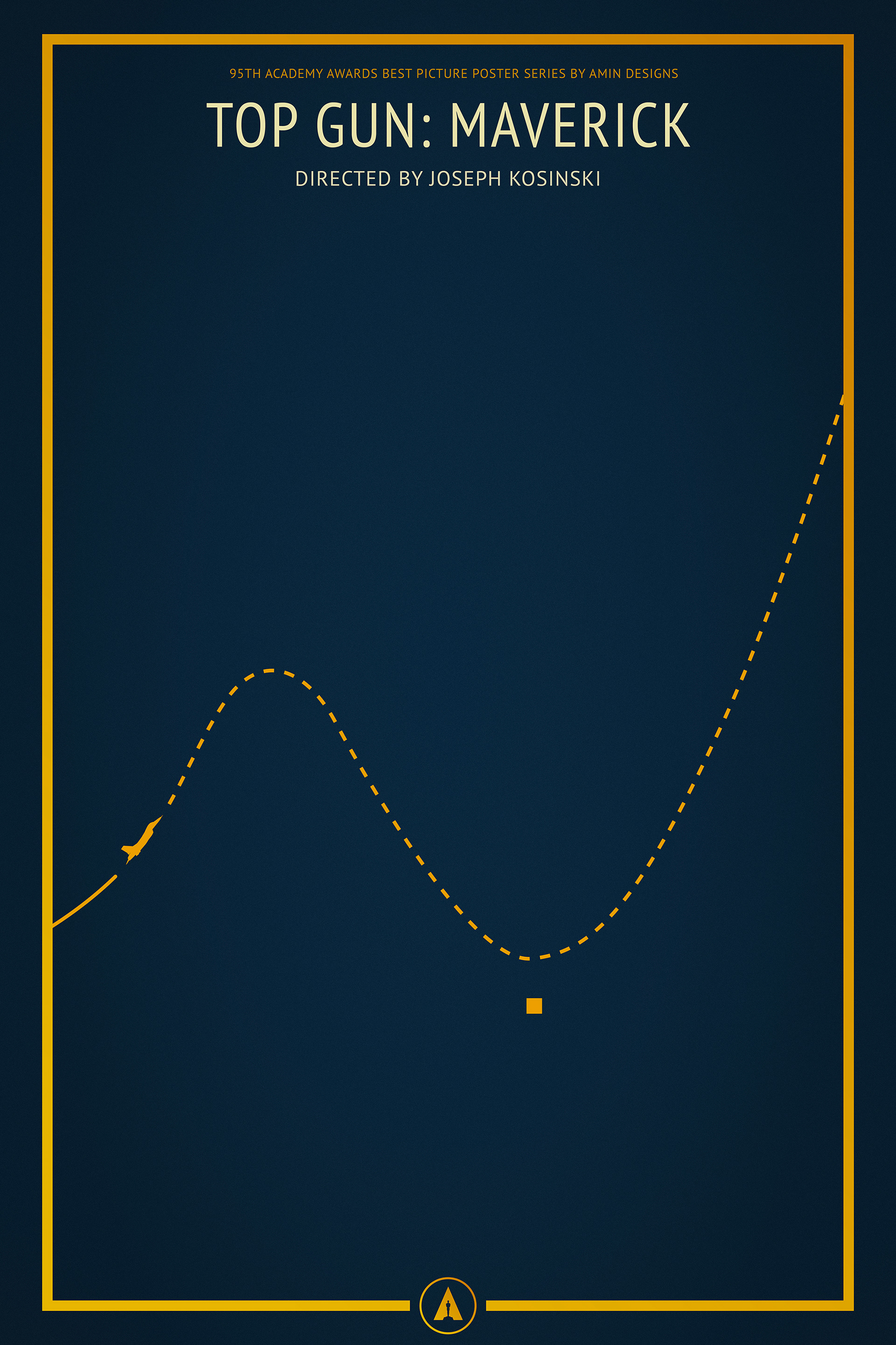
After the detour in 2022, I decided to return to what I knew best: minimalist posters. I wanted to build on the success of my 2021 series, which had received positive feedback, but this time I aimed to simplify even further. I challenged myself to use as few elements as possible, relying heavily on thin lines to tell the story within each poster (in the end I only managed to do so for about half of them).
I created a consistent template for all 10 posters, keeping the titles, frames, and Oscar logo uniform. Like in 2021, I used gold for the main elements, but this time I reserved it for the icons, with the backgrounds varying in colour. My goal was to convey the essence of each film through minimal design. The Top Gun: Maverick poster stood out as the strongest, with its fully minimalist approach capturing the film’s story in a single frame.
Overall, this was one of my favourite series, both visually and conceptually. The colour palette worked beautifully across the set, and apart from a couple of posters, I believe the series perfectly captures the essence of each film.

Top Gun: Maverick
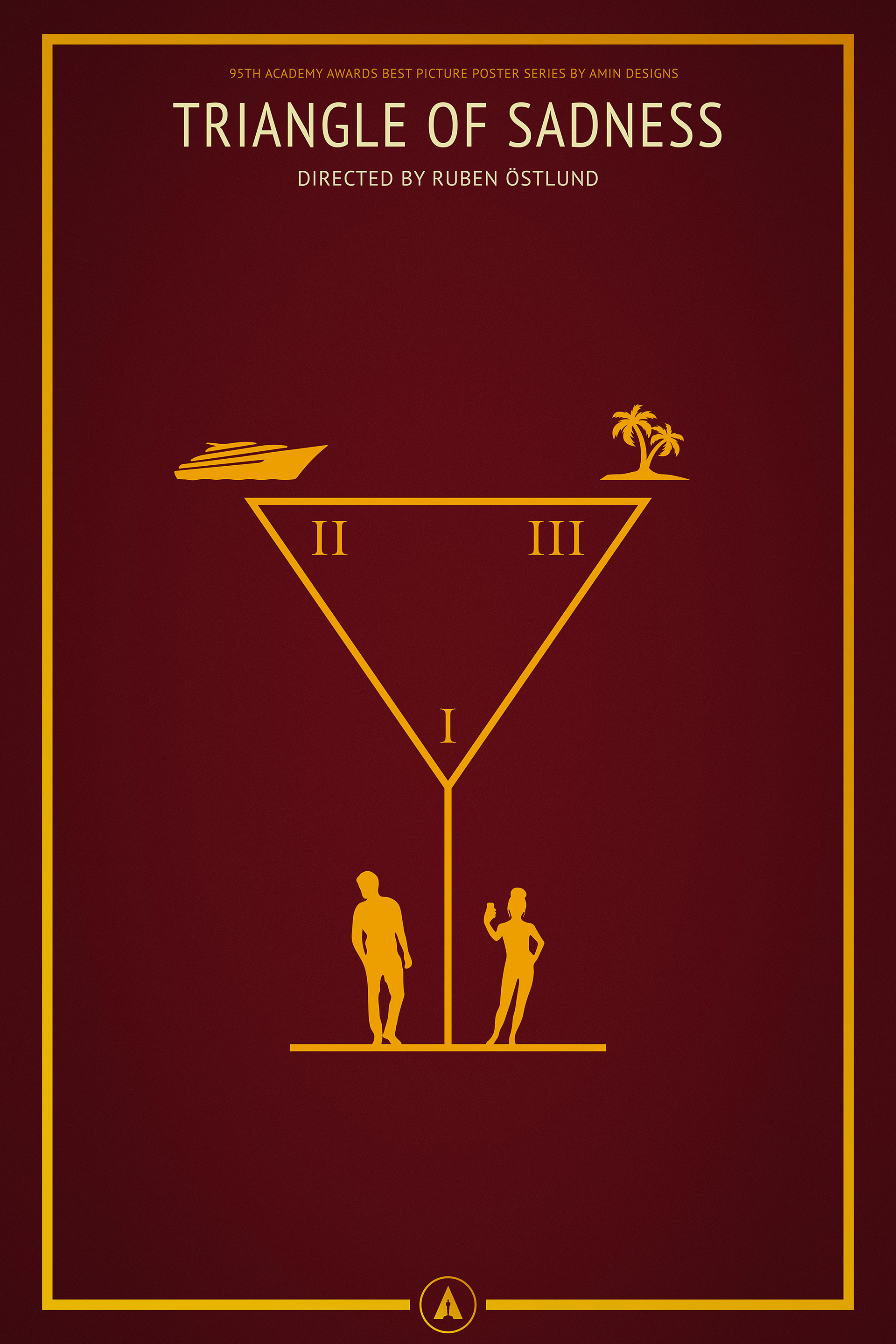
Triangle of Sadness
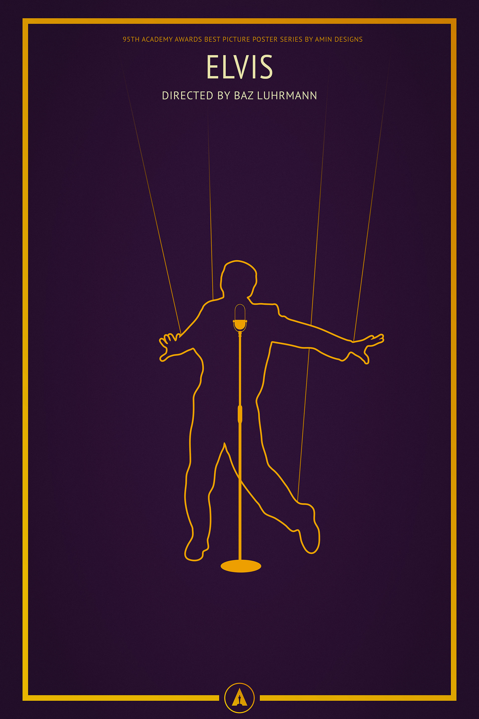
Elvis
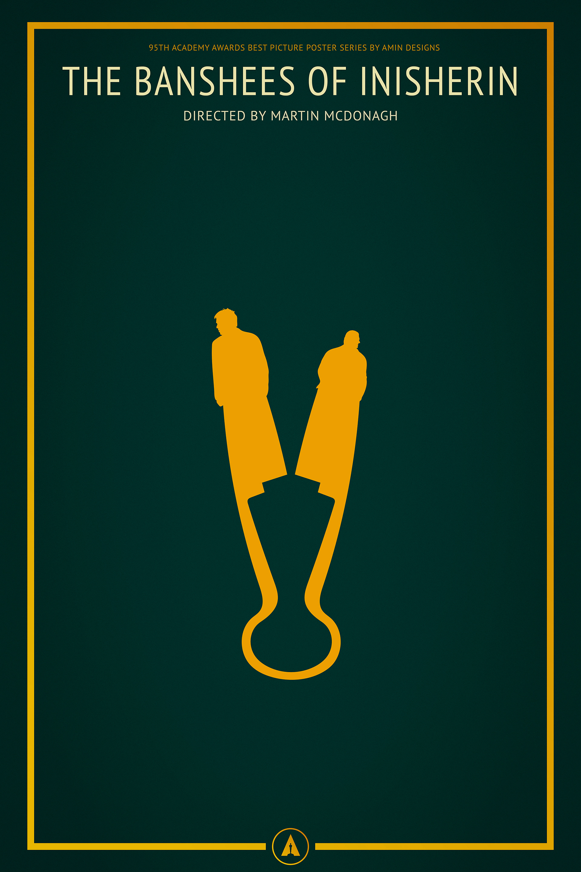
The Banshees of Inisherin
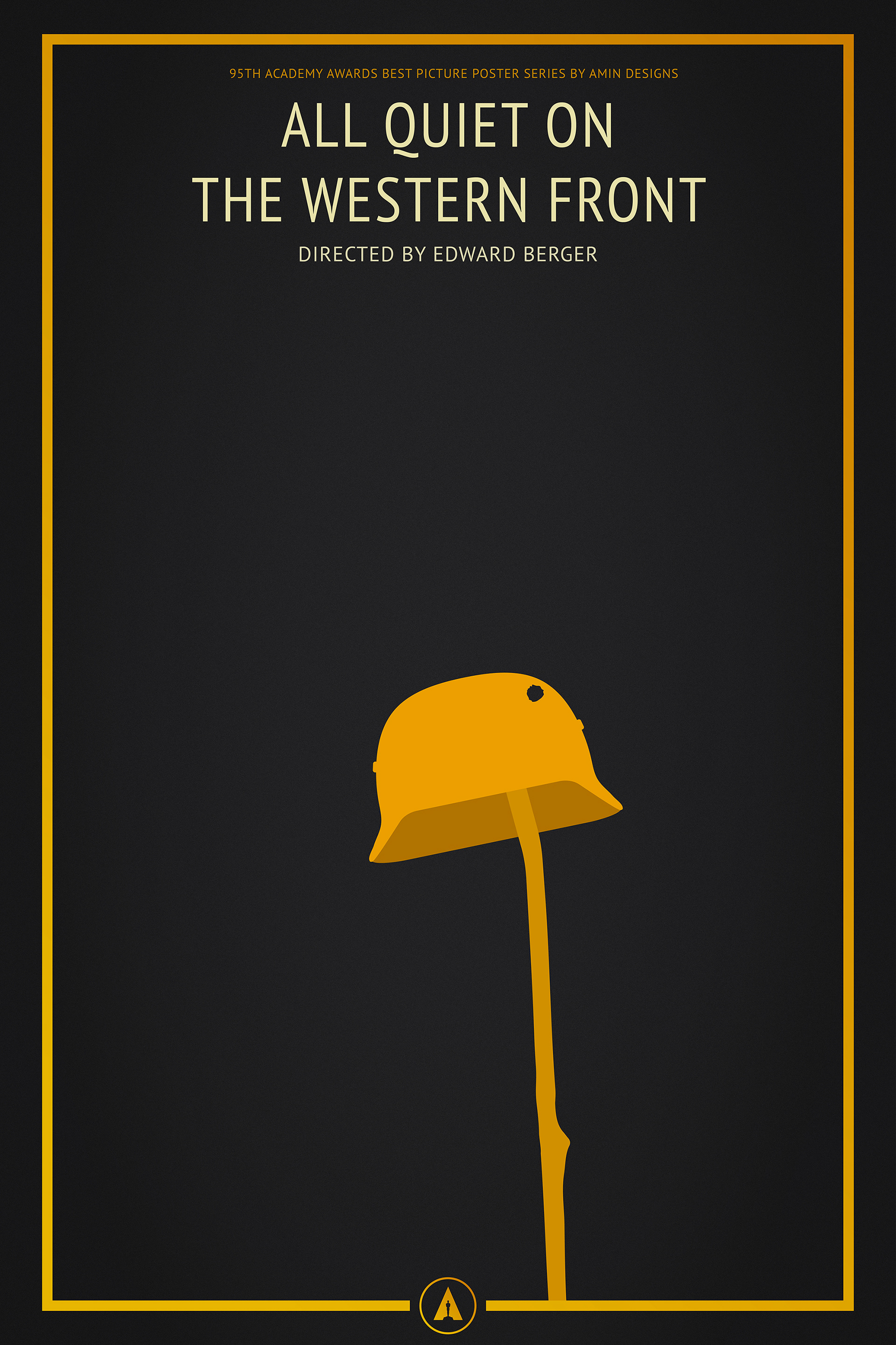
All Quiet on the Western Front
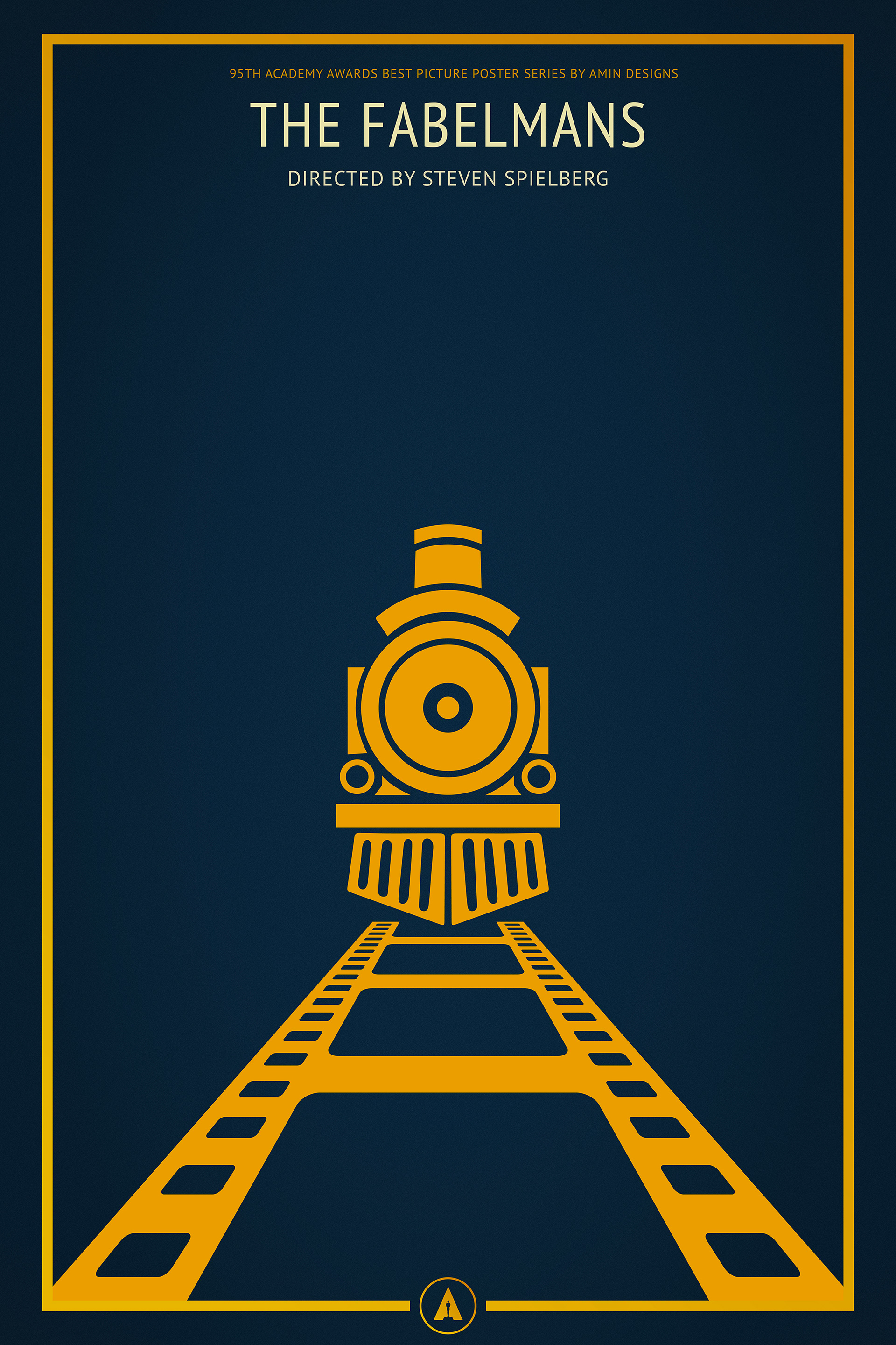
The Fablemans
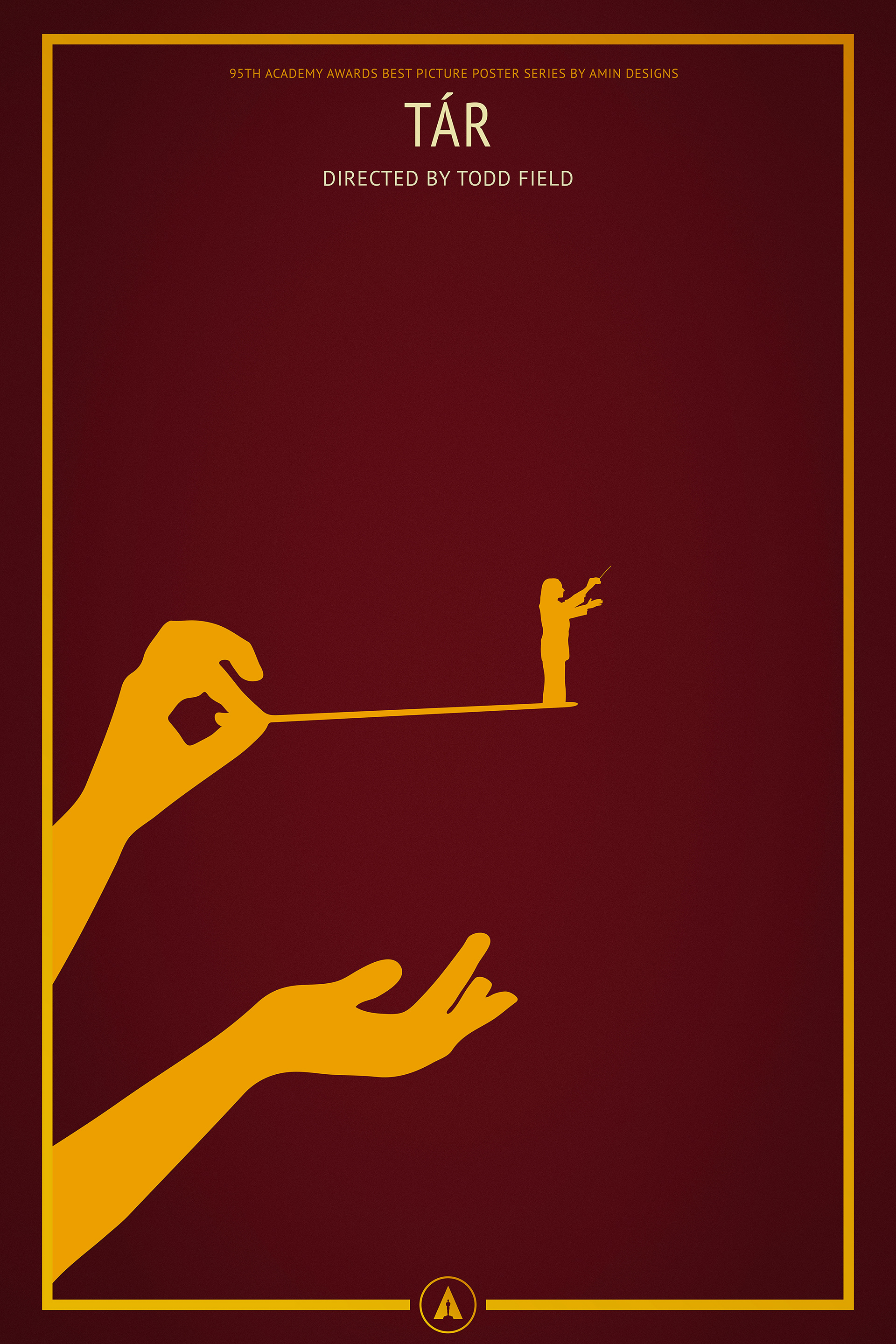
Tár
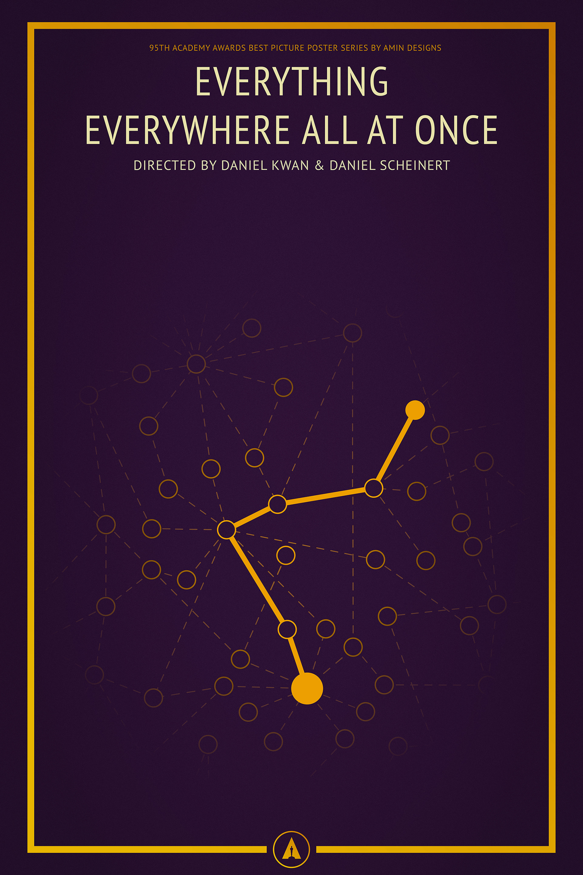
Everything Everywhere All at Once
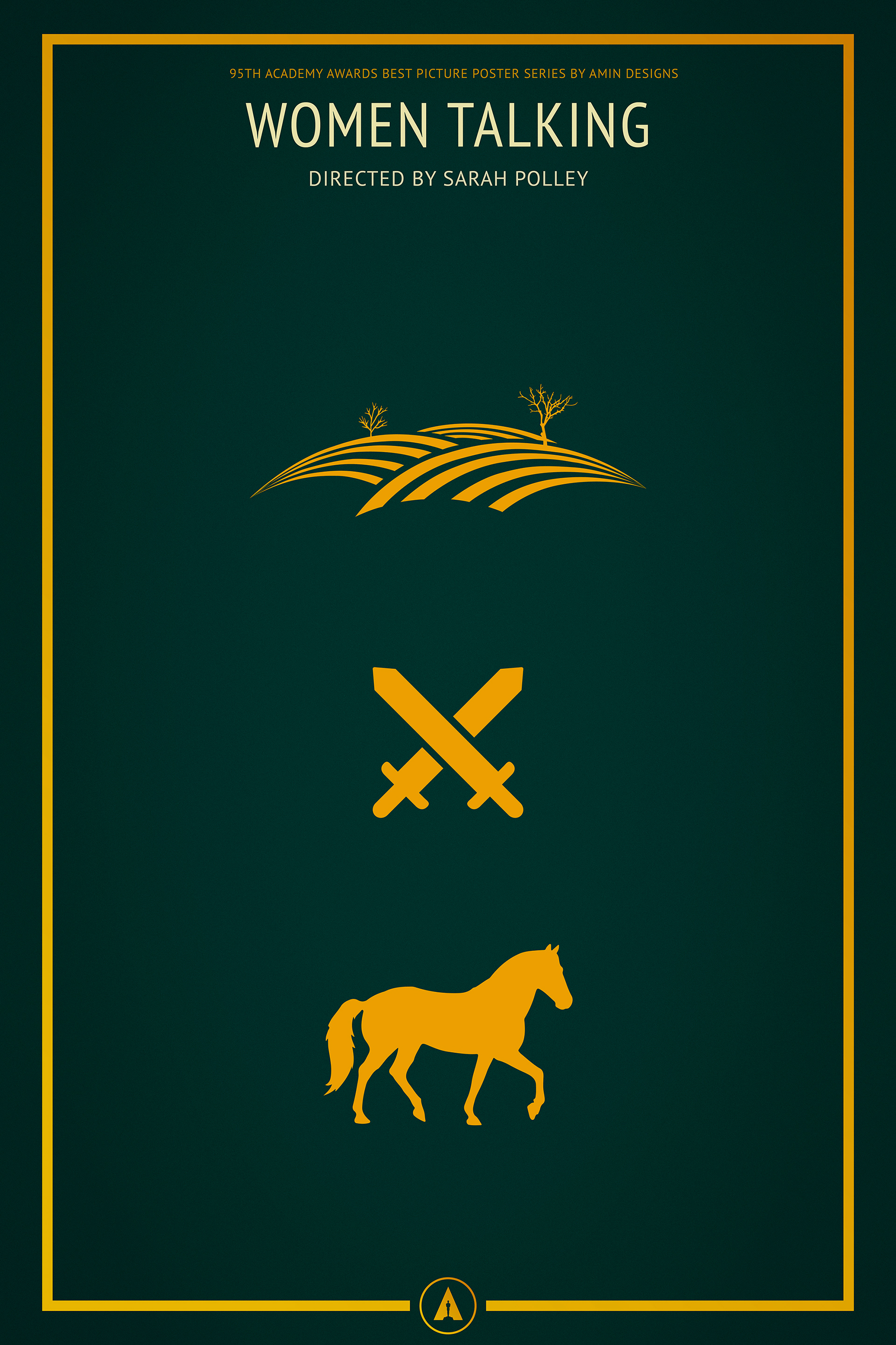
Women Talking
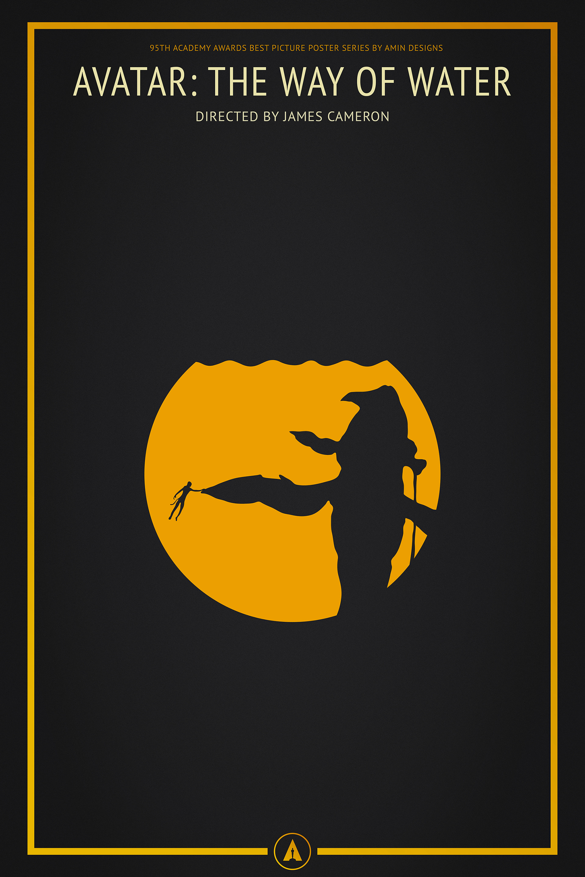
Avatar: The Way of Water
2024 - Hitting New Heights
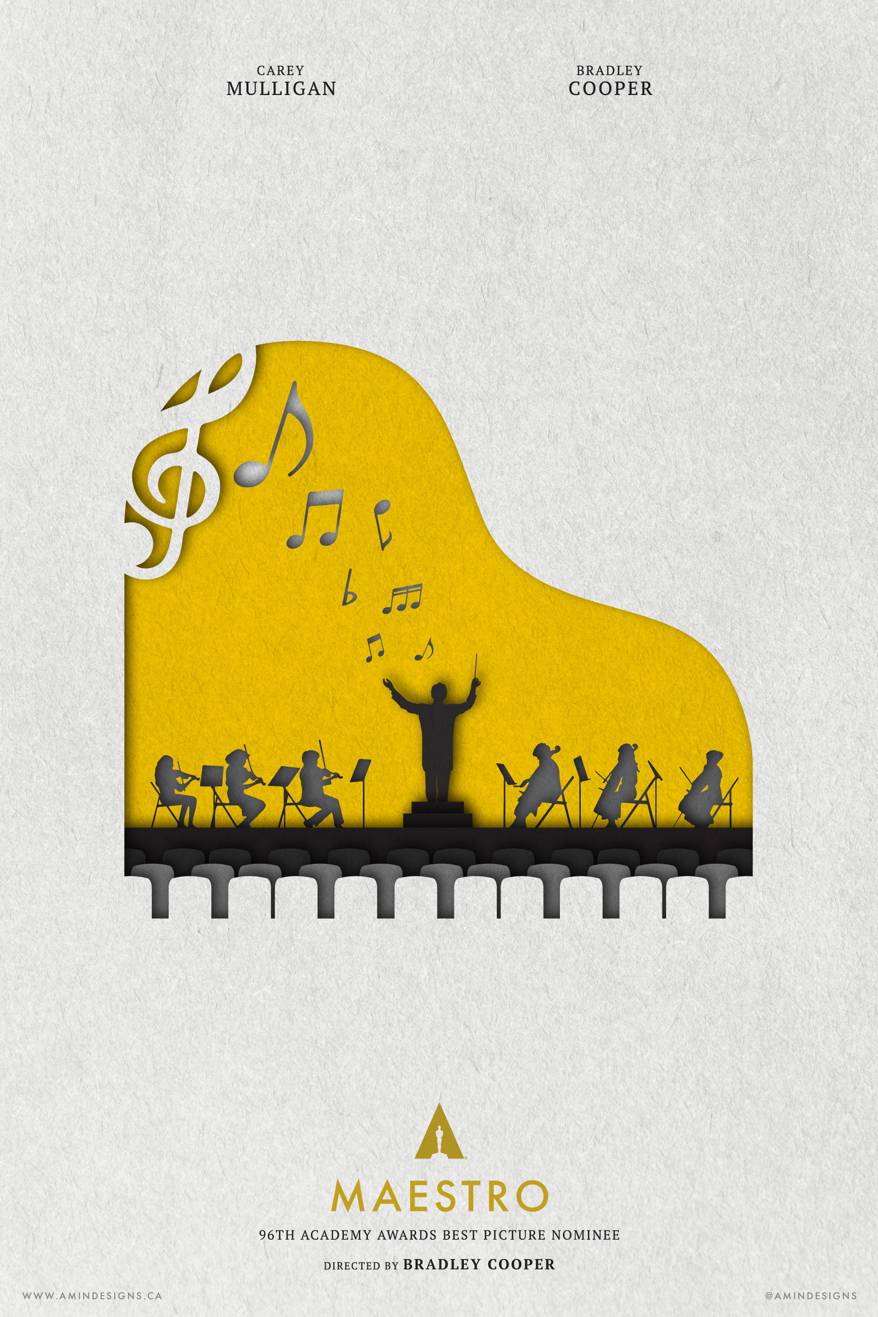
2024 marked a significant leap forward for me in terms of design skills. For the first time, I conceived the main concept of the series early on. I wanted to create a paper cutout effect within the posters—a new technique for me, as my previous work had been mostly flat. I aimed to add depth and texture, challenging myself to expand my skills and explore new design avenues.
I spent days sketching different ideas, carefully selecting a unique shape for each film that would serve as the main cutout. Each poster featured a specific colour palette, ensuring that no two were alike. Watching all 10 nominated films for the first time helped me immensely in coming up with concepts. I used character silhouettes and correlated shapes to create a window into each film's world, maintaining simplicity while adding layers of meaning.
The Maestro poster stands out as the strongest in the series, and perhaps one of the best posters I’ve ever created. It’s a perfect blend of strong concept, execution, and clever use of negative space. This is definitely one of my favourite series; I loved how each poster turned out. Although some films were challenging to represent, I’m proud of how well the series came together, both as individual pieces and as a cohesive set.
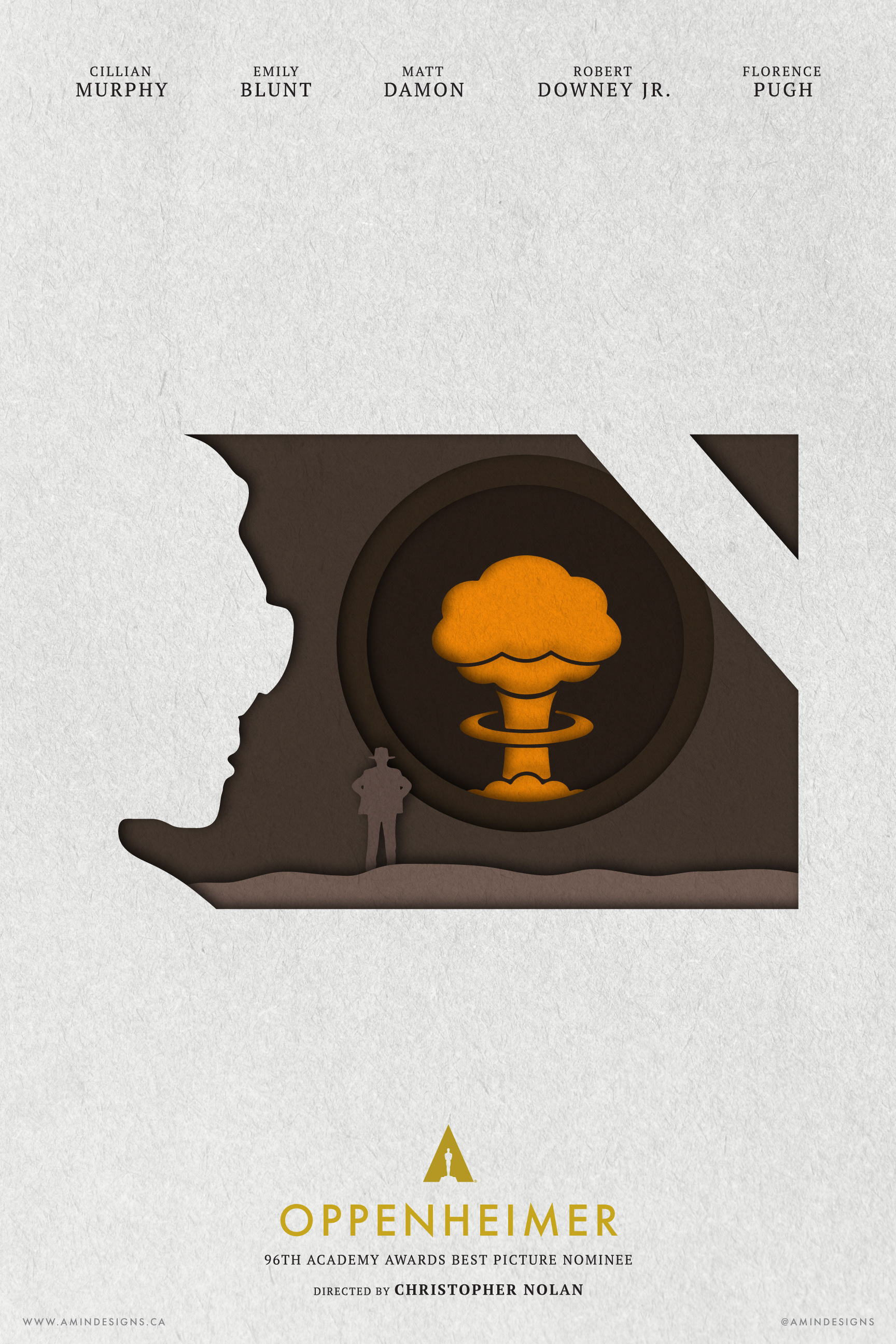
Oppenheimer
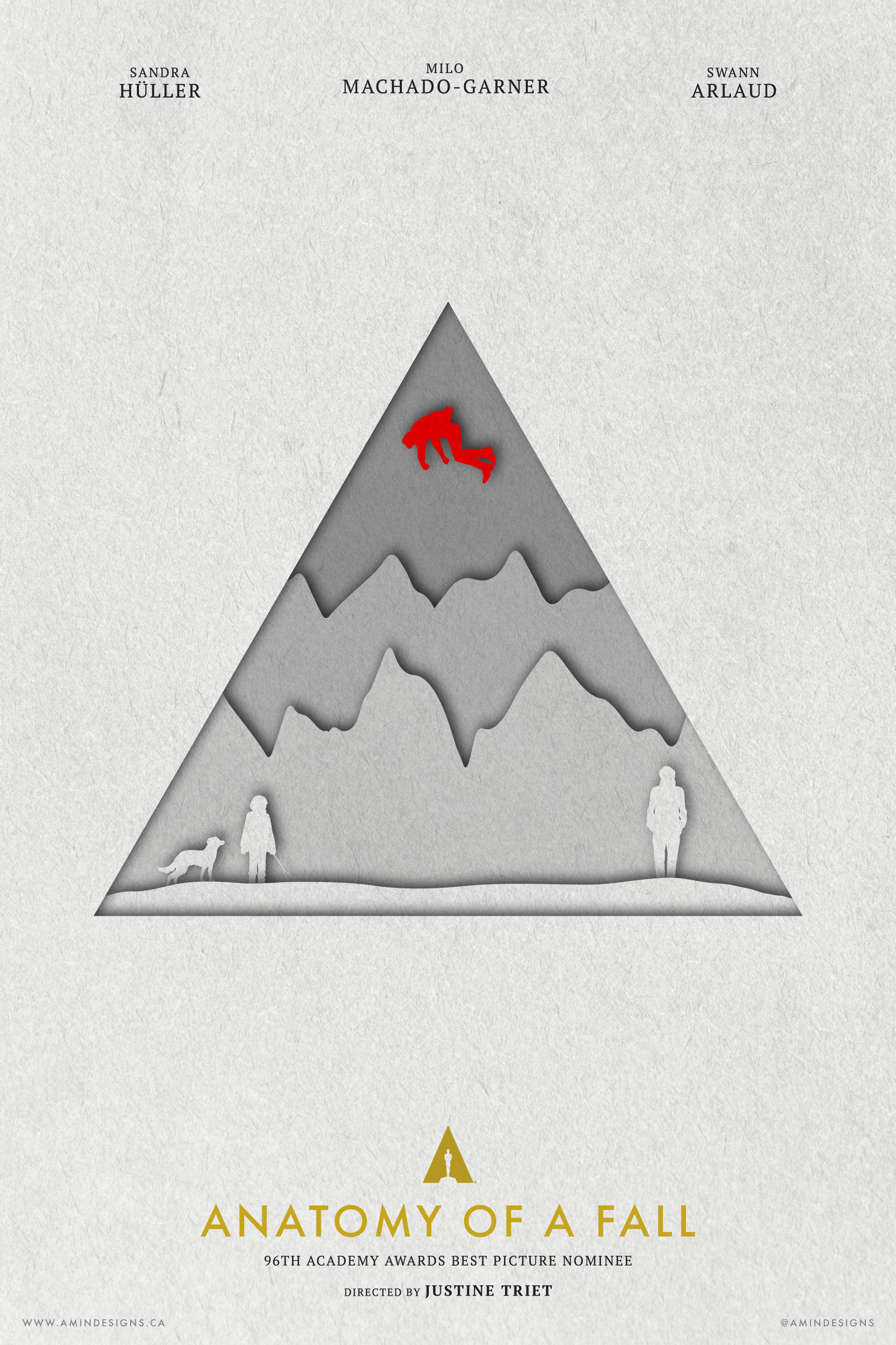
Anatomy of a Fall
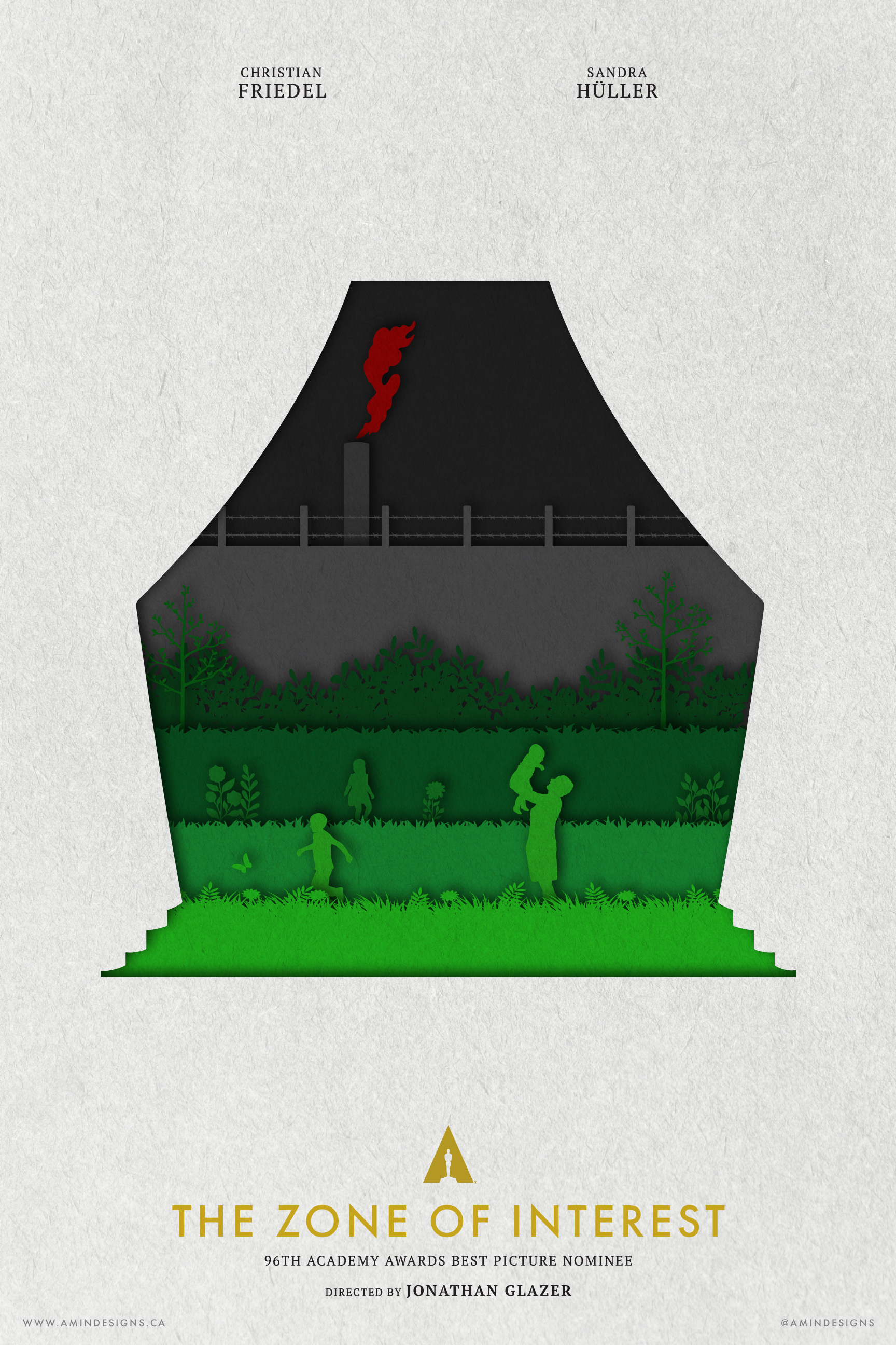
The Zone of Interest
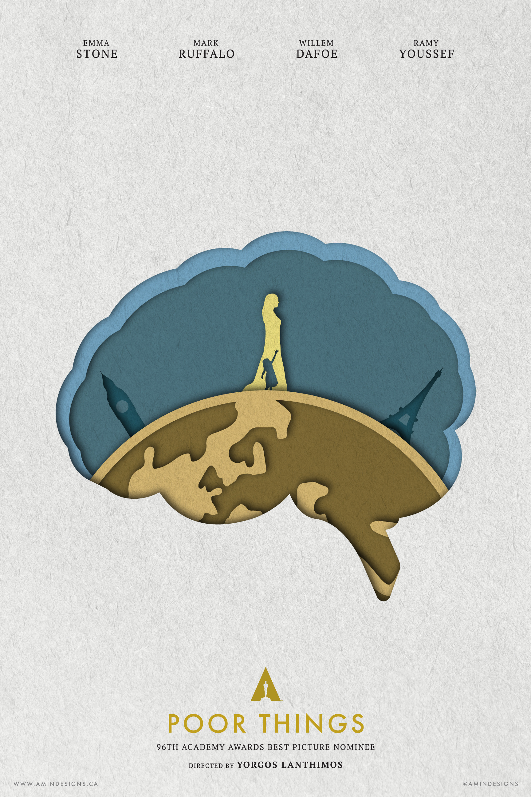
Poor Things

Maestro
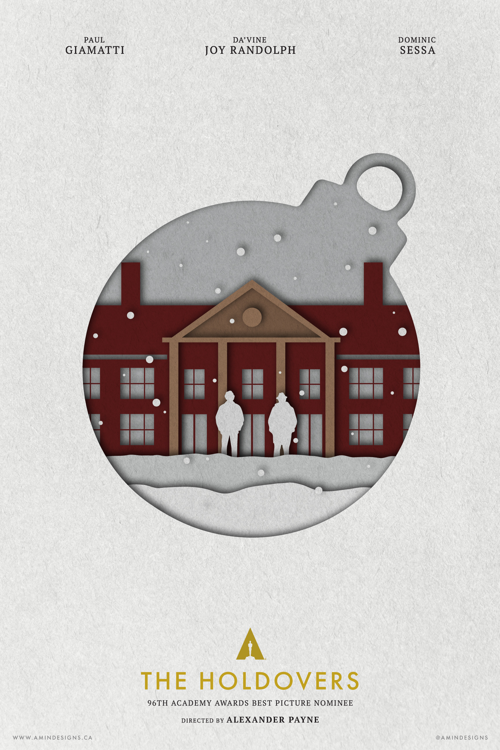
The Holdovers
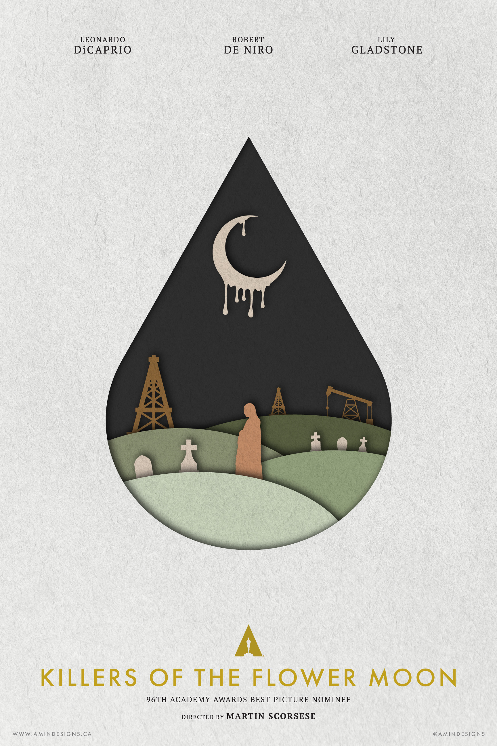
Killers of the Flower Moon
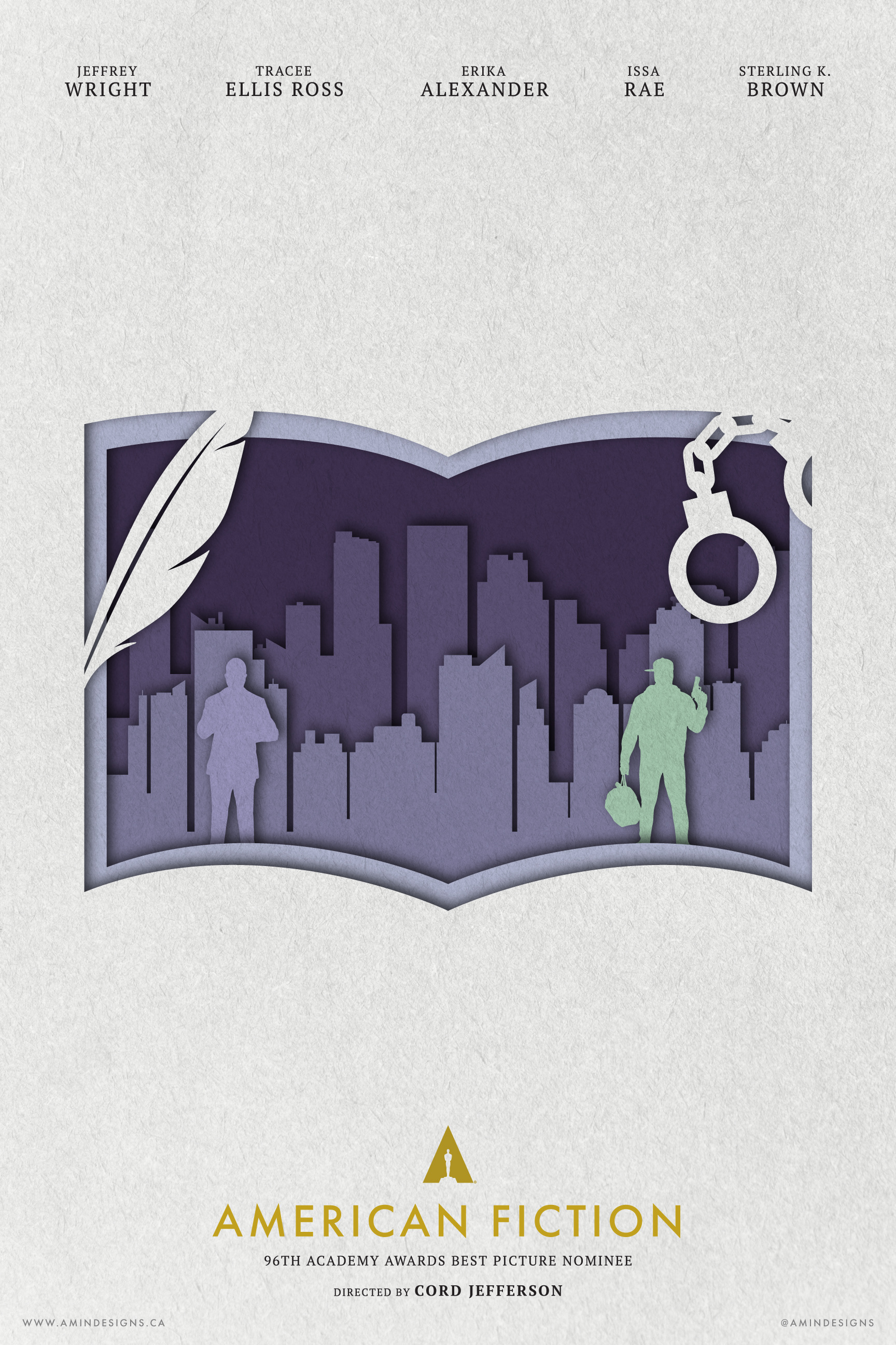
American Fiction
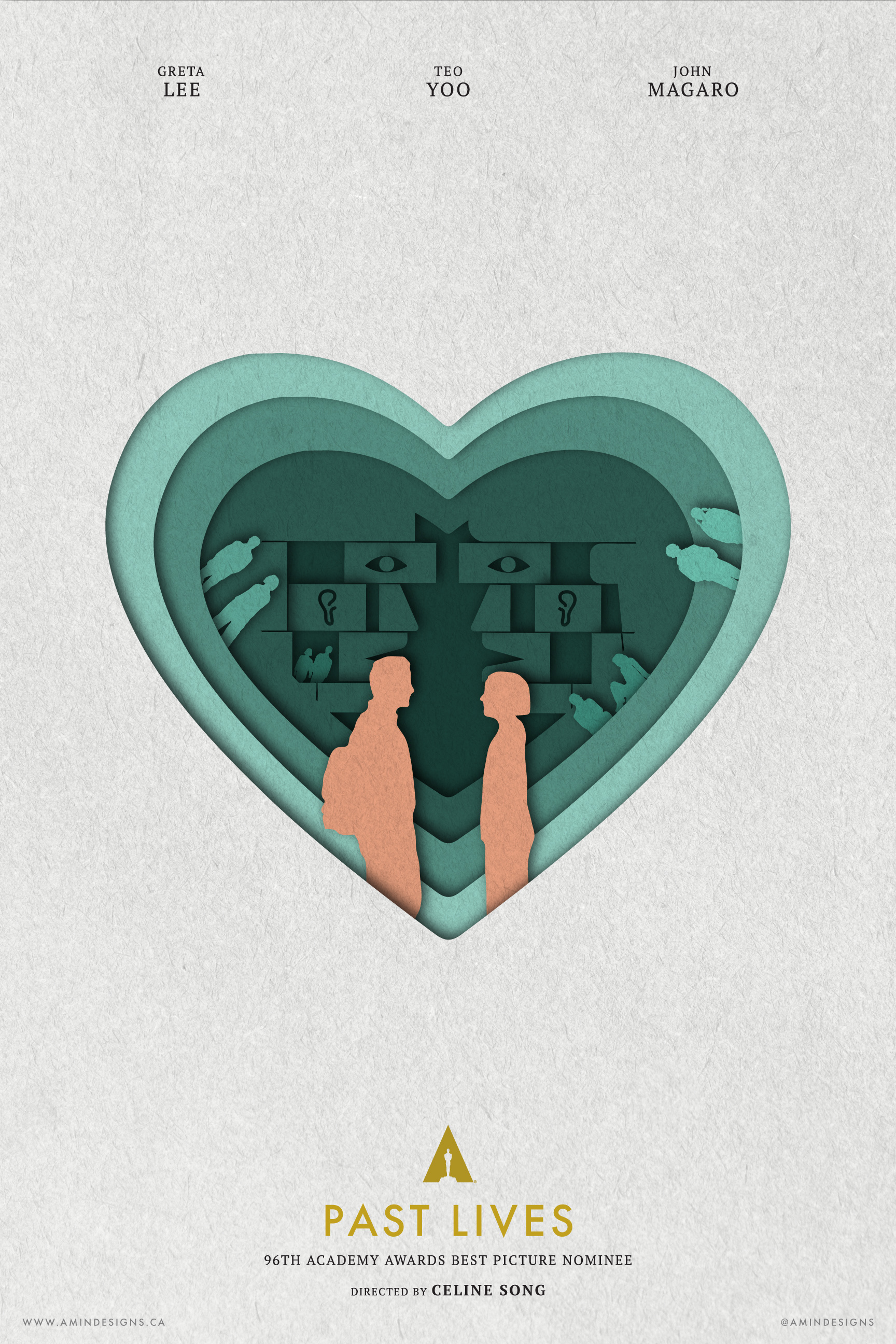
Past Lives
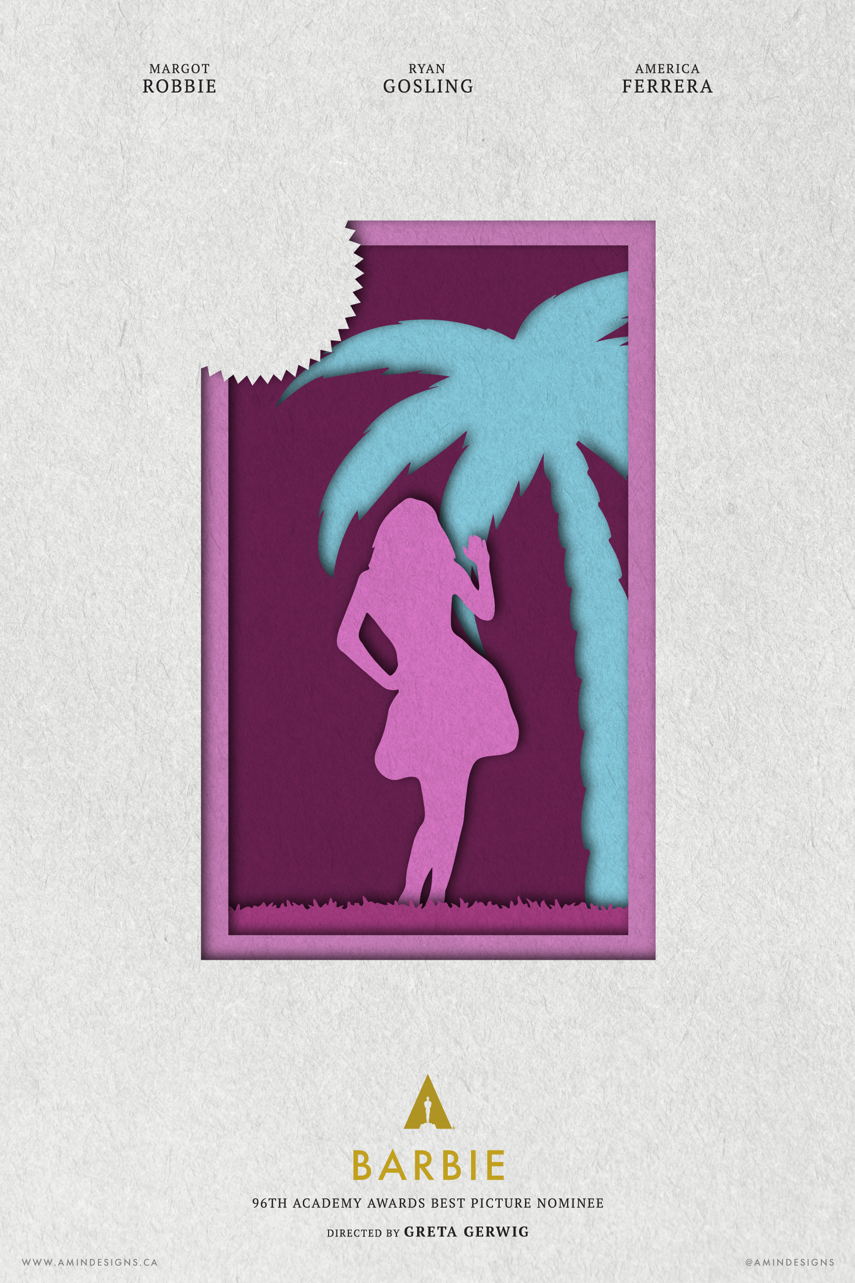
Barbie
2025 - The Motion Era
This year, I took the biggest creative leap yet—transforming my annual Oscar series from still posters into fully animated motion posters. From the start, I knew I wanted to push my skills further, exploring motion, transitions, and dynamic storytelling in a way I had never done before. But since each film needed to transition seamlessly into the next in alphabetical order, I couldn’t fully commit to the designs until the nominees were announced. This added a new layer of complexity, requiring meticulous planning, concept refinement, and countless hours of animation work.
My biggest inspiration came from the Academy’s 2014 and 2015 Best Picture nominee announcements, where motion graphics beautifully represented each film while smoothly transitioning between them. (Check out THIS LINK to see what I’m referring to.)
The biggest challenge? Time. With just four weeks between the nominations and the Oscars, I had to conceptualize, design, animate, and refine 10 different posters, each with its own movement and unique transition. It was an exhausting and intense process, but the end result is something I’m incredibly proud of.
This year was never about the still images, it was about motion, storytelling, and the seamless flow between frames. Seeing these posters come to life added a whole new dimension to the series, making this one of my most rewarding creative challenges to date.
Learnings & Future Plans
Learnings: The importance of a cohesive theme, time management, and community engagement.
Future Plans: Continue the project annually, explore new themes and styles, and possibly expand to other categories or film festivals.
I've created a ton of alternative movie posters. If you're interested in seeing my full catalogue of the posters I've designed over the years, feel free to check them out on my PosterSpy page, by clicking the button below.
