Overview
Client: IBA (Innovative Business Association)
Industry: Academic Student Society at UTM (University of Toronto Mississauga)
Project Duration: May 2019 (2-3 weeks)
Role: Director of Marketing and Design
Services Provided: Logo Design, Branding
Background
Client Description:
The IMI Business Association (IBA) at UTM is an Academic Society representing over 2000+ Management and Commerce students. They host year-round events and are the leader of business-related student initiatives and the largest academic society at UTM. IBA originally stood for IMI Business Association - the IMI meant Institute of Management and Innovation.
The name has since been changed to Innovative Business Association. They are dedicated to enabling students with various opportunities to learn and grow beyond the classroom. They aim to help shape students of today to become the business leaders of tomorrow through networking, professional development, and adding value to the community.
Project Objectives:
• Logo Design and Branding for the newly formed academic society
Research and Discovery
Initial Consultation:
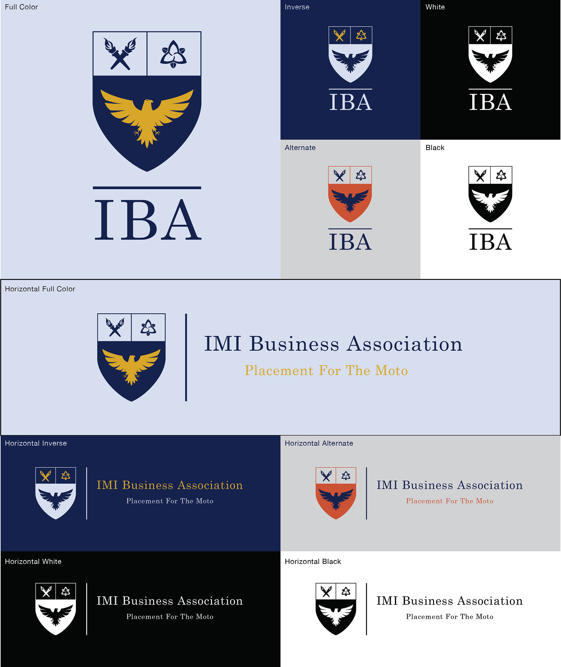
I joined the club as a Marketing and Design Director and after a couple of weeks, there were discussions about creating a logo. During the initial consultation, the presidents and board members of the association expressed their vision for a logo that represented their academic and professional focus. They initially considered a traditional academic design, resembling a coat of arms, but decided against it to avoid similarities with the University of Toronto's logo. This led us to explore a more minimal and modern design approach.
Design Process
Concept Development:
Initially, there was an internal competition within the marketing and design team. Each team member submitted design options and concepts. After feedback and several discussions, my concept was chosen to move forward. The initial ideas focused on incorporating academic symbols, but due to restrictions, we pivoted to a more minimal design featuring an eagle and a shield.
Design Iterations:
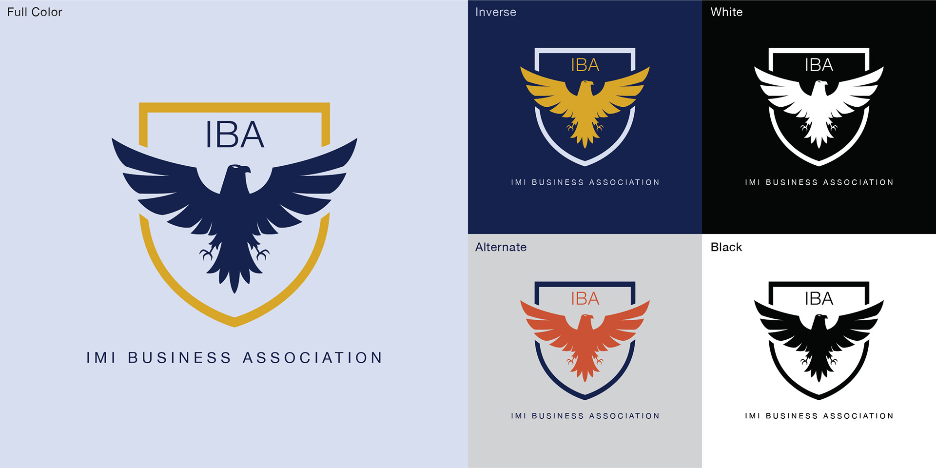
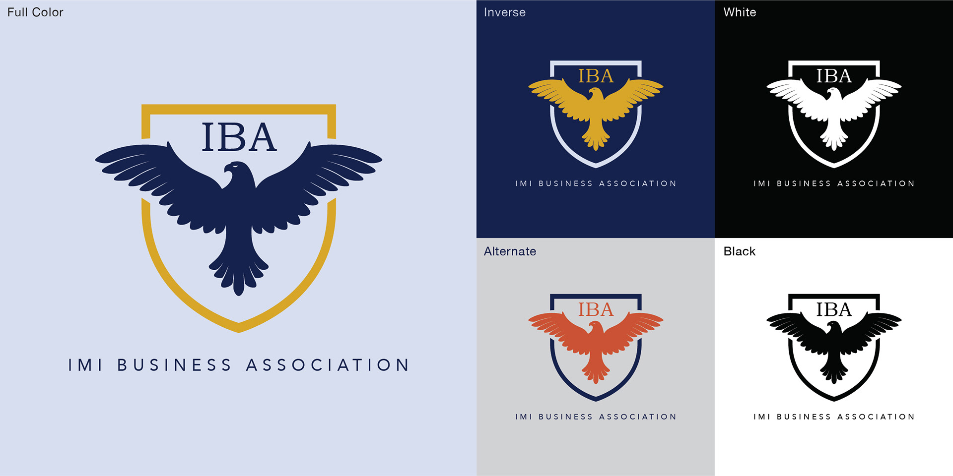
The design process involved numerous iterations, experimenting with different elements, colours, and styles. We started with the idea of using navy blue as the primary colour to align with UofT’s branding. An accent colour, particularly gold/yellow, was considered but ultimately not chosen to maintain a cleaner look. We refined the logo by adjusting the shield's shape, and the eagle’s positioning, and ensuring the design conveyed innovation and professionalism.
Final Design:
The final IBA logo is a modern take on a traditional shield. The navy blue and white colours pay homage to UofT and by extension, the Institute of Management and Innovation, and the UTM Department of Management.
The bird breaking through the shield symbolizes challenging the status quo, taking risks, and being innovative. The eagle - which is also UTM’s mascot- represents confidence, resilience, and excellence.
Implementation
Brand Guidelines:
To ensure consistent use of the logo, I created brand guidelines detailing the logo’s application, including typography, colour schemes, and placement rules.
Applications:
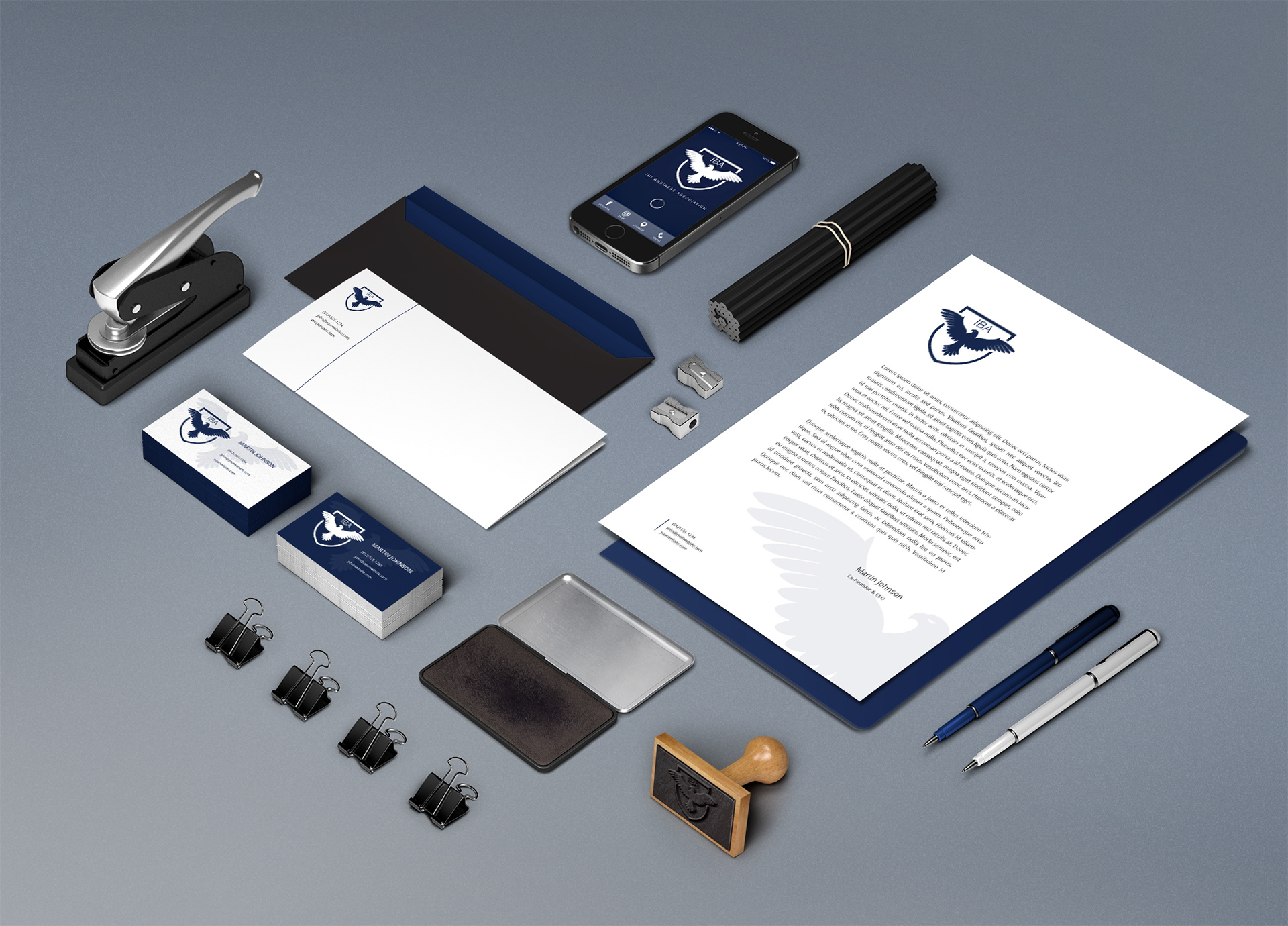
The IBA logo has been applied to various mediums:
• Website: Homepage, navigation bar, and footer
• Social Media: Profile pictures, cover photos and post graphics
• Signs: Banners for events and promotions
• Merchandise: Pens, mugs, stickers, and hoodies
• Business Cards: Clean and professional design
• Stationery: Letterheads, envelopes, and brochures
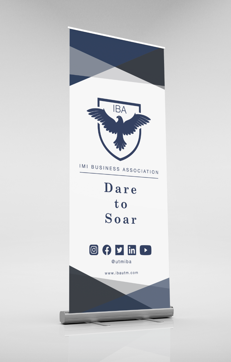



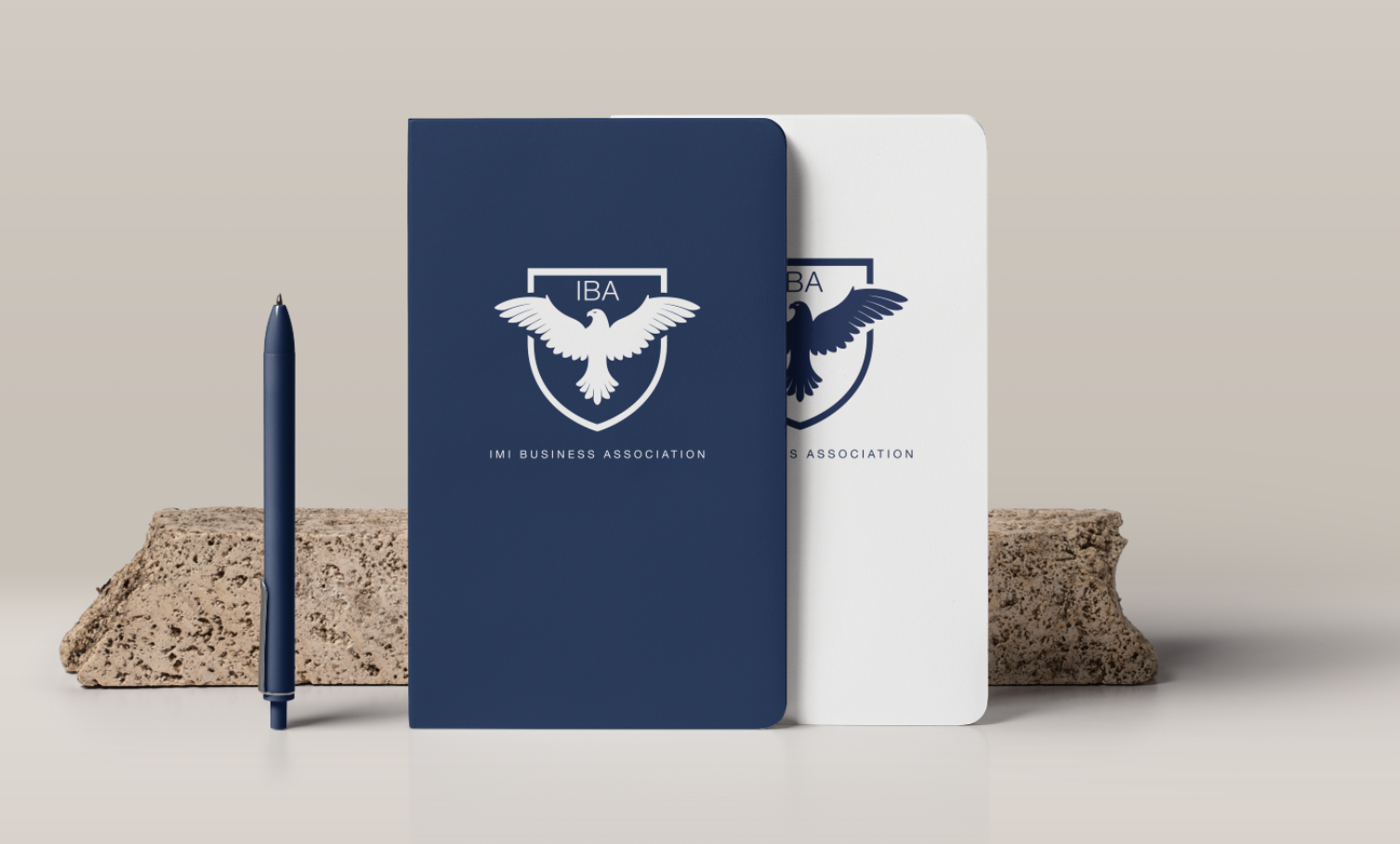
Logo Variations:
Throughout the year I ended up creating different theme and season variations of the logo, that we would post on our social media.
Results & Impact
The new logo significantly enhanced IBA's brand recognition and professionalism. It became a recognizable symbol around campus, helping to establish IBA's presence and identity (especially in the first year of its formation). The logo has remained unchanged over the past five years, symbolizing its lasting impact and success.
Conclusion
Reflecting on this project, I am proud of the work accomplished. From the initial concept to the final design and implementation, the project was a success. The logo not only met but exceeded the client's expectations, and it continues to represent IBA's values and mission effectively.
This project was a significant part of my final year at university, and seeing the logo used in various applications and recognized around campus is incredibly rewarding. It's a testament to the power of thoughtful design in creating a lasting impact.
