Project Overview
Project Name: AMIN Designs - Personal Logo Redesign
Duration: March - April 2024 (around 3 weeks)
Tools Used: Adobe Illustrator
Introduction
As a graphic designer, I understand the importance of having a logo and brand identity that truly reflect who I am and where I stand in my career. This case study outlines the journey of redesigning my personal logo—a complete rebrand that better represents my style, expertise, and the core values I bring to my work.
Objectives
• Express My Identity: Create a logo that captures the essence of who I am as a designer.
• Showcase Growth: Reflect the evolution of my skills and design aesthetics.
• Ensure Consistency: Develop a cohesive visual identity that works across various platforms, like my website, business cards, and social media.
• Create Memorability: Design a logo that is distinctive, memorable, and versatile.
Initial Reflection
Previous Logo Review:
I took a step back to analyze my previous logo, considering what worked and what didn’t. I looked at its strengths and weaknesses and why it didn’t fully capture the essence of my brand. When I originally designed the logo, I wasn’t entirely sure where my expertise as a designer lay. So, I chose a simple typeface logo, chose a font I liked, and tweaked it slightly.
I opted for red, a personal favourite, not just because I liked it but also because of its attention-grabbing qualities. Given my preference for dark backgrounds and dark mode in general, I chose an off-black colour as the main background for the logo.
Shortly after, I created my original website and branded my online graphic design work as AMIN Designs. Even then, I knew the logo wasn’t the best fit and didn’t truly align with my work, but I put off updating it until recently. The logo, standing alone, gave no clear indication of what it represented.
Inspiration & Mood Board:
Over the last several months, I’ve been contemplating what I wanted for my new logo. Seeing the logos of other graphic designers I follow online gave me a lot of inspiration and ideas for the direction I wanted to take with my own rebrand.
Design Process
1. Concept Development:
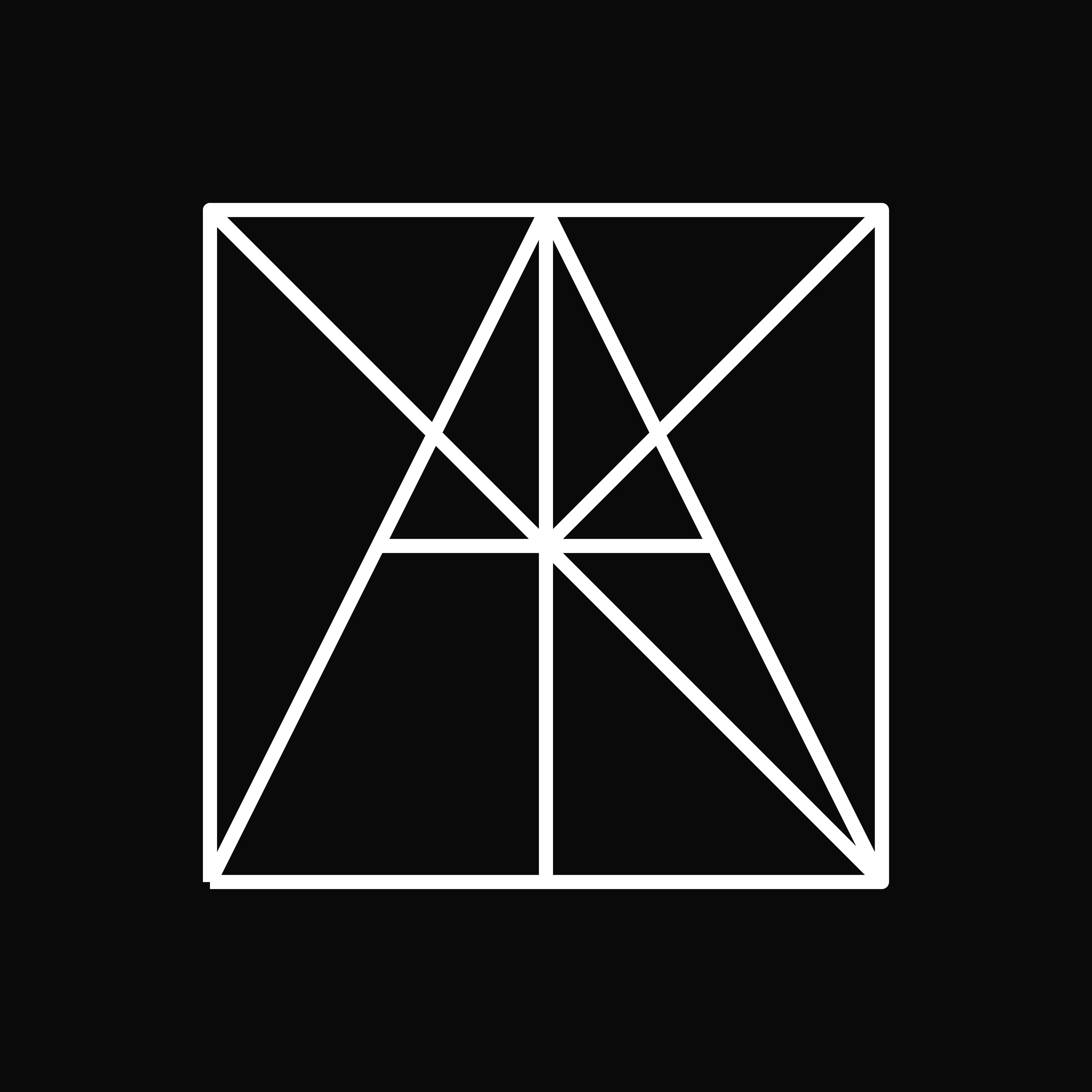
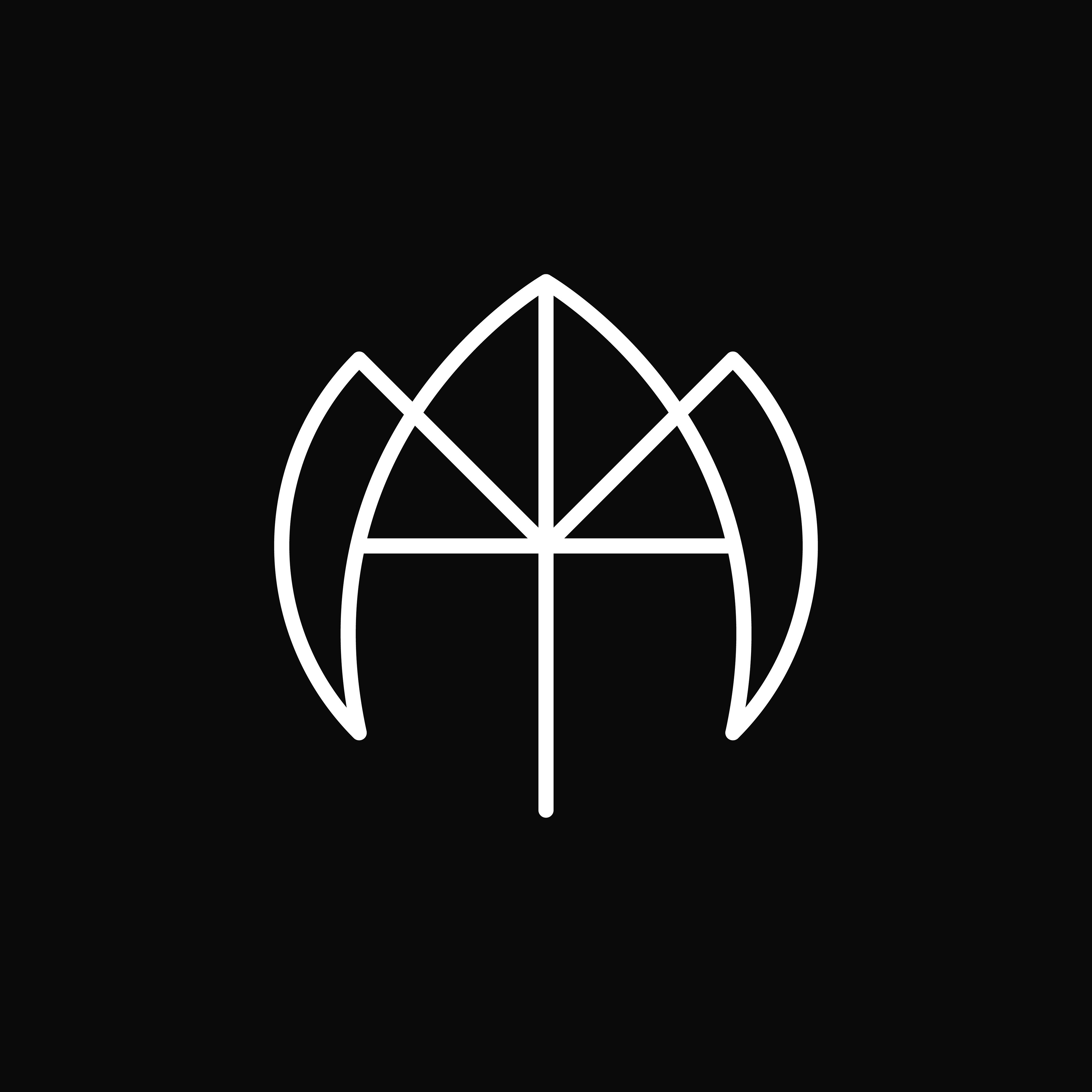
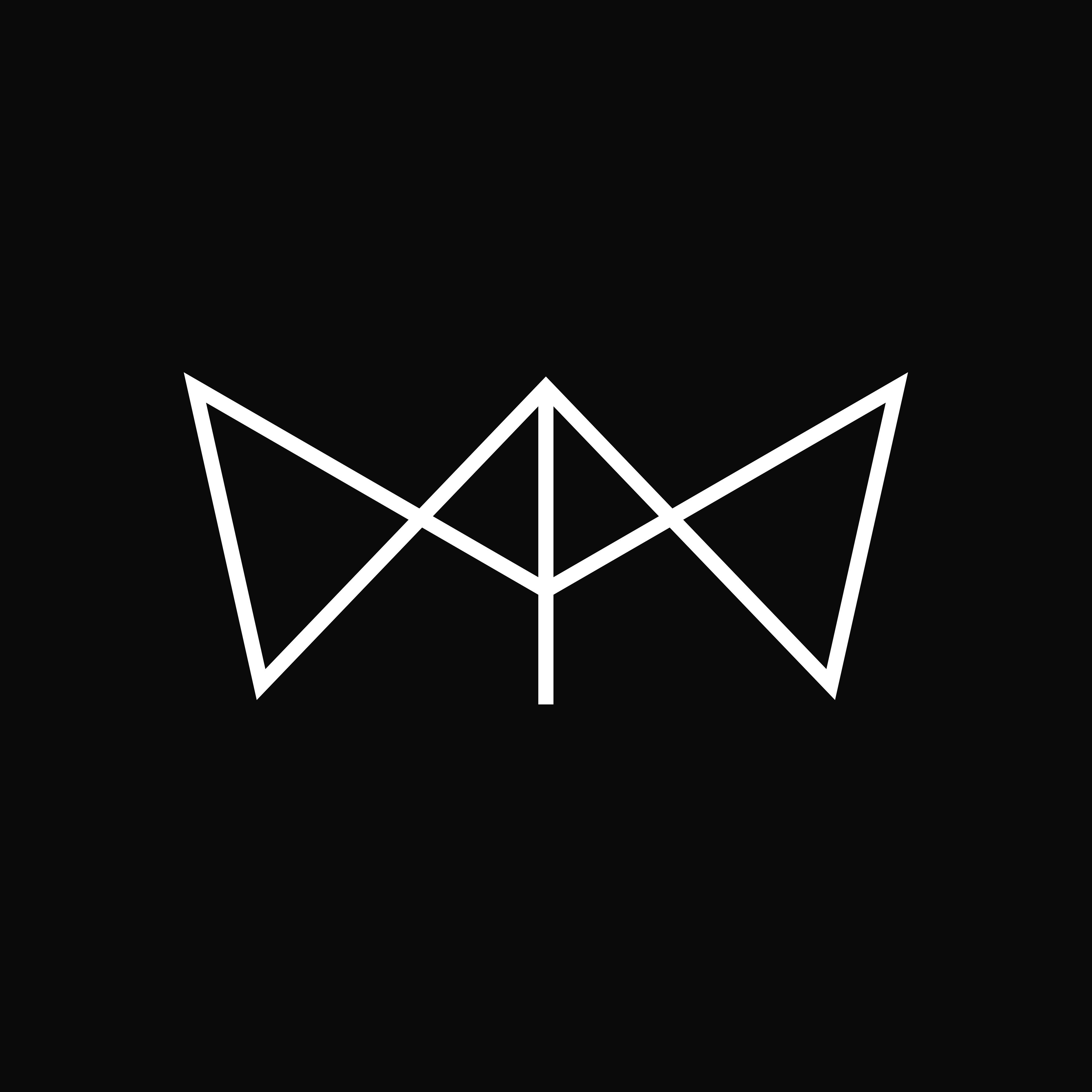
I began brainstorming and sketching out numerous ideas for the new logo. This stage was all about letting creativity flow and exploring different possibilities. From the start, I knew I wanted a monogram logo. My main struggle was deciding between an AD monogram for Amin Designs or an AMIN monogram for just my name. This was a tough decision because both concepts had strong potential. Check out some of my early concepts below.
2. Iteration & Refinement
Once I had some solid sketches, I moved to Adobe Illustrator to polish them up. After some initial feedback, I decided to scrap the AD (Amin Designs) monogram and focus solely on my name.
I explored various ideas, from simple and common to more unique concepts, aiming for something that worked both as a monogram and a logo mark—abstract, but still minimal and modern, to stay consistent with my brand and style. This stage was crucial in honing the final look, and I reached out to a fellow designer for input, which helped me make some minor but impactful adjustments.
3. Final Design:
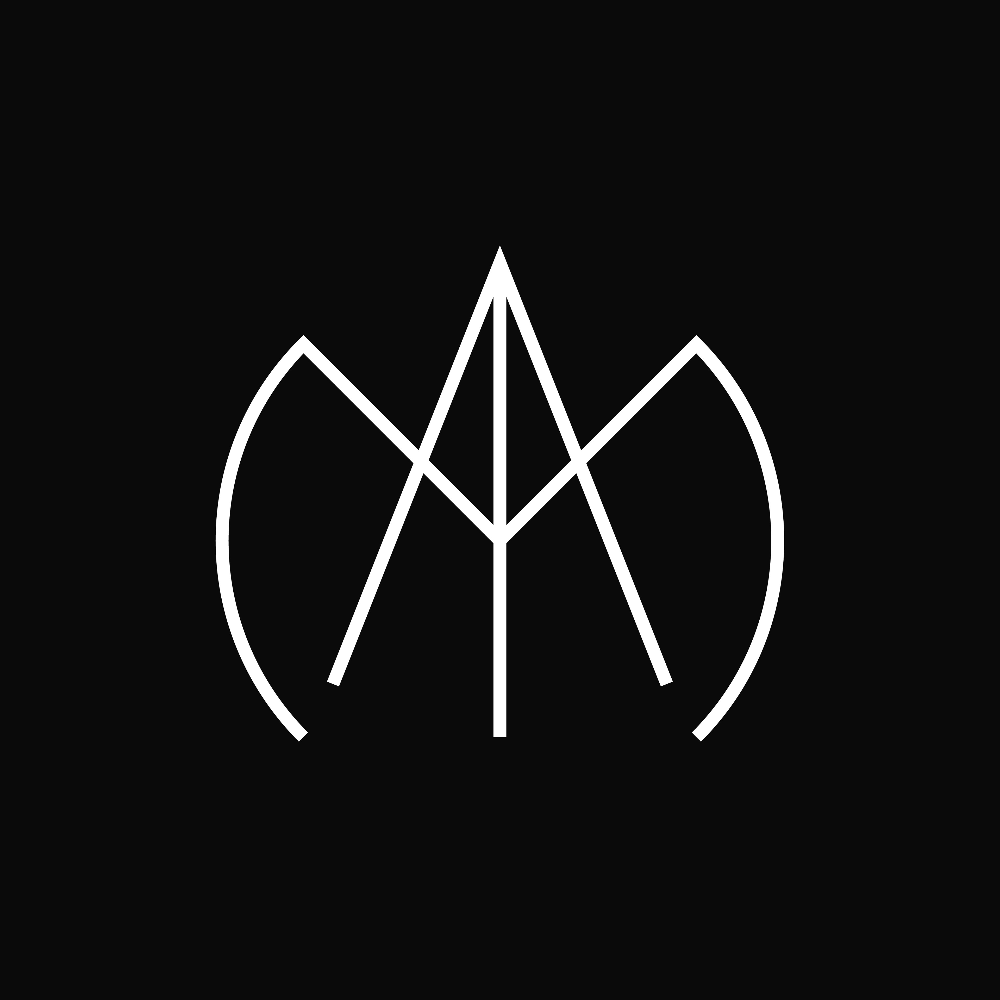
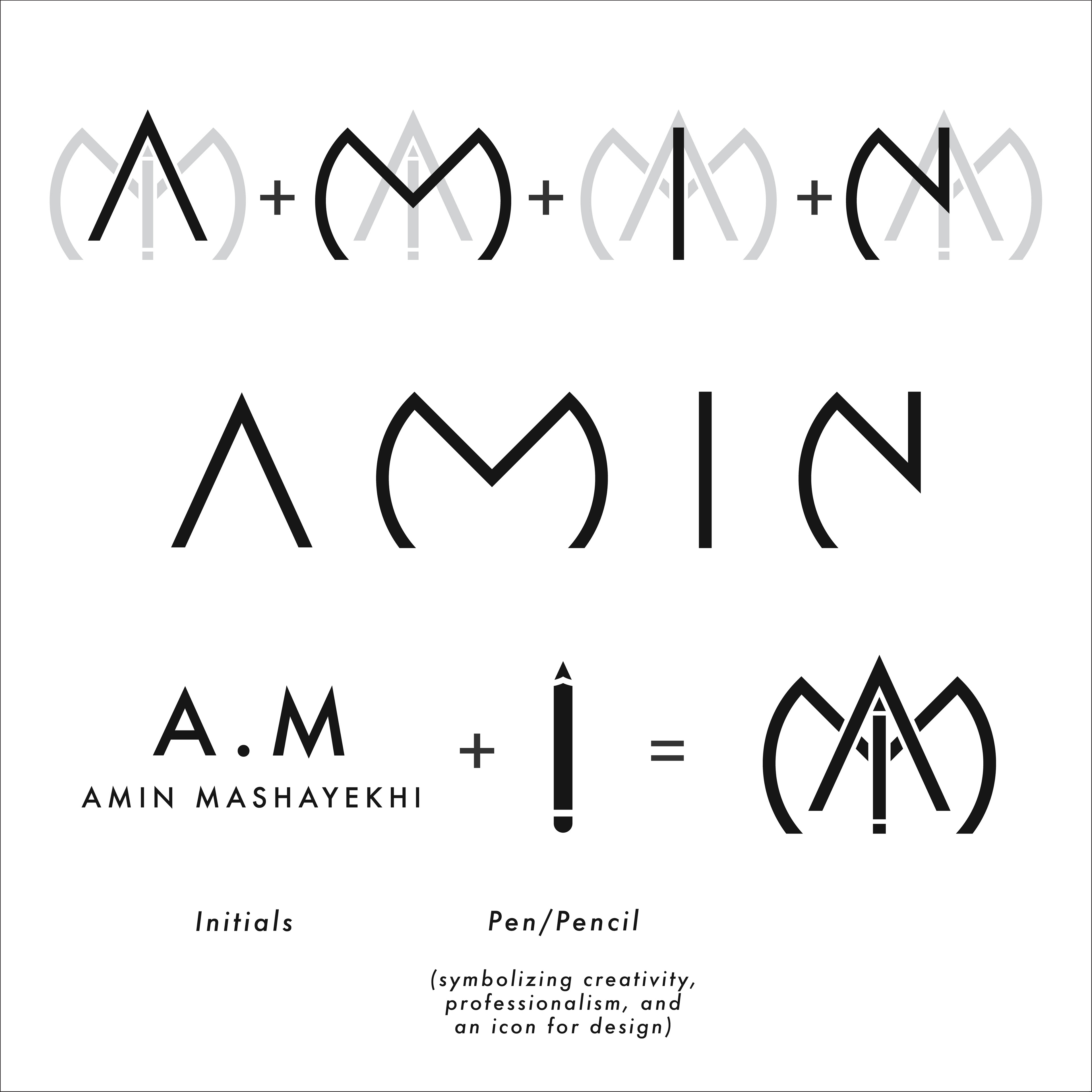
Logo Explanation: The final logo is a monogram logomark that combines the letters of my name, representing my brand and work in graphic design. The letters are slightly abstract, especially the 'N', but all four letters of my name are present. The pencil replaces the 'I', symbolizing creativity, professionalism, and design.
Additionally, the 'A' and 'M' are the most prominent, which also happens to be my initials (Amin Mashayekh). Together with the pencil icon, these elements form a logo that’s both personal and professional.
Brand Identity Development
1. Color Palette:
Unlike my original logo, I decided to stick to a black-and-white colour scheme. Over the past few years, I’ve noticed that I use my logo a lot as a watermark or “signature” at the bottom or corner of posters or projects.
Having it in a specific colour often clashed with the designs it was accompanying. As an artist, I understand the importance of keeping the focus on the design itself. Using just a white or black logo as a “stamp” works best. I did, however, create a blue version of my logo for occasional use, but for now, I think sticking to a monochrome scheme is the way to go.
2. Typography:
I experimented with several fonts, but since the focus of the logo is the icon itself, I decided to stick with a minimal font (Futura). I did tweak the lettering very slightly, but nothing major. I considered modifying a font completely but ultimately felt that Futura complemented the logomark best. The logo mark is going to be the most used element.
Impact & Results
Personal Reflection:
This redesign has had a significant impact on my personal brand. I now feel more confident presenting this logo as a true reflection of my work. It aligns with who I am as a designer and has elevated my professional identity.
Next Steps:
Moving forward, I plan to continue refining and expanding my brand identity. I still need to finalize a new business card and am working on creating patterns and graphic styles for the logo/brand identity. But the first, and most important, step is now complete.
Conclusion
Redesigning my personal logo has been a rewarding experience, allowing me to redefine my brand in a way that aligns with my current design philosophy and future goals. This new logo not only represents my growth as a designer but also sets the foundation for future creative projects.
My goal was to create an icon/logomark that both represented me and the work I do. The combination of the letters and the pencil icon has truly achieved that, and I couldn’t be happier with the result. I’m excited to continue building and evolving my personal brand, always striving to push my creative boundaries.
